
Chuck Purvis · @charleypurvis
66 followers · 182 posts · Server sfba.social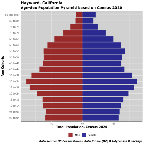
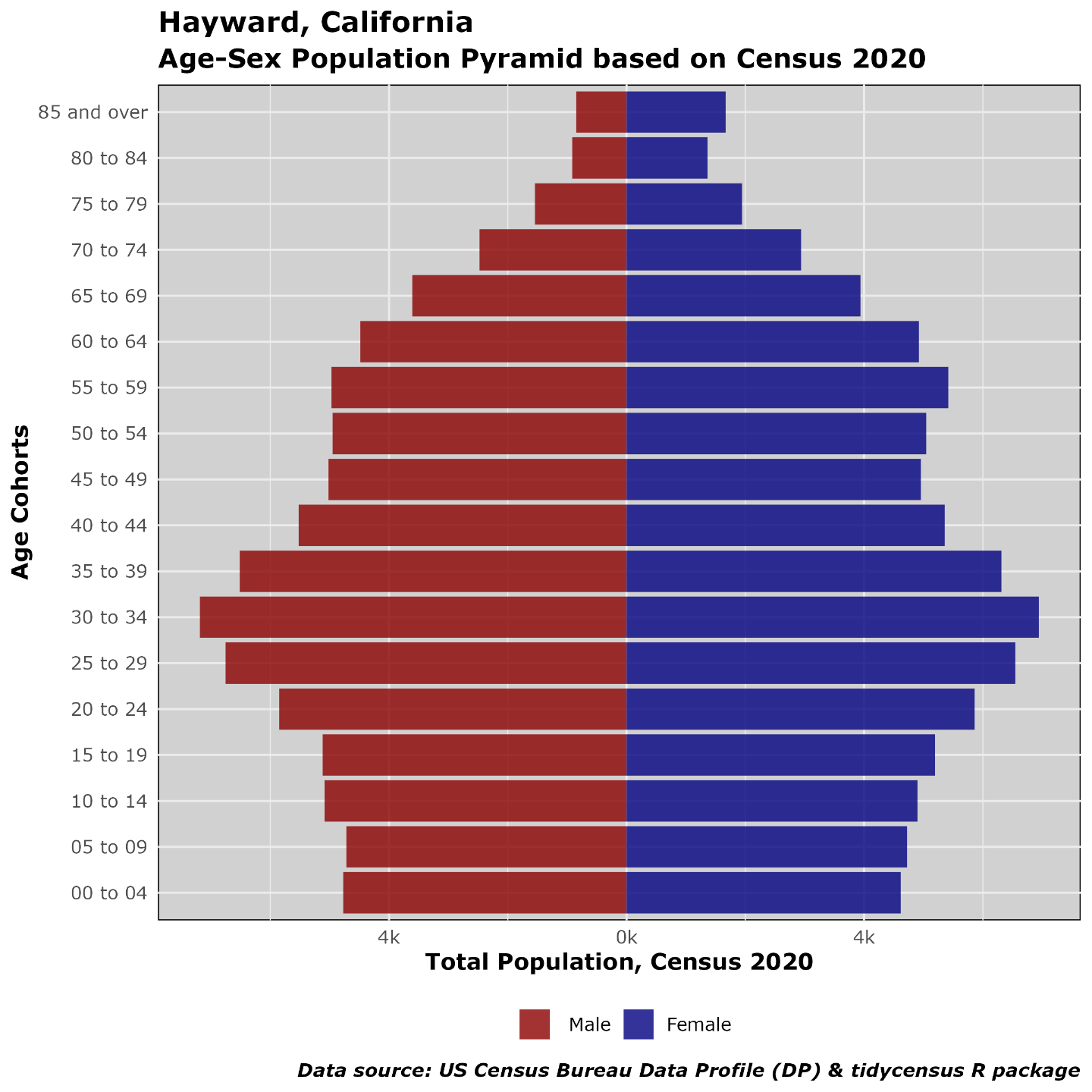
Easy to create age-sex population pyramids using #census2020 demographic profile data released May 2023; and the #rstats programs #tidycensus #tidyverse and #ggplot2
Adapted from the Kyle Walker book “Analyzing US Census Data”
scripts are shared:
https://github.com/chuckpurvis/r_scripts
#Census2020 #rstats #tidycensus #tidyverse #ggplot2 #census
Chuck Purvis · @charleypurvis
59 followers · 125 posts · Server sfba.social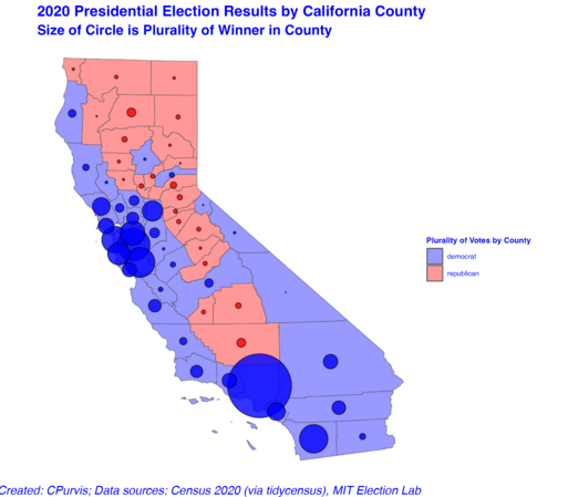
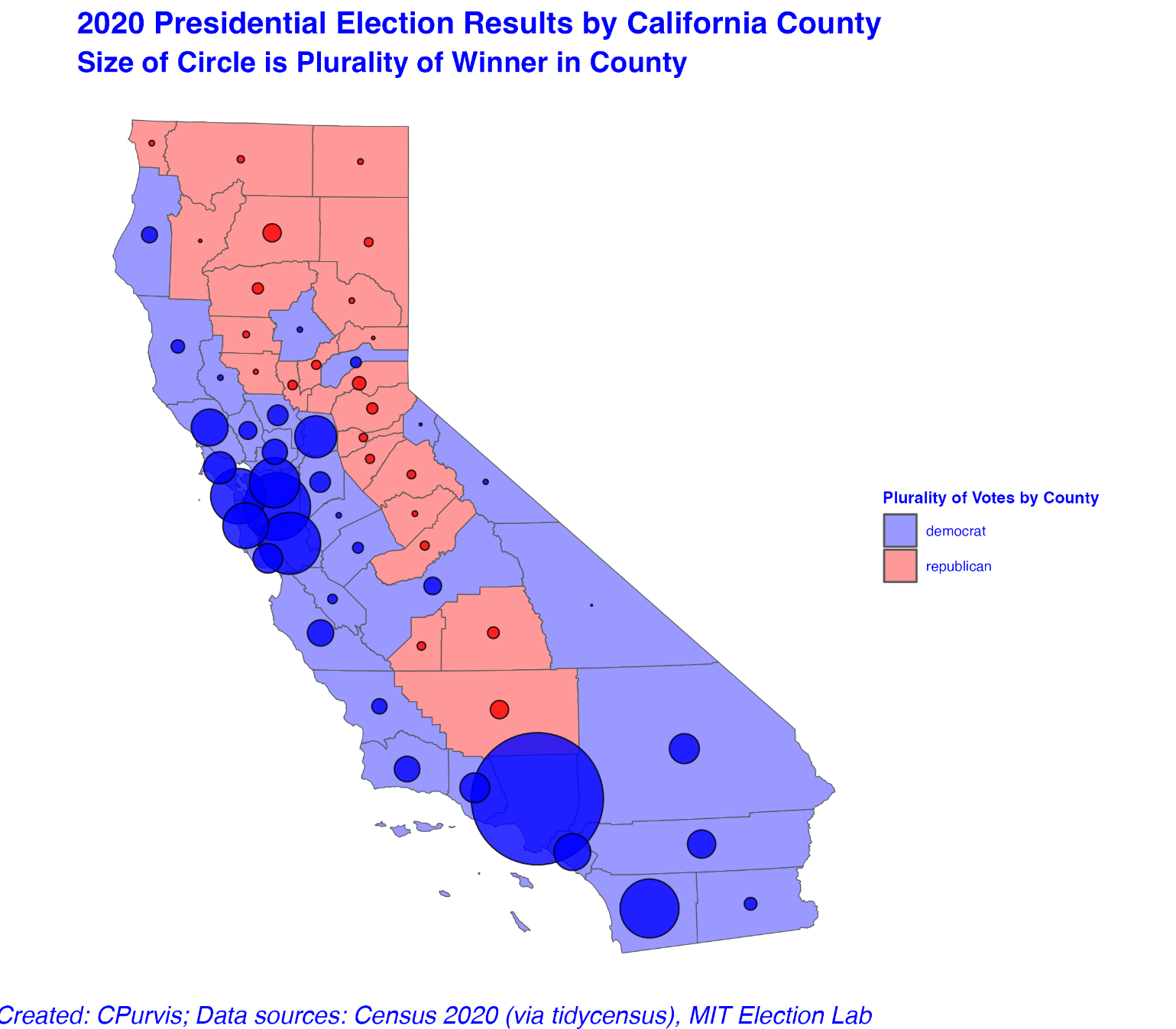
Today I learned a new #rstats package: #cartogram . This allows creation of Dorling cartograms (non-overlapping bubbles).
It's using the same 2020 presidential election county-level databased I created merging MIT Election Lab data with #tidycensus -derived files from the #census2020
The California Dorling plot is better by showing non-overlapping circles, especially in the Bay Area.
The Texas Dorling plot shows Harris County (Houston) nudged into the Gulf of Mexico. Dallas County and Travis County (Austin) have pushed (repelled) the little red bubbles to be more prominent.
All maps were created with the #tidyverse package #ggplot2
This is a lot of fun, for me, at least!
#rstats #cartogram #tidycensus #Census2020 #tidyverse #ggplot2

Alu · @alu
46 followers · 283 posts · Server social.freetalklive.com
https://libertyblock.com/us-census-shows-how-people-vote-with-their-feet/
What are your thoughts about the US Census??
#Census2020 #texas #california #florida