
Elias Dabbas :verified: · @elias
55 followers · 90 posts · Server seocommunity.social
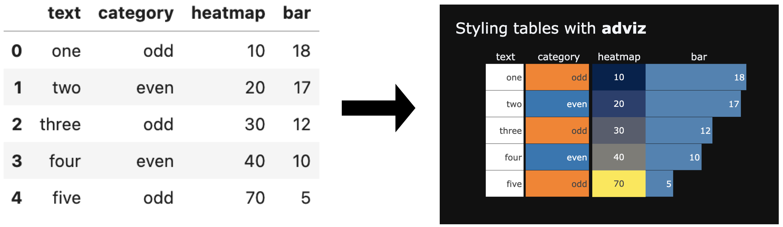
Styling tables with #adviz
New function/chart:
🔵 Style columns as text, category, bar, or heatmap
🔵 Set table title, width, height
🔵 Set relative column widths
🔵 Hover to see long text
🔵 HTML file
https://bit.ly/style_table
#DataScience #DataVisualization #Python #Plotly
#adviz #datascience #datavisualization #python #plotly
Elias Dabbas :verified: · @elias
52 followers · 70 posts · Server seocommunity.social
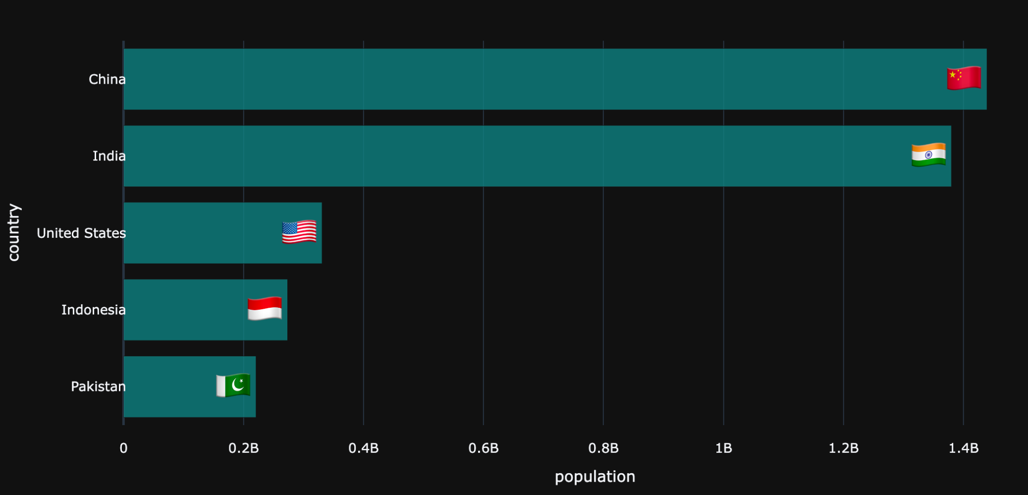
Country flags can make your charts/reports easier to read, & can give more space vs full country names.
Just released a simple new #adviz function flag() which converts a 2 or 3-letter country code or country name to its respective flag
python3 -m pip install --upgrade adviz
#adviz #advertools #datascience #datavisualization #python #plotly
Elias Dabbas :verified: · @elias
50 followers · 66 posts · Server seocommunity.social
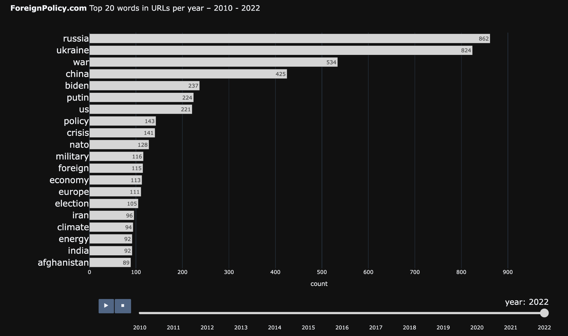
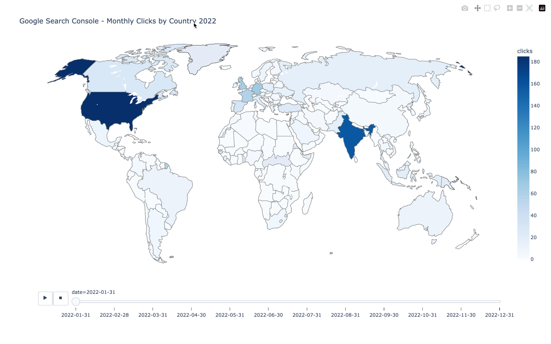
The racing chart is also a way to see how content has progressed over time.
Here you can see how the top 20 topics have evolved in ForeignPolicy's website (XML sitemap URLs)
Interactive chart: https://bit.ly/3V48k2N
#DataScience #DataVisualization #Python #advertools #adviz #SEO #SEM #DigitalMarketing #DigitalAnalytics
#plotly
#datascience #datavisualization #python #advertools #adviz #seo #SEM #DigitalMarketing #digitalanalytics #plotly
Elias Dabbas :verified: · @elias
50 followers · 65 posts · Server seocommunity.social
Do you like to watch keywords racing for the top positions in your data in an animated and interactive chart?
What about countries, URLs, products? Or any other entity measured by any metric across several periods of time?
The racing_chart* function is ready for testing if you want to try it out.
pip install --upgrade adviz
#DataScience #DataVisualization #Python #advertools #adviz #SEO #SEM #DigitalMarketing #DigitalAnalytics
*racing_chart: other/better names?
#datascience #datavisualization #python #advertools #adviz #seo #SEM #DigitalMarketing #digitalanalytics
Elias Dabbas :verified: · @elias
49 followers · 63 posts · Server seocommunity.social
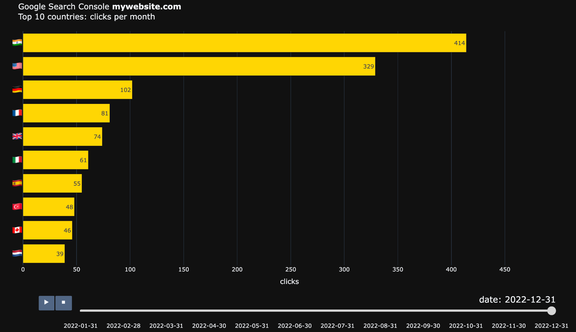
Google Search Console Animated Monthly Clicks Chart
Download it here: https://bit.ly/41BUc2X
Code & sample data: http://bit.ly/4050W8h
Coming soon...
#DataScience #DataVisualization #Python #advertools #adviz #SEO #SEM #DigitalMarketing #DigitalAnalytics
#datascience #datavisualization #python #advertools #adviz #seo #SEM #DigitalMarketing #digitalanalytics
Elias Dabbas :verified: · @elias
47 followers · 61 posts · Server seocommunity.social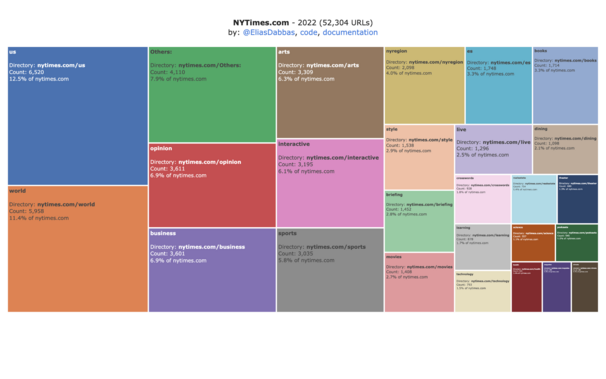
The split of topics that The New York Times covered in 2022.
Interactive HTML chart & code:
https://bit.ly/3zSxbNh
You can check other years and see how/if their publishing has changed.
I removed the dates from URLs in this case (YYYY/MM/DD) to get a better overview. Note that you can include links* in the chart:
Links*: more than one
Links*: using a URL shortener like bit[.]ly
Links*: containing UTM codes
#DataScience #DataVisualization #Python #treemap #advertools #adviz #SEO
#datascience #datavisualization #python #treemap #advertools #adviz #seo
Elias Dabbas :verified: · @elias
47 followers · 59 posts · Server seocommunity.social
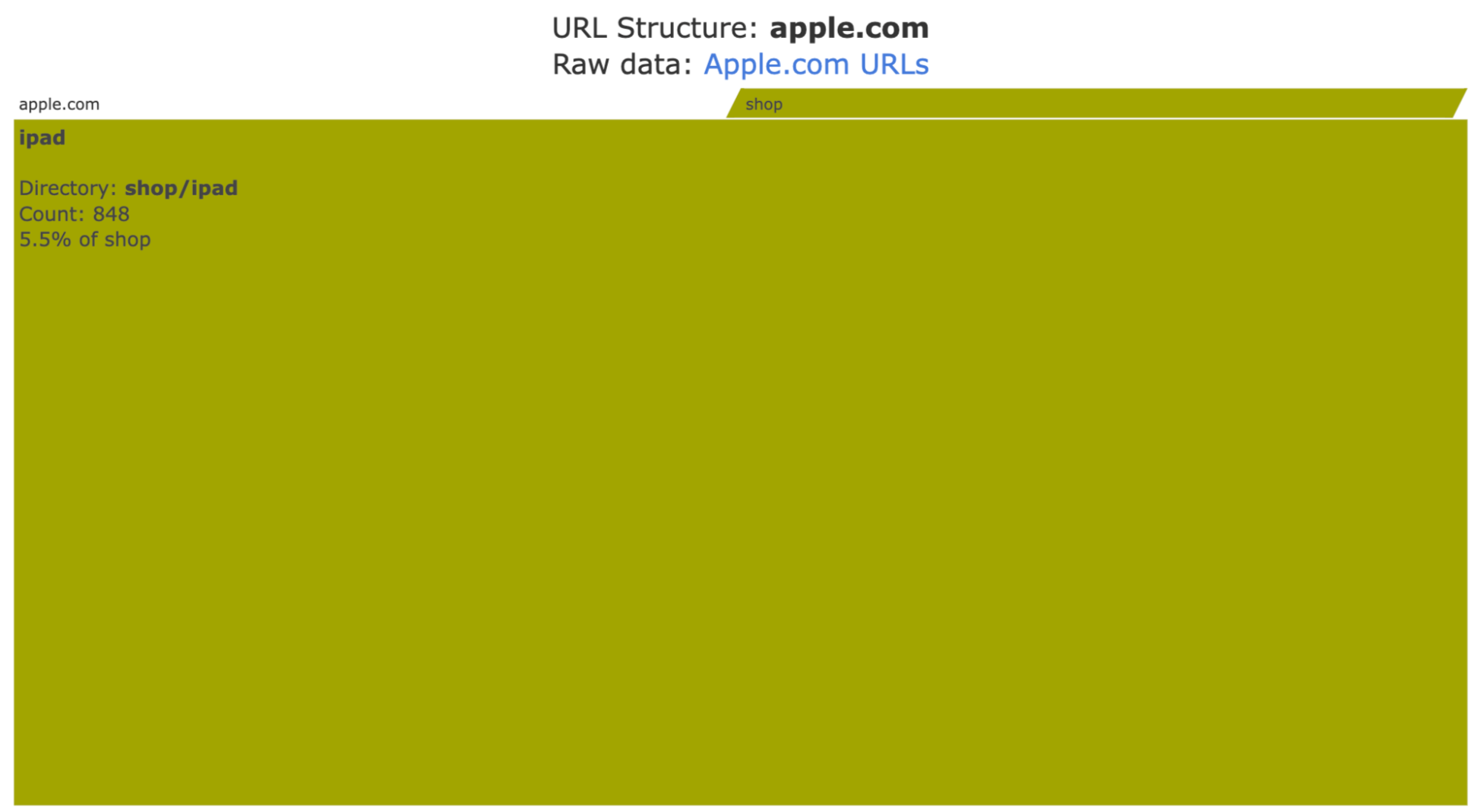
Code for visualizing a website's URL structure is ready for testing!
Many changes will be introduced later, but this is a good-enough version to try and play with.
Please let me know if you try and get any issues, or have suggestions.
#DataScience #DataVisualization #Python
#treemap #advertools #adviz #DigitalMarketing #SEM #SEO
#datascience #datavisualization #python #treemap #advertools #adviz #DigitalMarketing #SEM #seo