"You do you" is Eu-gen-ics. · @beadsland
1063 followers · 13603 posts · Server mastodon.social@wcbdata TY.
Map colors: standard #matplotlib sequential color gradient, for which "the lightness value increases monotonically": one presumes to make differences legible even with various color-blind profiles.
https://matplotlib.org/stable/tutorials/colors/colormaps.html
Explainer: took building entire library (#AnnoPlot, now pre-alpha) to allow for detailed annotations, as matplotlib doesn't support simultaneous word-wrapping and tight margins in same figure.
Cf. capacity trend viz earlier in thread.
"You do you" is Eu-gen-ics. · @beadsland
1063 followers · 13603 posts · Server mastodon.social@justyourluck Have been wanting to generate regional versions, but as of yet haven't even gotten around to the jiggery-pokery that would add outlying states and territories.
Unfortunately, #AnnoPlot charting library development is on hold as attend to other life matters. Ideally would release library for others to work with directly, but that's still a while off.
"You do you" is Eu-gen-ics. · @beadsland
1063 followers · 13603 posts · Server mastodon.social@Gdac Adding a note to my #AnnoPlot project plan to at some point generate a map of staffing loss since reporting began.
Hypothesis to be tested: population centers lost staff at a higher rate than rural facilities, simply as a function of more frequent unmitigated exposure of medical personnel where populations are denser, thus transmission sustained at higher levels.
Would be quite surprised if this weren't the case.
"You do you" is Eu-gen-ics. · @beadsland
920 followers · 10284 posts · Server mastodon.socialStill on December hiatus from programming this week—catching up on household projects—so no revisions to charts nor new features for #AnnoPlot dataviz library.
Hoping to get back to working on those in January.
"You do you" is Eu-gen-ics. · @beadsland
827 followers · 9356 posts · Server mastodon.socialThis week has been full of frustrations and aggravations. Thus no closer to returning to new dataviz design.
Looking forward to making some headway on birdsite archival and pachyderm migration tools during early part of December, return to #AnnoPlot library development by Jan.
"You do you" is Eu-gen-ics. · @beadsland
815 followers · 9177 posts · Server mastodon.socialBest laid plans or sumfin'.
Spoons this week went to food prep and stocking up the freezers with meals, before diving back into programming projects from twitter archival and mastodon utility tools to further development of #AnnoPlot & pandemic dataviz.
Daily postings to weekly #ThisIsOurPolio thread continues, but some half a dozen planned new #dataviz charts still remain on backburner for the forseeable future.
#annoplot #ThisIsOurPolio #dataviz
"You do you" is Eu-gen-ics. · @beadsland
816 followers · 9177 posts · Server mastodon.socialOther than minor legibility tweaks to hospital capacity charts, taking a hiatus from new chart dev this week and next.
Will be focused on #migration to and across #mastodon, including cleaning up incomplete archive received from birdsite and other suchnot.
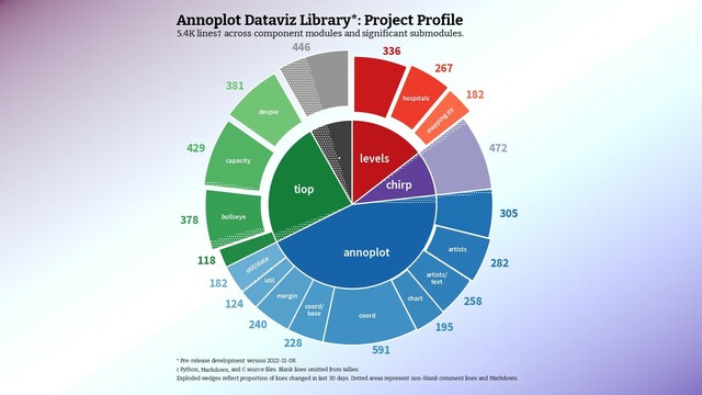
#AnnoPlot project profile: https://mastodon.social/@beadsland/109333798459653322
#migration #mastodon #annoplot
"You do you" is Eu-gen-ics. · @beadsland
816 followers · 9177 posts · Server mastodon.social#AnnoPlot #dataviz library for #matplotlib
Mostly hacks of working prototype hospital capacity & county choropleth (levels)—break out pediatrics & improve legibility.
Legibility improved also on prototype devpie—this chart. Project todo list has moved out of bullseye to top level grey slice.
Previous update: https://twitter.com/beadsland/status/1578308035063476224
#annoplot #dataviz #matplotlib #datavis
"You do you" is Eu-gen-ics. · @beadsland
816 followers · 9177 posts · Server mastodon.social@nobodyinperson Anyway, yeah, #AnnoPlot library started to address problem of including chart captions.
#matplotlib docs are quite explicit that one can't do tight margins and word wrapping in the same plot. That didn't suit me, so started building something to allow one to do both.
Up to 5.5K lines of working prototypes and preliminary library modules. Now have the scaffolding of an artists layout loop that jiggles things around until all the elements of a #dataviz play nice together.
#annoplot #matplotlib #dataviz
"You do you" is Eu-gen-ics. · @beadsland
816 followers · 9177 posts · Server mastodon.social@nobodyinperson It can be done, but only by explicitly using a font that provides the appropriate glyphs. There's no automatic failover substitution.
Am working on a #Matplotlib library (#AnnoPlot) that is pretty intensively text oriented. Currently building text out as Packer hierarchies of artists for each word, which will eventually support emoji integration.
Still have to figure out how to properly align character baselines though, as currently sentences and paragraphs are subtly janky. 🤷
"You do you" is Eu-gen-ics. · @beadsland
816 followers · 9176 posts · Server mastodon.socialHistorical tweets re development of #AnnoPlot dataviz library (the #ThisIsOurPolio toolchain) for #matplotlib:
https://twitter.com/search?q=from%3A%40beadsland%20matplotlib&src=typed_query&f=live
#annoplot #ThisIsOurPolio #matplotlib
"You do you" is Eu-gen-ics. · @beadsland
816 followers · 9176 posts · Server mastodon.socialGenerativist—#anarchism-adjacent #criptheory—#lumpentheory of #RentierSociety & #tensegrity fetters of #classposture #kyriarchy, with interest turning increasingly to societal #grief and collective acts of #mourning.
#cripplepunk meets #solarpunk
#abolitionist by way of #STS, #NVC, Pirsig.
#neologism by way of #neurodivergence.
Team #emdash.
Old school #programmer from before dotcom bubble, now developing #AnnoPlot #dataviz library & weekly refresh of #ThisIsOurPolio charts.
#introduction #anarchism #kyriarchy #criptheory #cripplepunk #grief #mourning #abolitionist #sts #nvc #neologism #neurodivergence #emdash #programmer #annoplot #dataviz #ThisIsOurPolio #solarpunk #lumpentheory #tensegrity #rentiersociety #classposture
