
Kaan Barmore-Genç · @kaan
164 followers · 268 posts · Server fosstodon.org
Sure, I didn't need to read any of those options
(This is the page as is, no dark mode hacks or anything)

Jonathan T · @JonnyT
364 followers · 784 posts · Server mastodon.me.uk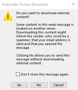
Over 30 years of using their product and this is an example of why I still hate every second of it to this very day... Microsoft continues to pull this stupid, user-hostile shit in their interface.
How can you be a software developer and still be unaware that you should never have Yes, No, Cancel dialogues? It was terrible UI back in the last century. It is completely unforgivable now.
Any budding developers out there? Please do not do this.
Grrr.
#schoolofshitdesign #badux #badui #windows

御子神アイリス · @ShionAmasato
21 followers · 2711 posts · Server matitodon.comhttps://twitter.com/tojoline__TJ/status/1677676473845682183
東上線に #BADUI らしきものが
ちなみに上り電車が来るのが左側、下り電車が来るのが右側

Joey Gibson :fez: · @joeygibson
142 followers · 380 posts · Server hachyderm.ioI sincerely wish Dropbox would _stop_ trying to get me to switch to their damn beta client. They ask me literally five times a week. One refusal should be enough.

Cormac · @cormac
41 followers · 149 posts · Server hachyderm.ioIf you are a medical billing company, please try and make your site usable.
My web-aware wife almost went to a phishing site because the "pay my bill" site was https://superlonghardtotypesubdomain.domain.com
She missed the domain and someone had parked on the subdomain.
After I got her past that, she still couldn't pay because the UI needed clientid*accountnumber. Just make the form use the same format the bill is and add another field.
Worst web experience, ever. 1 Star.

Axel Rafn · @axelrafn
78 followers · 504 posts · Server xn--lofll-1sat.is
Sá rétt í þessu að YouTube eru að prófa sig áfram með breytingar á layoutinu hjá sér til að koma betur að Shorts, en þetta er ekki að ganga að mínu mati..

IBBoard · @ibboard
70 followers · 1593 posts · Server hachyderm.ioNooooo! Something changed in Gnome and now my custom patches aren't applying and I've got those stupid round avatars everywhere.
IF I WANTED A ROUND PICTURE THEN I'D DRAW A CIRCLE!

Ryan Poirier (@rgpphotog) · @RGPphotog
23 followers · 290 posts · Server postchat.io
Was this supposed to be a question?
Pressing “OK” launches the web browser to a bill paying page.
But no, I wanted to monitor our daily energy consumption. Thanks, I guess?

ethan · @strangebirds
30 followers · 269 posts · Server mastodon.xyzThe practice of using a notification (phone or computer, doesn't matter) and the user goes to the notifier and the the notification dot or number doesn't change until something is interacted with is annoying as fuck.
I am viewing the notifier, that is the action; don't make me touch it or click it - just clear the notification symbol! It's lazy programming - did the user navigate to the notifier? Did it successfully display? Notification is done.

Axel Rafn · @axelrafn
7 followers · 16 posts · Server hachyderm.io
#Linode has started rebranding itself due to it being owned by #Akamai, which is fine. But the placement of the logo at the top of the sidebar is killing me!
#BadUI #WebDesign #failure
#linode #Akamai #badui #webdesign #failure

Jake Carpenter 🏳️🌈🏳️⚧️ · @jakecarpenter
29 followers · 227 posts · Server fosstodon.org

JonDThompson · @JonDThompson
4 followers · 75 posts · Server mstdn.party
This toggle is a horrible UI addition Apple. How am I supposed to tell a user to turn it on or off? "Make sure it's on the right or left?", "Make sure it is blue". The simple checkbox that it replaced was much, much easier to describe. #badui #apple #macos #macosventura
#badui #apple #macos #macOSVentura

Nicolas diPierro · @dipierro
19 followers · 17 posts · Server mas.toTIL you can't shift click to select a range of items in macos... in icon view. Maddening. #macos #badui #humaneinterface
#humaneinterface #badui #macos

Leonid :mastodance: · @leonid
293 followers · 660 posts · Server norden.social

Supermouse The Rodent · @Supermouse
311 followers · 2425 posts · Server mendeddrum.orgLogged on this morning to yet another attempt to move me from Windows 10 to 11. I had to search out three 'no' buttons.
#mswindows #software #aargh #badui

RevK :verified_r: · @revk
1486 followers · 2403 posts · Server toot.me.uk
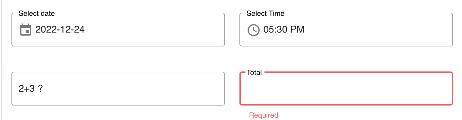
Ok this was really not obvious that this was a capture. Booking a table, and already asked how many guests so was not sure if total was guests or what, the 2+3 ? looks like another field or some sort, and you could select it even.
I mean if instead of "Total" it had "What is 2+3?" that may have made sense, but nothing suggested the box on the left related to the one on the right! #BadUI

Tekchip · @Tekchip
91 followers · 741 posts · Server mastodon.social
Maverick · @maverick604
33 followers · 1671 posts · Server mastodon.social
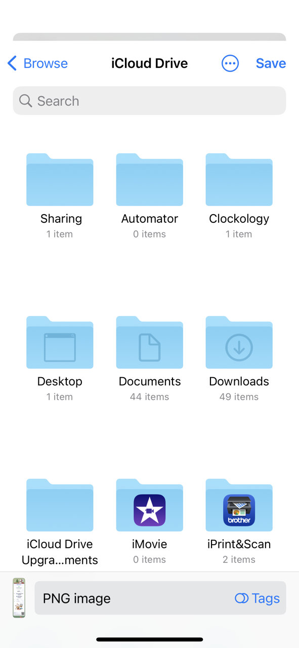
Ok #AppleSupport, how exactly is one supposed to cancel out of this??
This is exactly the sort of shit that used to only happen on Windows. 😡
#badUI #apple #ui #ux #iphonesupport #ios #sharesheet
#applesupport #badui #apple #ui #ux #iphonesupport #iOS #sharesheet

Aconite · @aconite27
0 followers · 15 posts · Server infosec.exchangeSo the agenda and schedule manager for #Blackhat Europe 2022 is absolutely weak. "Click <bookmark symbol> to register and add it to your schedule". The only things you can add are breakfast, coffee breaks, and so on.
How am I supposed to use that to build a schedule of briefings and arsenal talks to visit? #StupidTech #BadUI

Akkana Peck · @akkana
30 followers · 19 posts · Server fosstodon.orgTrying to sign up for next year's plan on my state's ACA healthcare exchange website. Couldn't find any buttons or links that looked like they'd let me do that. The Chat link doesn't do anything. Finally gave up and called the help line. Turns out the answer is: I have to first LOG OUT, go back to the website's top level, shop for a plan, add it to my cart, and then when I click checkout, it'll let me log in again. #BadUI