Albert Cardona · @albertcardona
1525 followers · 1050 posts · Server mathstodon.xyz@DD @hildabast @tombofnull I've noticed there aren't symmetrical letters, but the weights of a character's trace aren't differentiated quite as heavily as in fonts to facilitate reading for dyslexics.
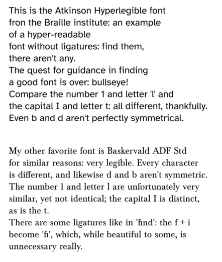
An example, comparing #AtkinsonHyperlegible with #BaskervaldADFStd fonts:
#baskervaldadfstd #atkinsonhyperlegible
Last updated 3 years ago
