
@990000@mstdn.social · @990000
269 followers · 2582 posts · Server mstdn.social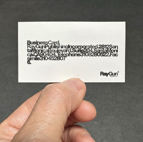
So good. 1997. #ChrisAshworth #GraphicDesign #Typography #RayGunMagazine #BusinessCard
#businesscard #raygunmagazine #typography #graphicdesign #chrisashworth
@990000 · @990000
235 followers · 1731 posts · Server mstdn.social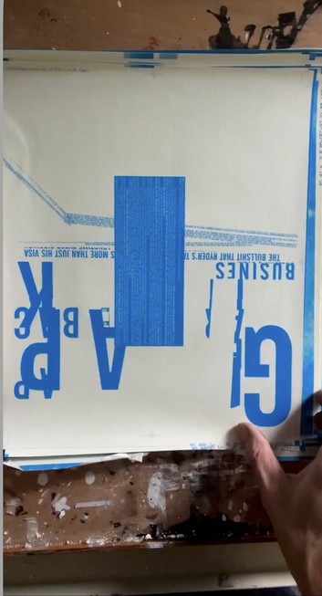
Fascinating to look back at this 90s design now and see the parallels with “Deconstructivist” architecture that was also a reaction to Modernism (which is actually kind of Baroque in spirit) and started just slightly earlier in the 80s I think.
https://www.instagram.com/reel/CqQTXjnPr64/
#GraphicDesign #Architecture #RayGun #RaygunMagazine #ChrisAshworth
#chrisashworth #raygunmagazine #raygun #architecture #graphicdesign
@990000 · @990000
227 followers · 1532 posts · Server mstdn.social
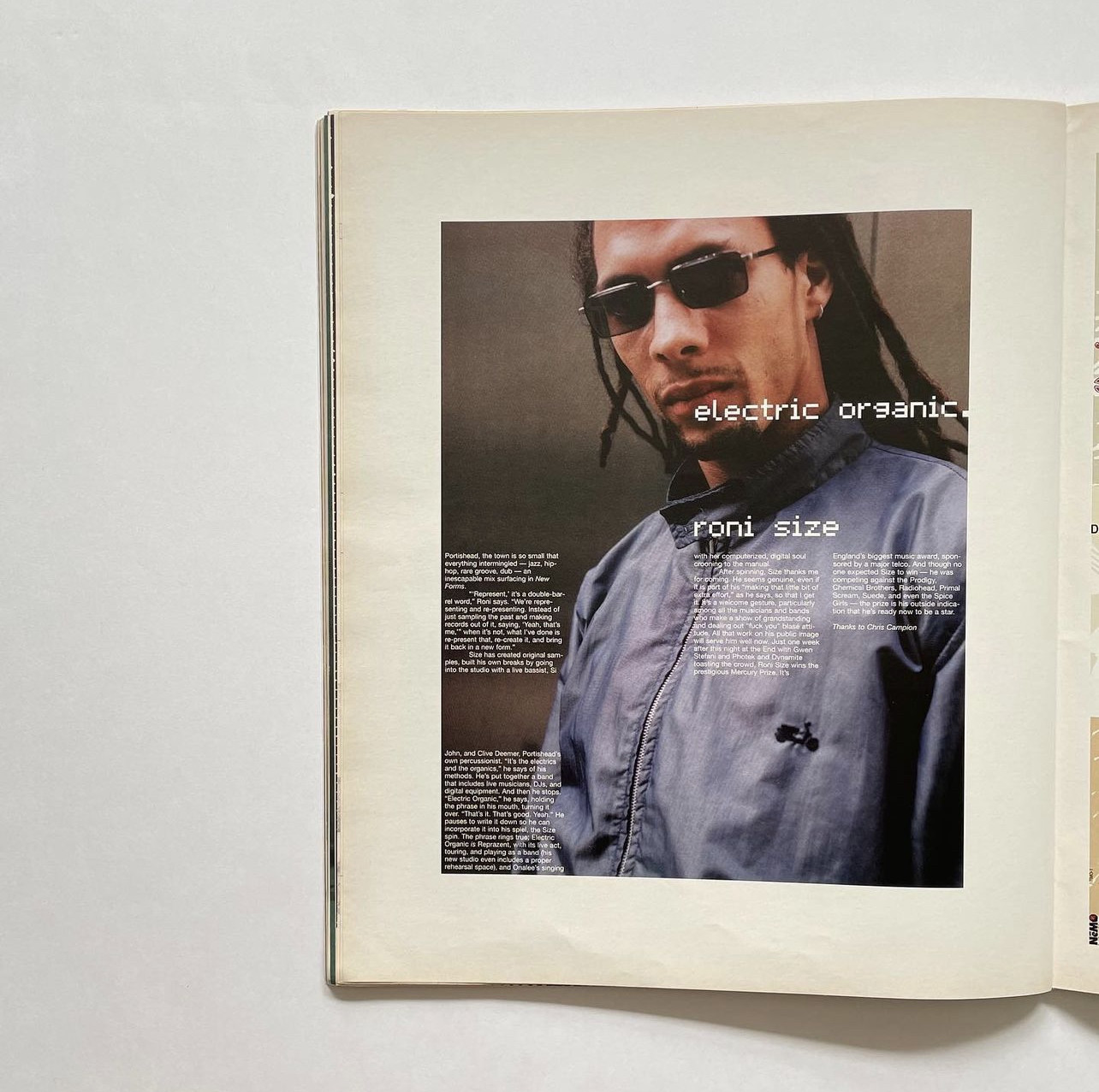
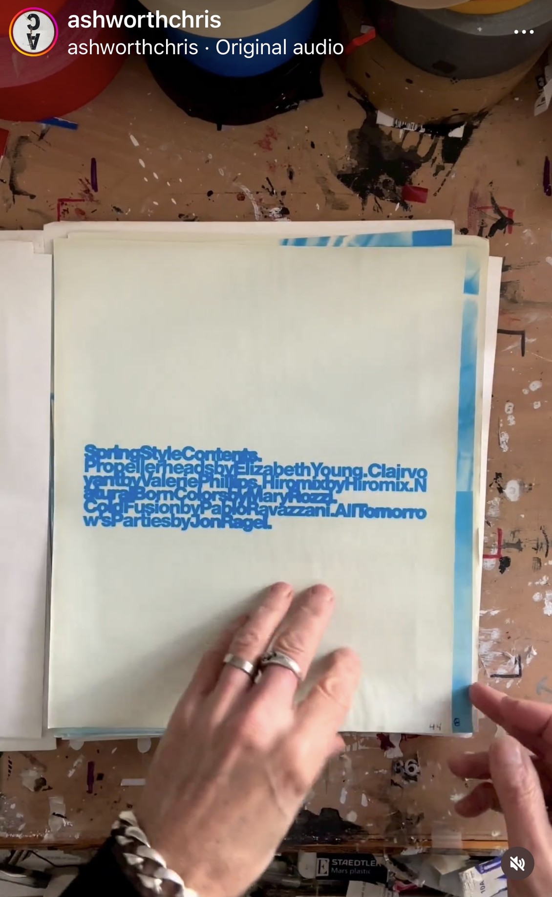
Very cool precursor to the digital design of the early 2000s, but done in the late 90s. Raygun Magazine issue 51, 1997.
#raygunmagazine #raygun #chrisashworth #graphicdesign
@990000 · @990000
221 followers · 1455 posts · Server mstdn.social
I always attributed this tightly tracked Helvetica black aesthetic and digital-esque
typesetting to early 2000s designers and didn't know about this direct connection with the [analog] late 90s
#raygunmagazine #raygun #chrisashworth #graphicdesign
@990000 · @990000
210 followers · 1320 posts · Server mstdn.social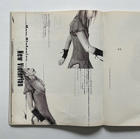
Chris Ashworth – Raygun magazine, 1997
“Set it, laser it, torture it (in the office fax machine), scan it and drop it in to the layout.”
#raygunmagazine #raygun #graphicdesign #chrisashworth