Georgios Karamanis · @georgios
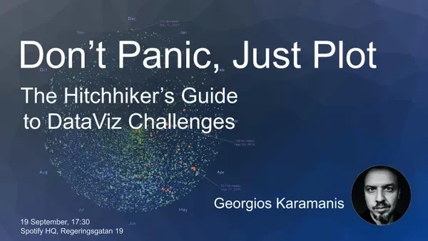
523 followers · 106 posts · Server vis.socialI'll be giving a talk at the Stockholm #Dataviz Meetup next week, come and join us!
👉https://meetup.com/data-visualization-stockholm/events/296031261/
PipeRider · @piperider
161 followers · 48 posts · Server fosstodon.orgPipeRider 0.33 is out now, with the main feature being:
- Support for dbt's new Semantic Layer that comes with dbt 1.6.
More info:
https://docs.piperider.io/get-started/run/metrics
PipeRider Cloud now also has powered-up pull request integration with Impact Report history.
View the Impact Reports for all your pull requests in one easy dropdown.
A welcome improvement for those managing pull request review for their team.
#PipeRider #dbt #AnalyticsEngineering #DataEngineering #DataViz
#piperider #dbt #analyticsengineering #dataengineering #dataviz
terence · @terence
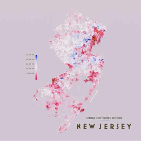
1858 followers · 355 posts · Server fosstodon.orgA map showing median household income of New Jersey, but this time by population (the previous one was census tract).
Higher spikes indicate greater population, colours indicate median income.
AI6YR · @ai6yr
4815 followers · 33316 posts · Server m.ai6yr.orgVia @pierre_markuse: Look at this super-interesting and well-written fifth part of the Gentle Introduction to #GDAL series by @rsimmon, this time dealing with shaded relief. #remotesensing #gis #dataviz #cartography #remotesensing https://medium.com/@robsimmon/a-gentle-introduction-to-gdal-part-5-shaded-relief-ec29601db654
#gdal #remotesensing #gis #dataviz #cartography
Nicola Rennie · @nrennie
1835 followers · 727 posts · Server fosstodon.orgCatching up on last week's #TidyTuesday, and keeping it simple with some line charts! This plot uses two of my favourite #ggplot2 extension packages:
🗺️ {geofacet} for visualising data across different geographic regions
📈 {gghighlight} for highlighting a subset of values in a chart, here showing each state in relation to others
Code: https://github.com/nrennie/tidytuesday/tree/main/2023/2023-09-05
#tidytuesday #ggplot2 #rstats #dataviz #r4ds
Voilà: Francis Gagnon · @chezvoila
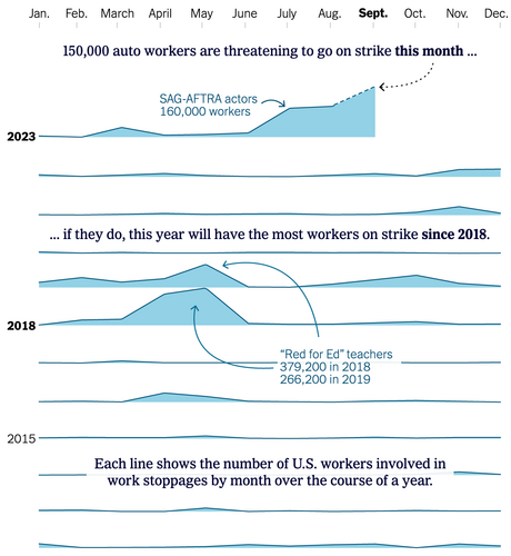
480 followers · 149 posts · Server vis.social@pbump from the Washington Post goes there and redesigns a chart from the New York Times. Here’s the before and after.
Do you agree it’s better?
Kristin (vis.social Admin) · @kristinHenry
2652 followers · 10147 posts · Server vis.socialJust finished reading this wonderful article by Federica Fragapane.
I first discovered her work at a Data Viz conference in Paris, and have been inspired by it ever since.
https://medium.com/@federicafragapane/alive-political-visual-words-65a5e00396e3
Much thanks to @Herover, for posting a link to it!
Leonora · @Herover
189 followers · 645 posts · Server helvede.netThis is a good read https://medium.com/@federicafragapane/alive-political-visual-words-65a5e00396e3 #dataViz #dataArt
Datascience · @datascience
544 followers · 317 posts · Server genomic.socialUsing fonts in R graphics can be tricky at times. {showtext} aims to make it easier: https://cran.rstudio.com/web/packages/showtext/vignettes/introduction.html #rstats #dataviz #ggplot
Krisztina Szűcs · @krisztina
281 followers · 9 posts · Server vis.socialReady for the US Open final?
#d3js #dataviz #tennis #usopen
Adam Fortuna · @adam
222 followers · 601 posts · Server ruby.socialThis D3.js data visualization I’m working on started as a page on my (Next.js) blog, but I think it’ll be better long-term to have it in its own repo.
After some planning for what I’ll need, I think The Pudding’s Svelte Starter Repo is the way to go. Coming from a group whose primary focus is D3.js data Viz, this looks far better than anything I could come up with.
Anyone have any recommended resources for learning Svelte?
#d3 #svelte #sveltekit #dataviz #d3js
Clyde Davies · @deadlyvices
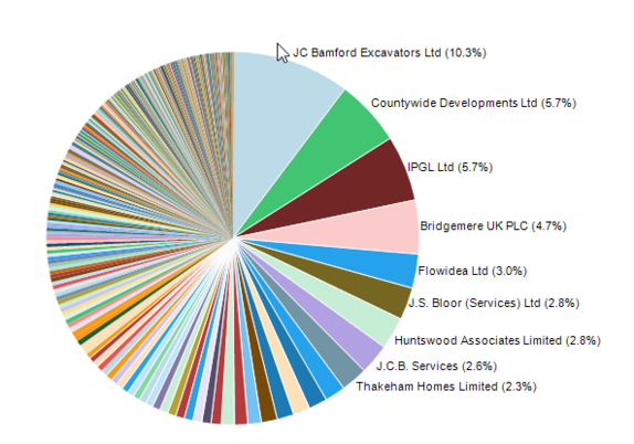
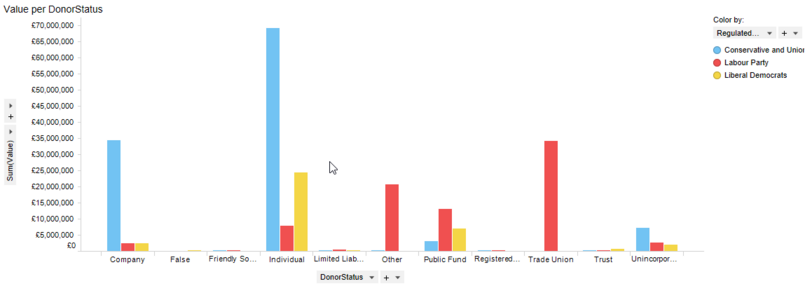
359 followers · 749 posts · Server toot.walesWhat is especially interesting, though, is that most of those corporate donations come from private (as opposed to public) limited companies. The shareholders can't vote these donations down.
#dataviz #ukpolitics #money
Clyde Davies · @deadlyvices
359 followers · 748 posts · Server toot.walesAs expected, the Conservatives get the lion's share of company and individual donations. No surprises there.
#dataviz #ukpolitics #money
Georgios Karamanis · @georgios
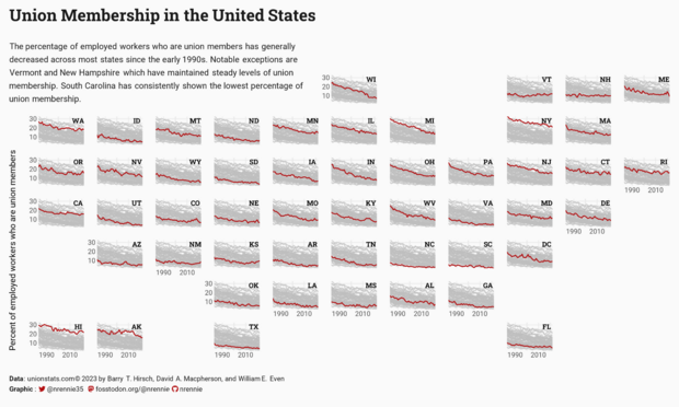
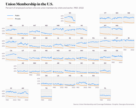
523 followers · 106 posts · Server vis.socialUnion Membership in the U.S. for this week's #TidyTuesday
Code: https://github.com/gkaramanis/tidytuesday/tree/master/2023/2023-week_36
Datascience · @datascience
540 followers · 316 posts · Server genomic.socialNeed some data to test a plot idea or algorithm? On https://drawdata.xyz/ you can draw the data you want... #rstats #synthetic #dataviz
Clyde Davies · @deadlyvices
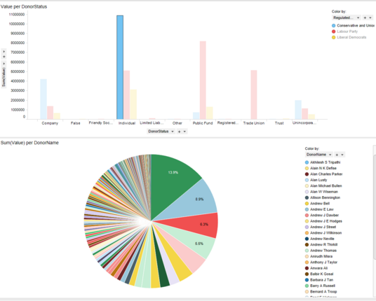
358 followers · 747 posts · Server toot.walesFollowing up on my investigations into visualizing political donations, I discovered this downloadable database:
https://www.ukpol.co.uk/wp-content/uploads/2023/04/results-2.csv
As it gives the donor name, but only the name of the recipient organization, it complements the Register of Member's Interests.
It is fascinating to see how much money people feel they can give to parties that represent them
#dataviz #ukpolitics #money #darkmoney
#dataviz #ukpolitics #money #darkmoney
Florin · @florin
304 followers · 884 posts · Server vis.socialimpressive work by morgenpost again: 3D visualisation of climate modelling. https://interaktiv.morgenpost.de/klimawandel-hitze-meeresspiegel-wassermangel-stuerme-unbewohnbar/en.html #dataviz #climate
Di · @didoesdigital
197 followers · 29 posts · Server bne.socialMy snake sightings data viz made the Information is Beautiful Awards 2023 Longlist alongside some spectacular entries this year 😊
#dataviz #iibawards #informationisbeautiful
Zack Labe · @ZLabe
8275 followers · 1306 posts · Server fediscience.orgMy Arctic temperature plots are updated for August 2023: https://zacklabe.com/arctic-temperatures/
and also for its average sea-ice thickness:/volume: https://zacklabe.com/arctic-sea-ice-volumethickness/ #DataViz #SciComm
Cara Thompson · @cararthompson
148 followers · 47 posts · Server fosstodon.orgReally enjoyed delivering today's training session, in preparation for which I came across the quote I'd been looking for! 👇
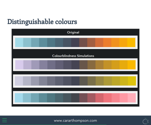
For a while, I've been conscious that creating #accessibility-conscious #dataviz colour palettes is really tricky. Here's one I've been working on...
