
Xan Gregg · @xangregg
189 followers · 73 posts · Server vis.social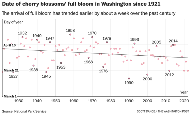
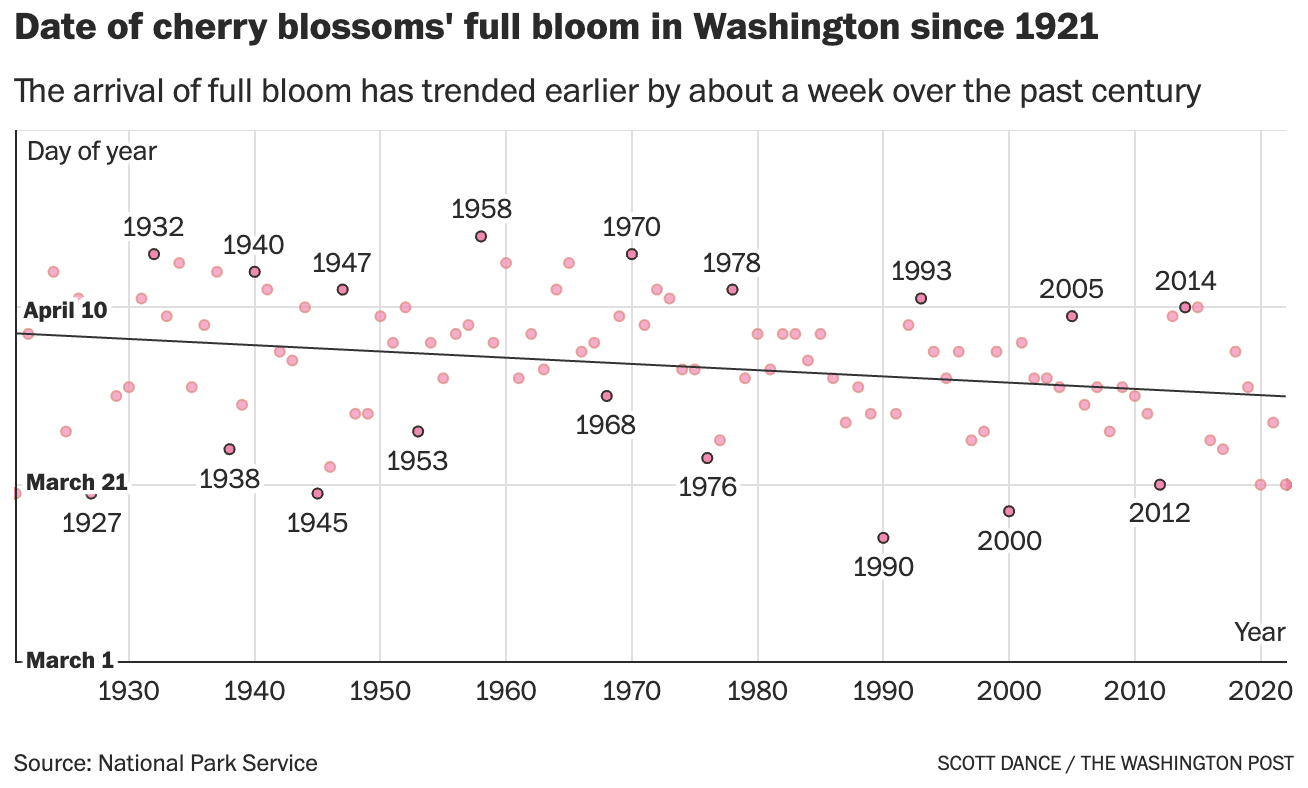
Seeing this #wapost chart of DC cherry blossom bloom dates and a line fit, I had to try a smoother #datviz. Slightly different story. With no shift in first 50 years, it's more like a week lost in 50 years instead of in 100 years as they reported.
I was also going to try adjusting the dates for leap years, but they had already done that and just not labeled it. I "fixed" that by adding a true date of year gridline.

Andy @Revkin · @revkin
1941 followers · 985 posts · Server mastodon.green
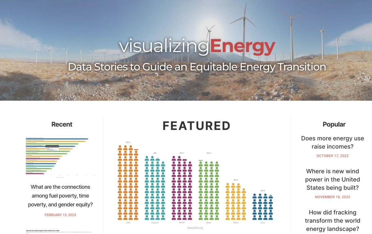
Excited to meet folks from @VisualizeEnergy and @myheatinc on our @columbiaclimate #sustainwhat show this FRIDAY, 2/17, 1 pm ET! Paste this link in calendars right now and join us! (No signup) https://www.earth.columbia.edu/videos/view/visualizing-energy-for-climate-impact #datviz
---
RT @revkin
US #energypoverty programs are falling short https://visualizingenergy.org/is-the-united-states-government-doing-enough-to-reduce-energy-poverty/ L…
https://twitter.com/Revkin/status/1623019098962640896
#sustainwhat #datviz #energypoverty

Duc-Quang Nguyen · @dqn
118 followers · 21 posts · Server vis.socialRT @sdbernard@twitter.com
NEW: Incredible visual story on how Europe shares its electricity between countries and will it be able to provide heat and power to its citizens this winter.
Read @lesliehook@twitter.com and @NathalieThomas3@twitter.com fascinating piece
https://ig.ft.com/electricity-sharing/
#datviz #gistribe
🐦🔗: https://twitter.com/sdbernard/status/1597505919633719298

Jesus M. Castagnetto🇵🇪💉x4 · @jmcastagnetto
42 followers · 765 posts · Server mastodon.social
RT @danoehm@twitter.com
I hadn't found a super easy way to crop an image to a circle in #Rstats so I made a little package. It simply crops a vector of images to circle with a transparent background in a single mutate step.
I called it {cropcircles}. Sorry. 🌽🟢