
22 · @22
601 followers · 6764 posts · Server octodon.socialOne of my favorite views of the stock market is the sector/sub-sector daily/weekly/etc. returns visualization at https://finviz.com/map.ashx. Many bad "just-so" stories about a stock's behavior can be dispelled by looking at what that stock's peers did (see https://octodon.social/@22/109327333967001573 about that LLY insulin fake tweet nonsense).
But #FinViz also has the only public open-source database I've found that breaks down 5000+ US publicly-traded companies into sectors and sub-sectors, which I didn't discover until I created a tiny #gitscraping project for it (thanks to @simon for being a passionate promoter of this trick).
https://github.com/fasiha/finviz-git-scraper#all-us-sector-and-subsector-breakdowns has the collapsible list of sectors, sub-sectors, and stocks . This is the first time I've seen all these in one view and it's cool because I've always been interested in the variety of things people make and jobs people do. It's cool to see the consumer sector broken down into alcohol, non-alcohol beverages, candy-maker ("confectioners" so fancy!), discount stores, education, farm products… Reminds me a lot of that Grain Into Gold booklet for role-playing gamers except updated to modern life.

Mike · @mike_p
37 followers · 65 posts · Server mastodon.world
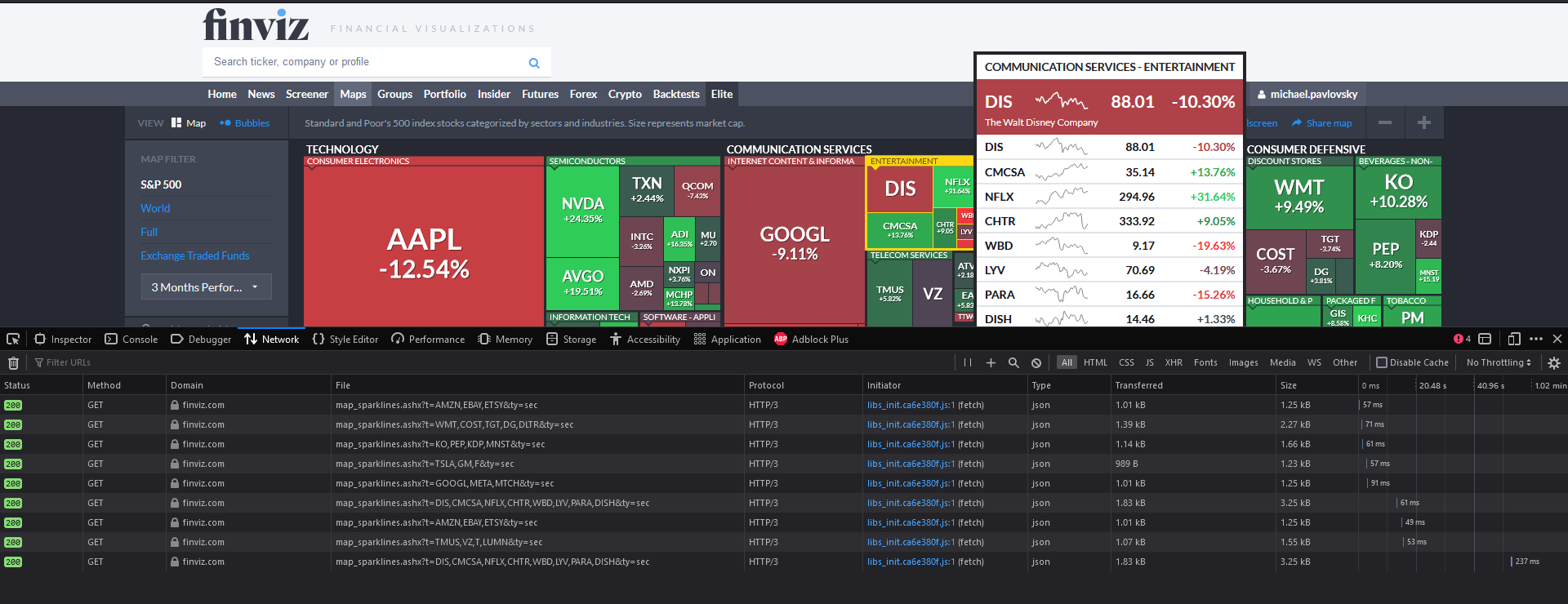
Kudos to the FinViz team. The site is fast and has no distractions. The stock data arrives almost instantaneously. It might not be the fanciest tool, but
it handles my queries well. I have always wanted to implement something similar. As you can see, they use HTTP3; on average, it takes 50-60 ms to load data.
Disclaimer: I am not affiliated, associated, authorized, endorsed by, or in any way officially connected with the FinViz brand.
#finviz #screener