
Juan B. Rodriguez · @jbrodriguez
7 followers · 31 posts · Server mas.to
Tamas · @iamdtms
80 followers · 1698 posts · Server mas.to
How to create a #responsive grid system with #CSS #Grid | Go Make Things
https://gomakethings.com/how-to-create-a-responsive-grid-system-with-css-grid/
> I recently updated the grid system on my site from #Flexbox to CSS Grid. Today, I wanted to share how to use it, how it works under-the-hood, and why I made the switch. Let’s dig in! A responsive grid system My websites tend to be pretty boring. Years ago, I decided to prioritize simple readability over flashy features, and that seems to resonate with a lot of people.
#flexbox #grid #css #responsive

ppk 🇪🇺 · @ppk
2267 followers · 1117 posts · Server front-end.socialAnd @rachelandrew was right: being able to refer to #grid makes some aspects of #flexbox much easier to explain.
ppk 🇪🇺 · @ppk
2266 followers · 1112 posts · Server front-end.social
Felipe Bojorquez🐁:verified_bi: · @febog
1 followers · 31 posts · Server hachyderm.io
Whenever I need to work with flexbox, I use this amazing resource 😊 https://css-tricks.com/snippets/css/a-guide-to-flexbox/ #css #flexbox

Axolotat :verified_gay: · @axolotat
11 followers · 59 posts · Server hachyderm.ioIf you're someone who frequently forgets about CSS flex properties like me, you might find this VS Code extension helpful.
Name: CSS Flexbox Cheatsheet
Description: Open a flexbox cheatsheet directly in VS Code.
Version: 3.3.1
Publisher: Dzhavat Ushev
VS Marketplace Link: https://marketplace.visualstudio.com/items?itemName=dzhavat.css-flexbox-cheatsheet
#css #flex #devFront #FrontEnd #devFrontEnd #developper #tech #flexbox #vscode
#css #flex #devfront #frontend #devfrontend #developper #tech #flexbox #vscode

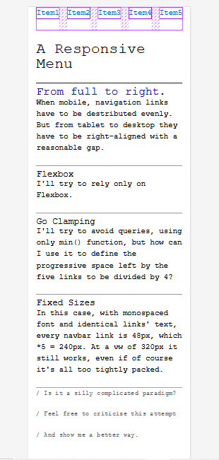
Carlo Grosoli · @carlogrosoli
12 followers · 73 posts · Server typo.social
I'm quite a FrontEndDev rookie.
So if anyone wants to give constructive criticism, I'll be happy to enrich my knowledge.
https://codepen.io/carlogr/pen/YzJgbOa?editors=1100
I tried to make a navbar menu wit flexbox which takes the full 90vw on mobile, but keeps itself right-aligned with a 2.5em gap from tablet to desktop, but...
avoiding queries, hamburger/kebab hidden menus.
So, when mobile, it should behave as if justify-content: space-between; was declared under 600/650px of vw.
Carlo Grosoli · @carlogrosoli
12 followers · 73 posts · Server typo.socialI'm quite a FrontEndDev rookie.
So if anyone wants to give constructive criticism, I'll be happy to enrich my knowledge.
https://codepen.io/carlogr/pen/YzJgbOa?editors=1100
I tried to make a navbar menu wit flexbox which takes the full 90vw on mobile, but keeps itself right-aligned with a 2.5em gap from tablet to desktop, but...
avoiding queries, hamburger/kebab hidden menus.
So, when mobile, it should behave as if justify-content: space-between; was declared under 600/650px of vw.
#flexbox #navbar #menu #css
ppk 🇪🇺 · @ppk
2176 followers · 791 posts · Server front-end.social... and with the writing of the final example the #flexbox chapter is really done - in draft.
One more edit and I'm happy for now. Then His Tabness can go over it, and my publisher's editor as well, and then we'll see.
ppk 🇪🇺 · @ppk
2173 followers · 781 posts · Server front-end.social
David Bisset · @davidbisset
744 followers · 1527 posts · Server phpc.socialResponsive Yearly Calendar with #Flexbox #CSS
https://shkspr.mobi/blog/2023/04/responsive-yearly-calendar-with-flexbox/
via @Edent
ppk 🇪🇺 · @ppk
2149 followers · 726 posts · Server front-end.social
Fluttershy :eevee: :v_trans: · @IDeletedSystem64
134 followers · 7349 posts · Server glaceon.social
today..
Marie learns #flexbox so she can make her website a lot better with it's upcoming rewrite
(originally I wanted to change it's layout, but it's becoming a completely new site xD)
Fluttershy :eevee: :v_trans: · @IDeletedSystem64
134 followers · 7349 posts · Server glaceon.social
today..
Marie learns #flexbox so she can make her website a lot better with it's upcoming rewrite
(originally I wanted to change it's layout, but it's becoming a completely new site xD)
ppk 🇪🇺 · @ppk
2148 followers · 714 posts · Server front-end.socialI'm in the train to Düsseldorf. Old-timers who followed me ten years ago on the bird site know what that means: I'll be bored and tooting.
Have a question? Ask away. Especially about #flexbox, right now I have the entire simplified sizing algorithm in my head.
ppk 🇪🇺 · @ppk
2139 followers · 706 posts · Server front-end.social
ppk 🇪🇺 · @ppk
2137 followers · 703 posts · Server front-end.social
ppk 🇪🇺 · @ppk
2131 followers · 696 posts · Server front-end.socialProven: if a #css #flexbox has a flex-basis and a smaller min-width, the flex-basis behaves as a width: it does not allow flex items to grow to their min-content width, something that is allowed without the min-width
But it's *not* the case that in the presence of the min- or max-width, flex-basis is always interpreted as width - the combination mentioned above is an exception to the rule that min- and max-width work as expected on flex items while leaving flex-basis and width behaviour intact.

nosh :fosstodon: · @nosherwan
418 followers · 3019 posts · Server fosstodon.org
Andreas · @larnius
8 followers · 101 posts · Server mastodontech.deDay 82 of #100daysofcode was really good and immensely productive for me. Having a day off gave me the chance to take a lot of time for coding today. I started with #GitHub and #Git, then moved on to #Flexbox and positioning. I had an absolute blast playing around with all the new knowledge and can't wait to go deeper tomorrow. So far, the #Academind teaching style is simply great, and I am more than willing to continue with the course.
#100daysofcode #github #git #flexbox #academind