
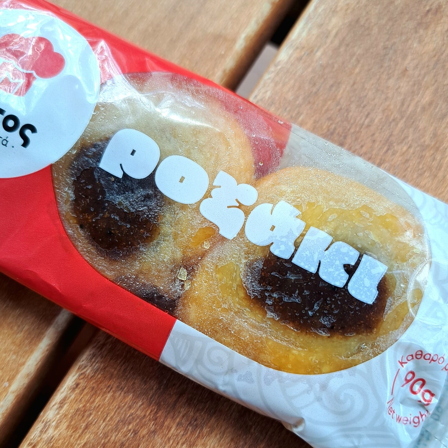
Fonts In Use · @FontsInUse
2194 followers · 242 posts · Server typo.social
Newly added:
Stingray, a twisted 3D extravaganza drawn by John S. Allen in the late 1960s for Photo-Lettering, Inc. See it in use for a book jacket and two record covers:
https://fontsinuse.com/typefaces/175125/allen-stingray
#fontsinuse #typefaces #fonts #typography
Fonts In Use · @FontsInUse
2193 followers · 241 posts · Server typo.social
Staff pick:
Vinicius Theodoro of São Paulo-based Studio Tempo used the bubbly PicNic (Mariel·le Nils, 2022) for AMA, a Brazilian soap brand 🧼
https://fontsinuse.com/uses/54502/ama-soap-bars
#fontsinuse #typefaces #fonts #typography #soap
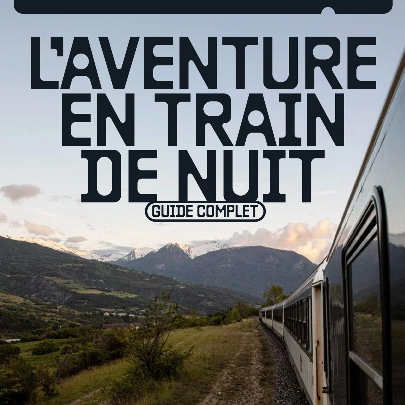
Fonts In Use · @FontsInUse
2193 followers · 241 posts · Server typo.social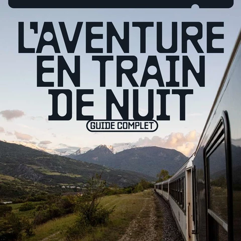
Staff pick:
Baste (Lift Type) in use for “L’aventure en train de nuit” (“Night Train Adventure”). The e-book was designed and published by Les Others, an inspirational medium for lovers of the outdoors, travel and photography. In supporting roles, LL Catalogue (Lineto) and ABC Diatype (Dinamo):
https://fontsinuse.com/uses/54808/l-aventure-en-train-de-nuit
#fontsinuse #typefaces #fonts #typography #trains #travel

Kostas Bartsokas · @kosbarts
39 followers · 1 posts · Server typo.social
I came across my Oi today at the kiosk. It's always nice to see my fonts in the wild. #fontsinuse #fontsinthewild
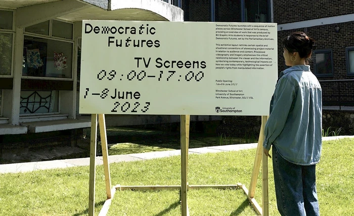
Fonts In Use · @FontsInUse
2165 followers · 238 posts · Server typo.social
Staff pick:
Democratic Futures is a collaborative inquiry between students at Winchester School of Art, @unisouthampton, and the Parliamentary Archives.
Studio 3015 mixed Neureal (Laura Csocsán, ÉCAL) and FT88 Italic (Oriane Charvieux, @velvetyne): https://fontsinuse.com/uses/55081/democratic-futures
#fontsinuse #typefaces #fonts #typography
Fonts In Use · @FontsInUse
2165 followers · 238 posts · Server typo.social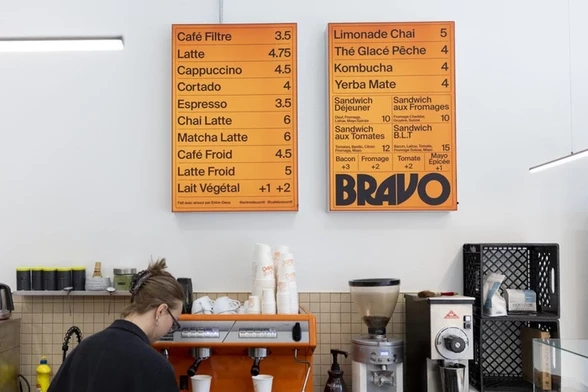
Staff pick:
Café Bravo is a café and wine bar in #Montréal. Demande Spéciale designed the visual identity, using a customized version of Herbus Bold, paired with Suisse Int’l.
https://fontsinuse.com/uses/54797/cafe-bravo-montreal
#montreal #fontsinuse #typefaces #fonts #typography
Fonts In Use · @FontsInUse
2137 followers · 231 posts · Server typo.social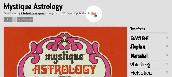
Follow the link with the artwork date on any use page to see more #typography from that year.
Today we published a number of items designed in #1969 – including a triple about Mattel’s fortune-telling line, “Mystique”, contributed by @goodspeed:
https://fontsinuse.com/search/advanced?artwork-date0=is-1969
#typography #fontsinuse #fonts #typefaces
Fonts In Use · @FontsInUse
2052 followers · 214 posts · Server typo.social
Last week, Albert Boton, one of the preeminent French type designers of the past sixty years, died at the age of 91. We pay tribute with a series of applications his #typefaces ✒︎ https://fontsinuse.com/type_designers/13/albert-boton
The newly added in-use examples span 57 years and feature 13 different typefaces, providing a glimpse into #AlbertBoton’s rich œuvre. Six of the #FontsInUse weren’t represented in our collection yet.
#typefaces #albertboton #fontsinuse
Fonts In Use · @FontsInUse
2016 followers · 210 posts · Server typo.social
Staff pick:
LB Plantes was set up to participate in responsible and sustainable #viticulture and #agriculture. For the visual identity, Toulouse-based studio Huz & Bosshard used different weights and widths of the Klub typeface family designed by @panefarre:
https://fontsinuse.com/uses/54192/lb-plantes
#viticulture #agriculture #fontsinuse #typefaces #fonts #typography
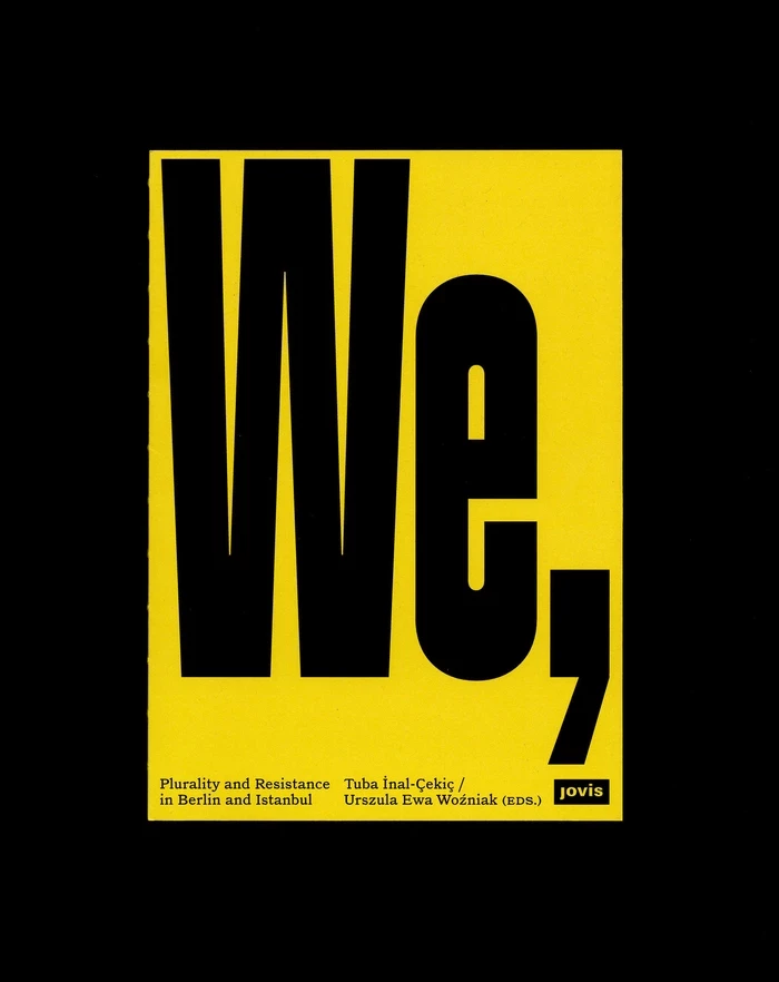
Fonts In Use · @FontsInUse
2007 followers · 209 posts · Server typo.social
Staff pick:
“We, the City. Plurality and Resistance in Berlin and Istanbul” is a book edited by Tuba İnal-Çekiç & Urszula Ewa Woźniak and published by Jovis. For the design, Sylvan Lanz made early use of his own AC Bandit, alongside Nazareno Crea’s LL Catalogue.
https://fontsinuse.com/uses/54393/we-the-city-by-tuba-inal-cekic-urszula-ewa-wo
#fontsinuse #typefaces #fonts #typography
Fonts In Use · @FontsInUse
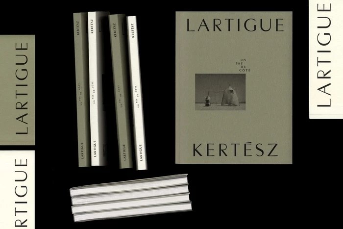
1995 followers · 207 posts · Server typo.social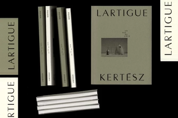
“Kertész – Lartigue. Un pas de côté” is the catalog for the eponymous exhibition at Espace Richaud, Versailles, in 2023. It presents works by two pioneers of modern #photography, #JacquesHenriLartigue and #AndréKertész.
Design by Clémence Michon using Persona (@abyme) and Louize Display (@205TF).
https://fontsinuse.com/uses/54383/kertesz-lartigue-un-pas-de-cote
#photography #jacqueshenrilartigue #andrekertesz #fontsinuse #typefaces #fonts #typography
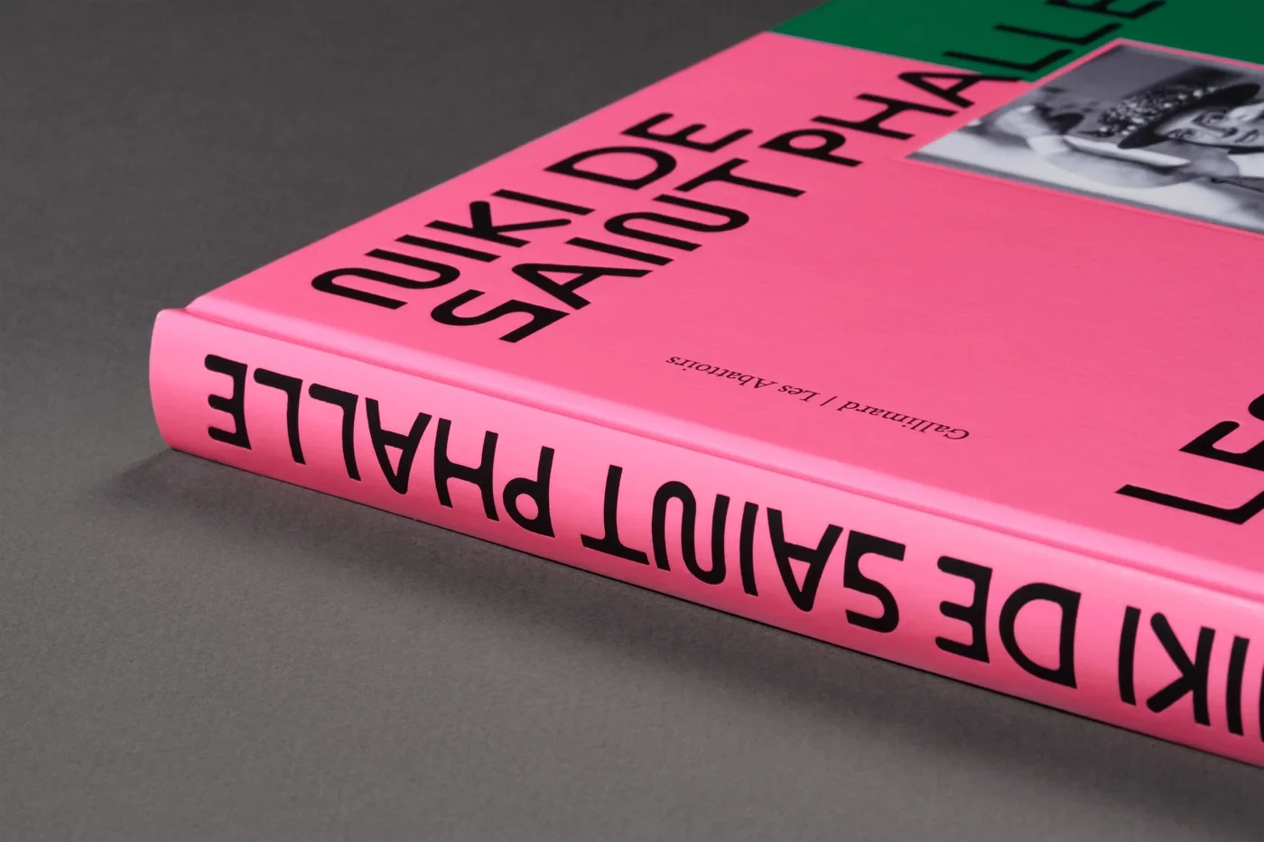
Fonts In Use · @FontsInUse
1926 followers · 201 posts · Server typo.social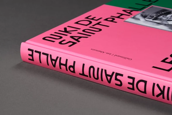
Staff pick:
“Niki de Saint Phalle. Les années 1980 et 1990. L’art en liberté” is an exhibition shown in Les Abattoirs in Toulouse, France.
Agnès Dahan Studio designed the catalog, using ABC Maxi Round for titles and ABC Marfa for text.
https://fontsinuse.com/uses/51045/niki-de-saint-phalle-les-annees-1980-et-1990-
#NikiDeSaintPhalle #FontsInUse #Typefaces #Fonts #Typography
#nikidesaintphalle #fontsinuse #typefaces #fonts #typography
Fonts In Use · @FontsInUse
1917 followers · 200 posts · Server typo.social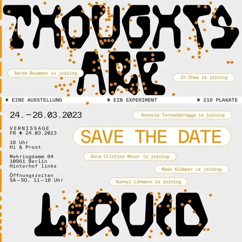
Staff pick:
“Thoughts are Liquid” is a one-year artistic experiment with 1,000 questions answered by six designers in 216 #posters. The project is a collaboration by Studio Terhedebrügge Terhedebrügge, Studio Sara Cristina Moser, studio mado klümper, Bureau Sarah Baumann, Sunnyi Löhmann, and In Chae.
#FontsInUse: Hofmann by Nguyen Gobber × TWK Everett Mono by Nolan Paparelli: https://fontsinuse.com/uses/54321/thoughts-are-liquid
#posters #fontsinuse #typefaces #fonts #typography
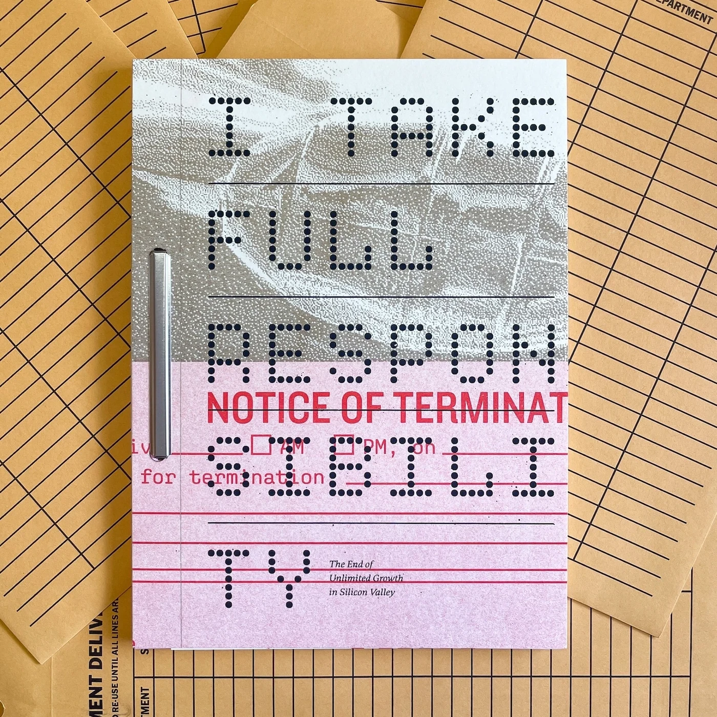
Fonts In Use · @FontsInUse
1917 followers · 200 posts · Server typo.social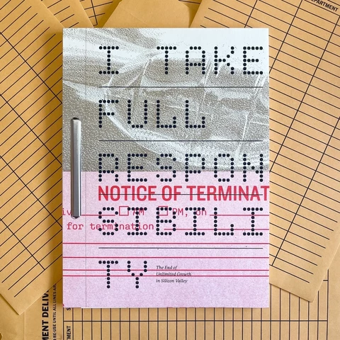
“I Take Full Responsibility” is a book about the end of unlimited growth in Silicon Valley. For the 2nd Riso-printed edition, author and designer @scottboms used a varied mix of #fonts.
The main typeface is Bennet Text (Richard Lipton). The cover combines Gridlite (@rosetta), Knockout (@jonathan), and Aglet Mono (@jesseragan). See all of these and the other six on #FontsInUse: https://fontsinuse.com/uses/53618/i-take-full-responsibility
#fonts #fontsinuse #typefaces #typography
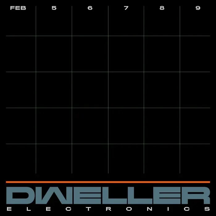
Fonts In Use · @FontsInUse
1905 followers · 197 posts · Server typo.social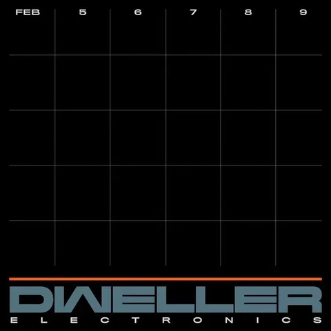
Staff pick:
Dweller is a festival celebrating Black electronic artists. The logo was designed by Hassan Rahim, making early use of Laurenz Brunner’s Rapid – featuring the Black Extended with an upside-down M for the W.
#fontsinuse #typefaces #fonts #typography
Fonts In Use · @FontsInUse
1905 followers · 197 posts · Server typo.social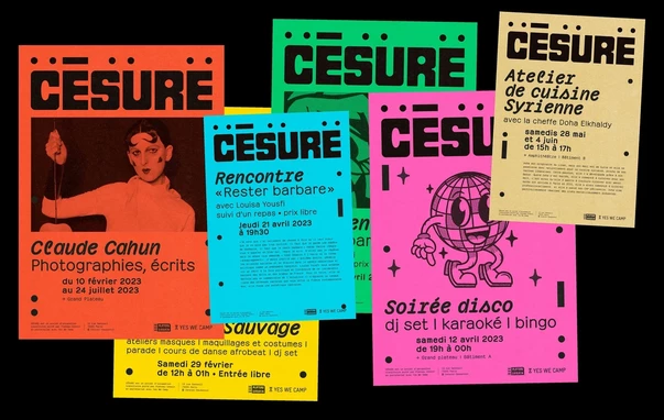
Staff pick:
Césure is a place in Paris that’s dedicated to the transmission of knowledge and skills. Jeanne Triboul designed the identity using Émilie Rigaud’s Pachinko. The logo is in Fat Albert by Ray Cruz.
#fontsinuse #typefaces #fonts #typography
Fonts In Use · @FontsInUse
1851 followers · 189 posts · Server typo.social
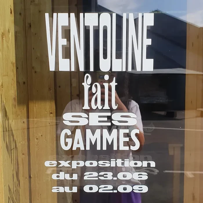
Félicité Landrivon used several of the #fonts that originated at X Cicéro for an exhibition currently shown La Fanzinothèque in Poitiers. These include Excessive (Clara Dousson), Nouvelle Grotesquerie (Guillaume Lelong), Jakob and Américaine (both by Alan Madić).
https://fontsinuse.com/uses/54668/ventoline-fait-ses-gammes-2020-exhibition
#fonts #fontsinuse #typefaces #typography

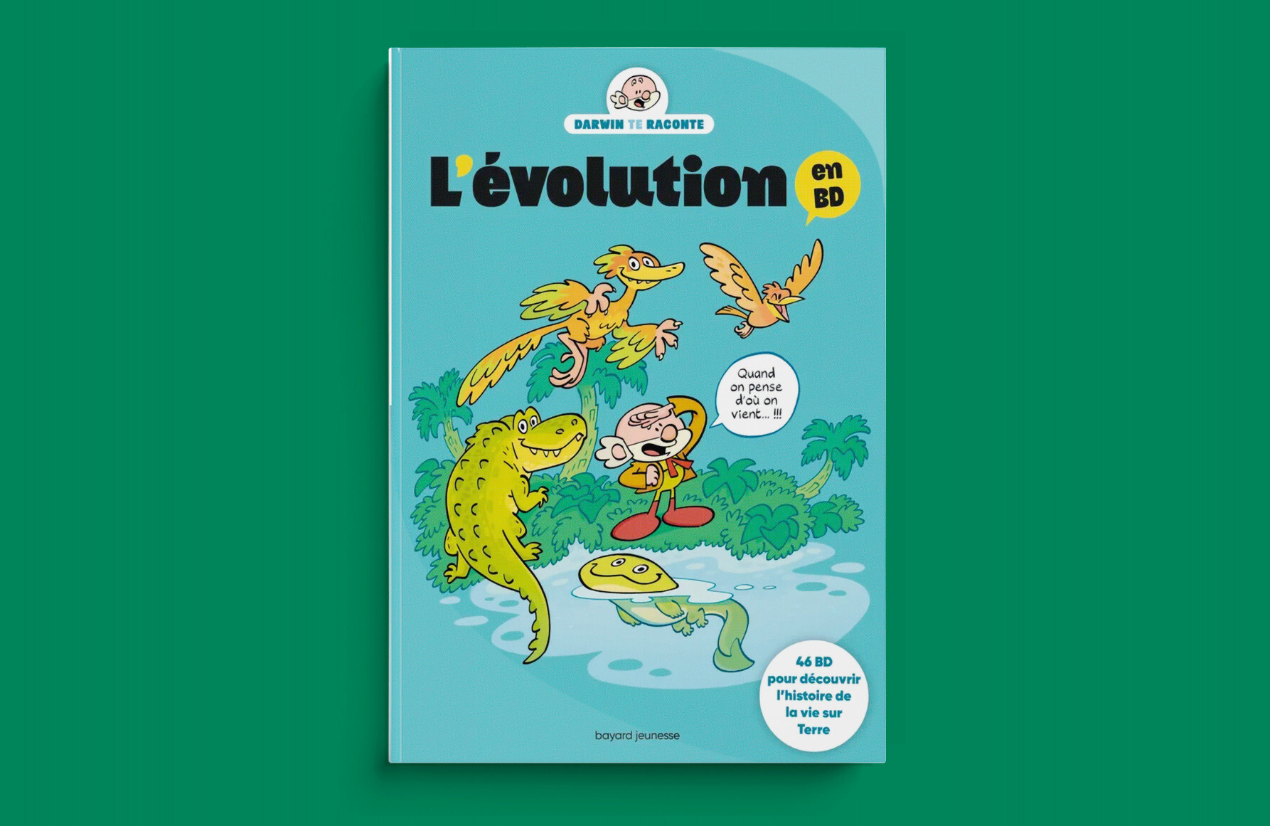
Art Grootfontein · @art_grootfontein
49 followers · 59 posts · Server typo.social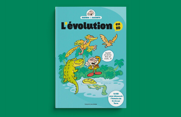
#fontsinuse!
Here is my Bangel Black font on a book cover for kids published by Bayard Editions
#graphicdesign #graphicdesigner #bookcover #typography #type #font #typedesign
#fontsinuse #graphicdesign #graphicdesigner #bookcover #typography #type #font #typedesign
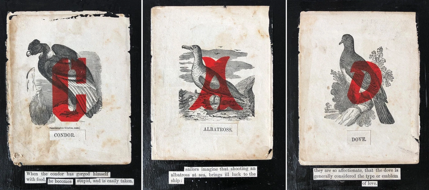
Fonts In Use · @FontsInUse
1811 followers · 180 posts · Server typo.social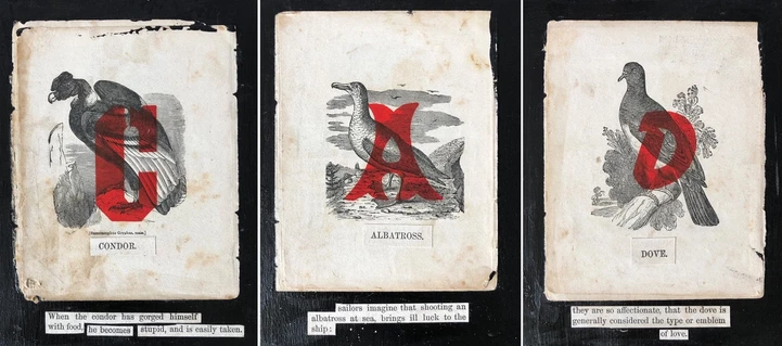
Staff pick:
For #Alphabet of #Birds, Kent Henderson transformed a battered copy of a 19th-century book into something new and spectacular. He overprinted each of the ornithological engravings with a single red letter, using fonts from the #WoodType collection at #DepressionPress Mfg. & Ink, Inc., a #letterpress studio in Chicago.
https://fontsinuse.com/uses/54349/alphabet-of-birds
#alphabet #birds #woodtype #depressionpress #letterpress #fontsinuse #typefaces #fonts #typography
Fonts In Use · @FontsInUse
1795 followers · 179 posts · Server typo.social
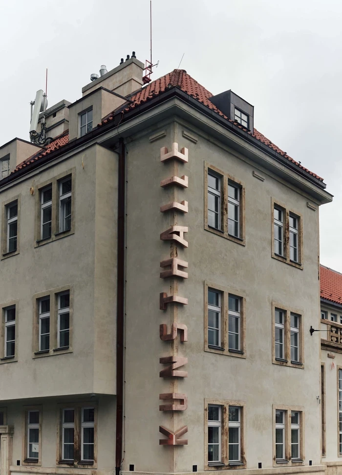
Staff pick:
Kunsthalle Praha is a new contemporary art #museum in the Czech capital.
For the visual identity, Studio Najbrt designed a custom #typeface based on a 1930s alphabet by #JanTschichold. It’s supported by Suisse Int’l by Swiss Typefaces
https://fontsinuse.com/uses/54063/kunsthalle-praha-visual-identity-and-signs
#museum #typeface #jantschichold #fontsinuse #typefaces #fonts #typography