Dr Helen Metcalfe · @hmetcalfe
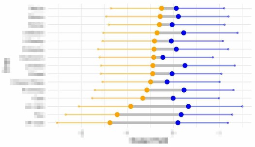
49 followers · 11 posts · Server mastodonapp.ukBeen playing around with dumbbell plots in #ggplot2 looking for ways to show predicted means from an #lmm with standard errors.
I've come up with this option overlaying the dumbbell showing the means over smaller dumbbells showing SEPs for each treatment but wondering if there is a way to jitter/adjust the alignment to see the overlapping parts a bit better
Ps I know the errors are huge, I have a LOT of very noisy data…that’s #ecology for you!
#ggplot2 #lmm #ggalt #dataviz #rstats #ecology
Last updated 3 years ago
