
Datascience · @datascience
544 followers · 317 posts · Server genomic.socialUsing fonts in R graphics can be tricky at times. {showtext} aims to make it easier: https://cran.rstudio.com/web/packages/showtext/vignettes/introduction.html #rstats #dataviz #ggplot

Frank Hänel · @frankhaenel
14 followers · 28 posts · Server fosstodon.org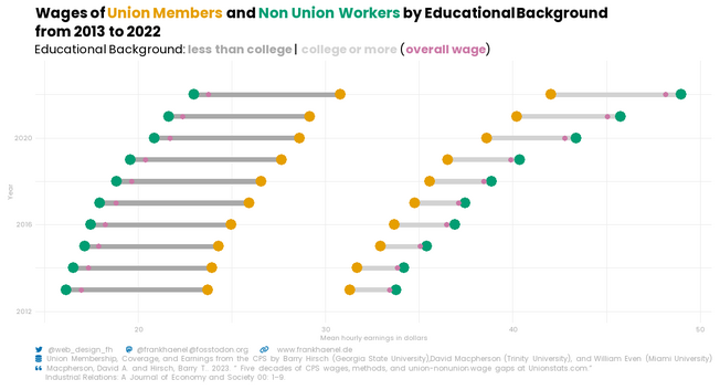
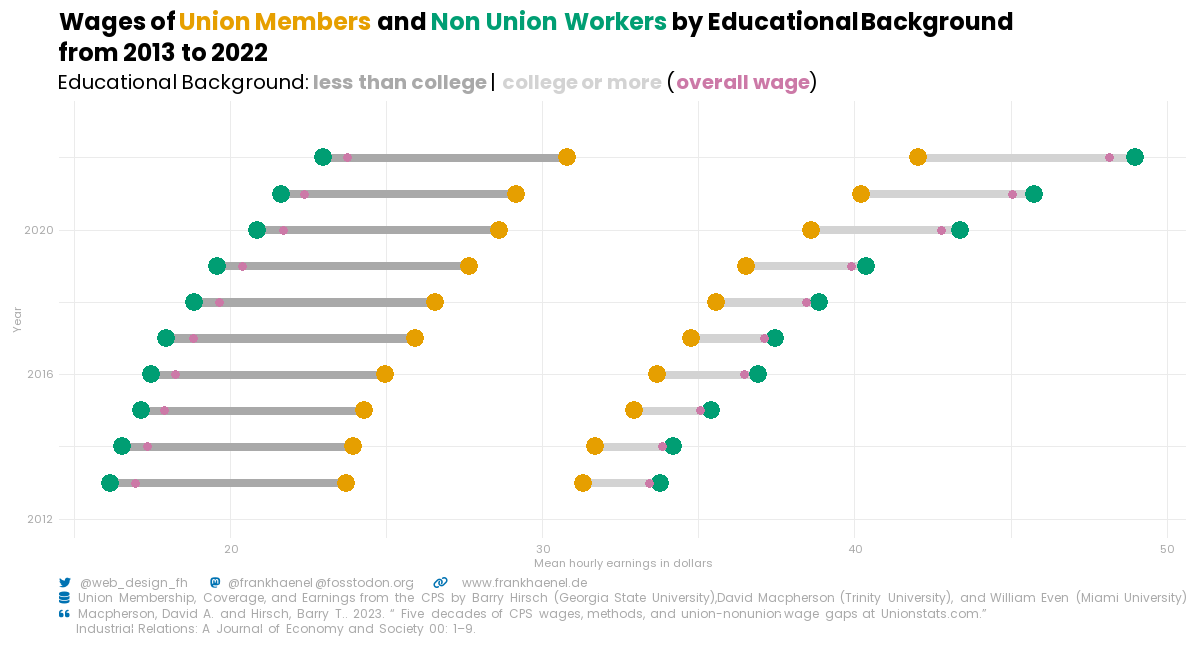
#tidytuesday Week 36: Just created a dumbbell chart 📊 comparing mean wages of union members and non-union workers by educational background from 2013 to 2022. Check it out! #r4ds #rstats #ggplot #DataViz #TidyTuesday 🔗code: https://bit.ly/3sOE4Pk
#tidytuesday #r4ds #rstats #ggplot #dataviz
Datascience · @datascience
535 followers · 313 posts · Server genomic.social
Frank Hänel · @frankhaenel
14 followers · 28 posts · Server fosstodon.org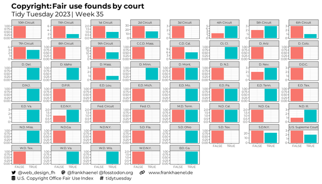
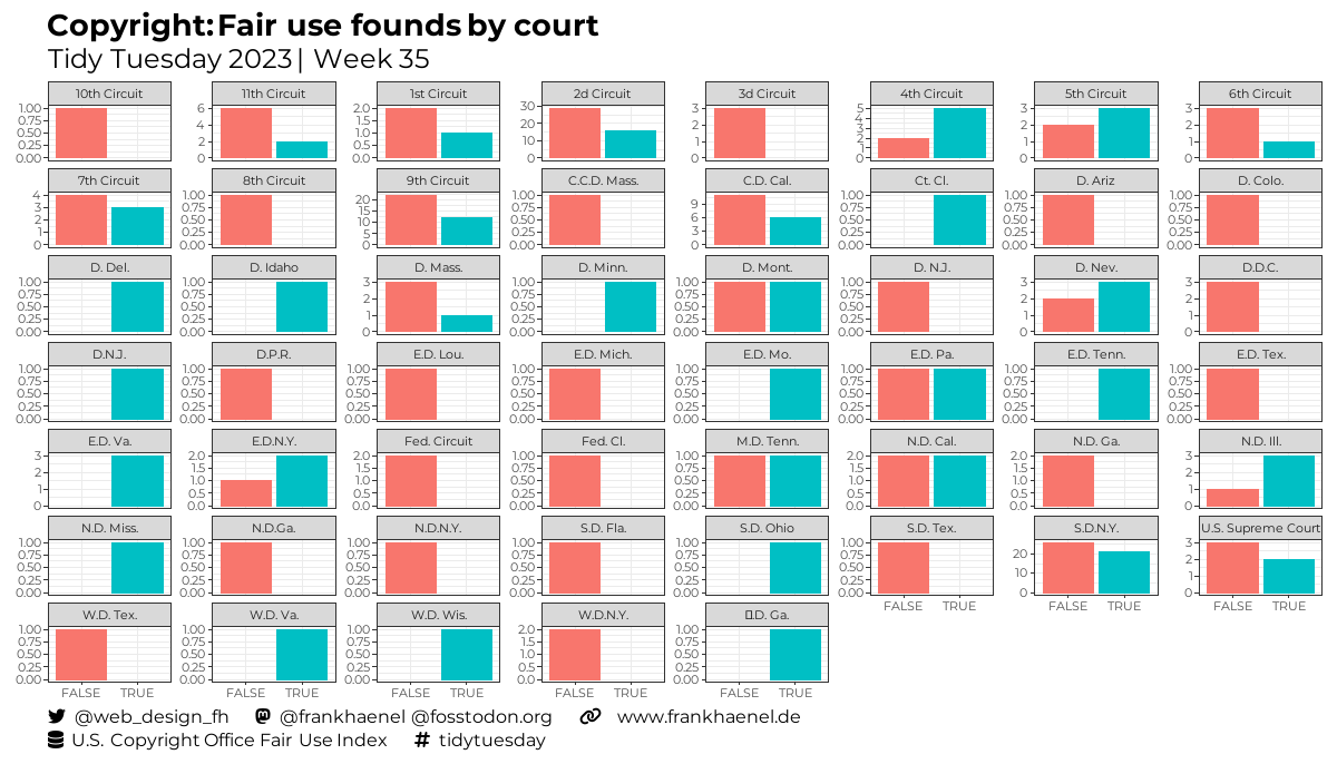
📊 Explore fair use findings by court in our latest data visualization! 🏛️📜 Discover how different courts handle copyright issues. #r4ds #rstats #ggplot #DataViz #TidyTuesday #Copyright #FairUse 🔗 https://bit.ly/3L4Qf0H
#r4ds #rstats #ggplot #dataviz #tidytuesday #copyright #fairuse
Frank Hänel · @frankhaenel
14 followers · 28 posts · Server fosstodon.org
Datascience · @datascience
531 followers · 308 posts · Server genomic.socialI did not know about ggplot_build() before. It can come in handy in situations where you want to access computed metrics of a #ggplot. https://ggplot2.tidyverse.org/reference/ggplot_build.html. Thanks @thedatainklab for sharing. #rstats #ci

Schmuel · @snij22
4 followers · 57 posts · Server mstdn.social
Jesse Onland · @jdonland
53 followers · 122 posts · Server vis.socialJust discovered the life-changing magic of `scale_fill_identity()`. #ggplot
Datascience :verified: · @datascience
501 followers · 287 posts · Server genomic.socialr-charts.com provides example code for a variety of chart types, both in base R and ggplot: https://r-charts.com/ #rstats #ggplot #design

Capybara :neovim: :arch: · @sotneStatue
400 followers · 3089 posts · Server fosstodon.org
Ploomber · @ploomber
32 followers · 34 posts · Server fosstodon.org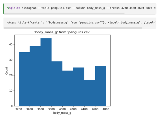
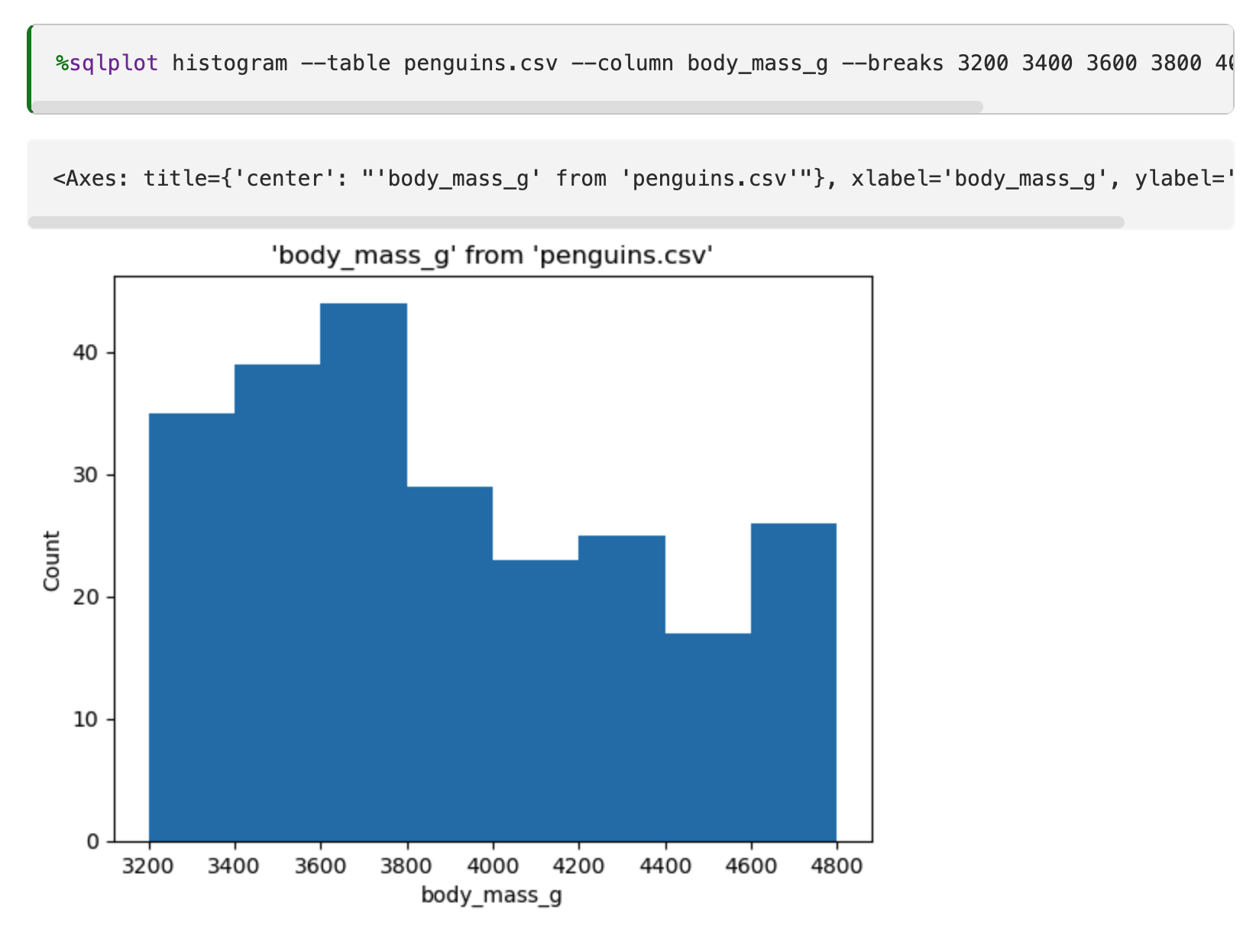
📊 Exciting Update! We've just implemented a new feature that allows users to specify breaks in ggplot histograms with the --breaks/-B option.
⚡ Breaks allow you to set custom intervals for a histogram. You can specify breaks by passing desired each end and break points separated by whitespace.
Now visualizing your data distributions is more flexible and tailored to your needs!
Check out the updated documentation to learn more: https://jupysql.ploomber.io/en/latest/api/magic-plot.html#specifying-breaks
Capybara :neovim: :arch: · @sotneStatue
398 followers · 3048 posts · Server fosstodon.org
Datascience :verified: · @datascience
485 followers · 276 posts · Server genomic.social{ggdist}: Visualizations of distributions and uncertainty https://mjskay.github.io/ggdist/ #rstats #ggplot
Sharon Machlis · @smach
2296 followers · 235 posts · Server masto.machlis.com
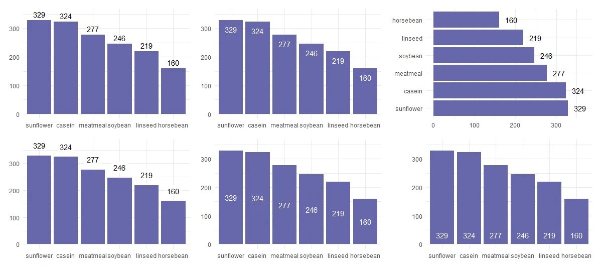
How to add labels to your ggplot2 and plotly graphs in R: examples and code by Jānis Stūris
https://datacornering.com/add-data-labels-to-column-or-bar-chart-in-r/
#rstats #ggplot #ggplot2 #plotly #DataViz #DataVis #R @rstats
#rstats #ggplot #ggplot2 #plotly #dataviz #datavis #r
Datascience :verified: · @datascience
475 followers · 271 posts · Server genomic.social
{ggblanket}, a wrapper around #ggplot for quick, explorative plots with sensible defaults and less code. https://davidhodge931.github.io/ggblanket/ #rstats
Datascience :verified: · @datascience
475 followers · 271 posts · Server genomic.social
{ggbump} creates elegant bump charts in ggplot. https://github.com/davidsjoberg/ggbump #ggplot #rstats
Jesse Onland · @jdonland
41 followers · 87 posts · Server vis.social
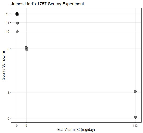
A very quick Tufte-ish plot of estimated added vitamin C intake versus symptoms of scurvy in James Lind's 1757 experiment for #tidytuesday
I'm very fond of this trick of setting the scale ticks to the actual values. #ggplot

Anna Szala · @anna
181 followers · 27 posts · Server fediscience.org
Okay so I just found an unofficial #Barbie #theme for #ggplot #R by Matthew B. Jané and it has brightened up my day. 🩷🩷🩷 https://github.com/MatthewBJane/theme_barbie Make sure to get it!

Frank Hänel · @frankhaenel
2 followers · 6 posts · Server fosstodon.org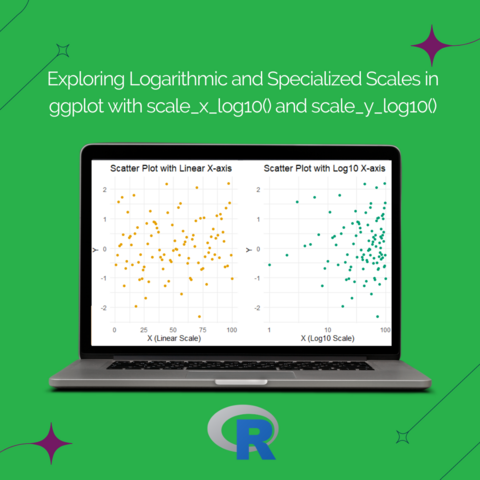
1/7: 🔢📈 #DataVisualization with #ggplot! Let's dive into logarithmic and specialized scales using scale_x_log10() and scale_y_log10() in ggplot. These functions are handy when dealing with data that spans a wide range. Let's get started! #DataScience #DataViz #Tutorial #rstats #r4ds
#datavisualization #ggplot #datascience #dataviz #tutorial #rstats #r4ds

Cee · @ceenell
43 followers · 32 posts · Server vis.social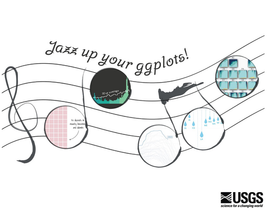
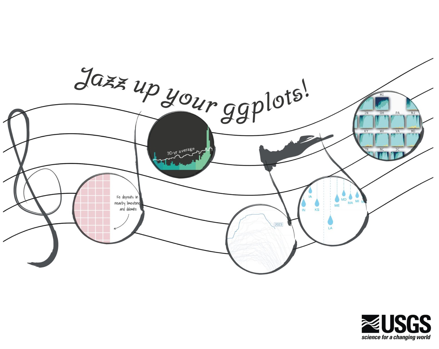
New blog post from #USGSvizlab: jazz up your #ggplot! Showing some of our favorite #dataviz design tricks using #rstats https://waterdata.usgs.gov/blog/ggplot-jazz/
#rstats #dataviz #ggplot #usgsvizlab