
Ian Cooper · @ICooper
1433 followers · 15 posts · Server hachyderm.ioIt was great at #KCDC to meet up with @jeremydmiller - who owns Wolverine - and Chris Patterson - who owns Mass Transit and have a meeting of #dotnet minds in the messaging space. Some useful insights.

Ian Littman · @ian
739 followers · 1836 posts · Server phpc.social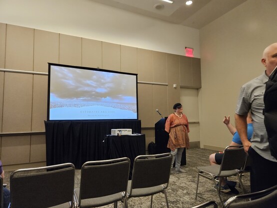
After running around the sponsor area, I'm back to attending sessions at #kcdc. Next up: Jennie Ocken talking about how estimates are evil but can be used for good.
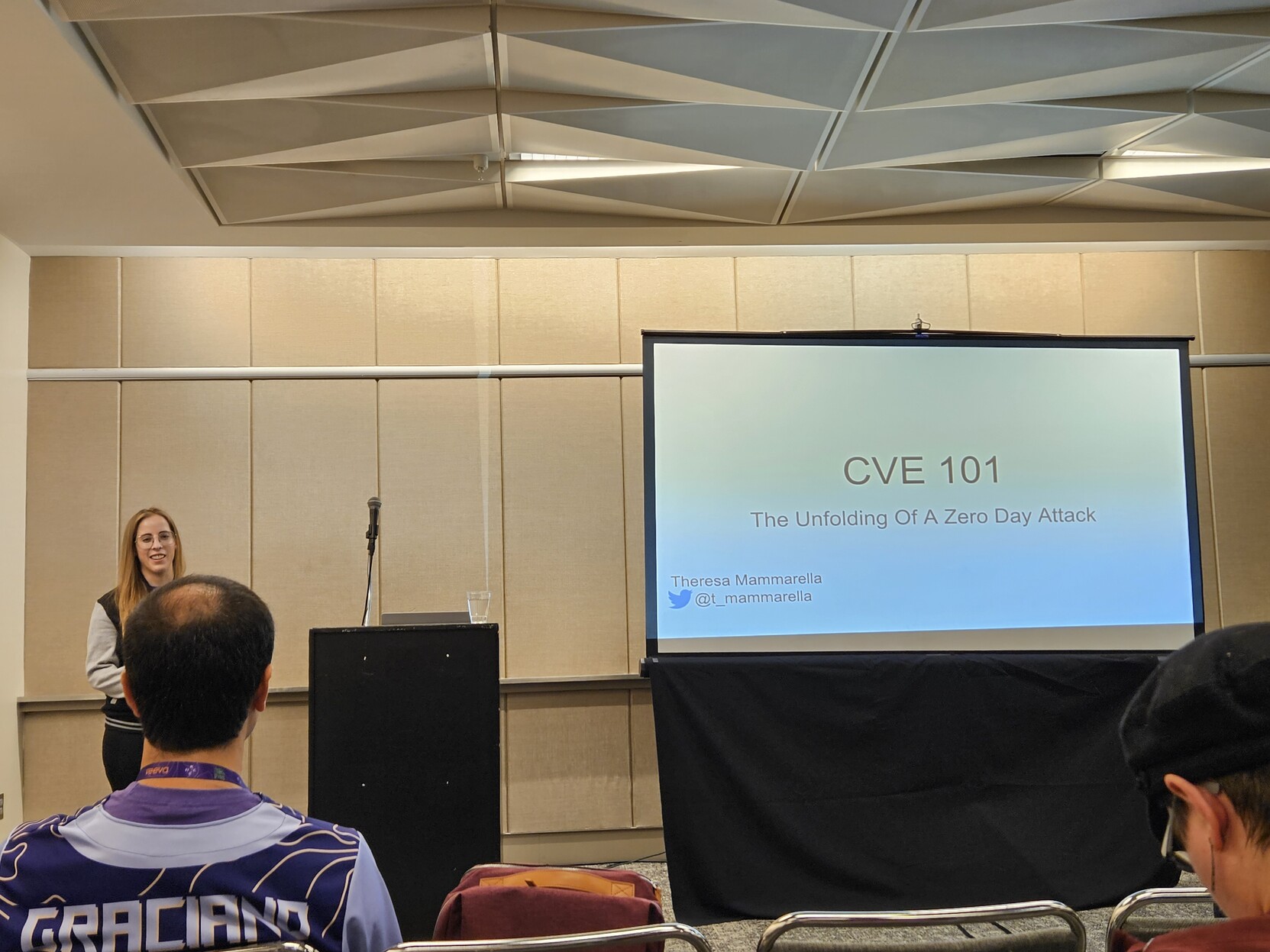
Ian Littman · @ian
739 followers · 1834 posts · Server phpc.social
Time to find out how the CVE sausage is made with Theresa Mammarella at #kcdc

David Giard · @davidgiard
45 followers · 1347 posts · Server techhub.socialI was feeling a little sad about missing #KCDC;
Then, I saw the awesome speaker badges that I missed out on;
Now, I think I will cry myself to sleep.
Ian Littman · @ian
739 followers · 1826 posts · Server phpc.social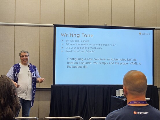
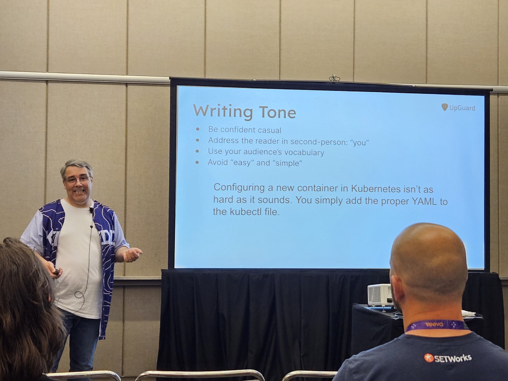
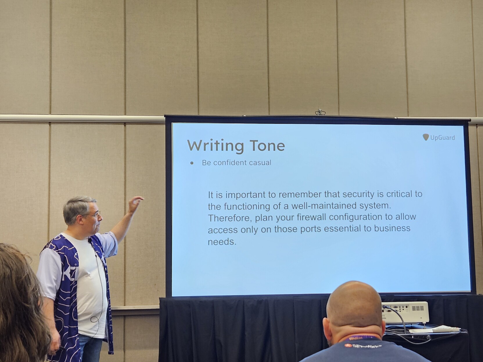
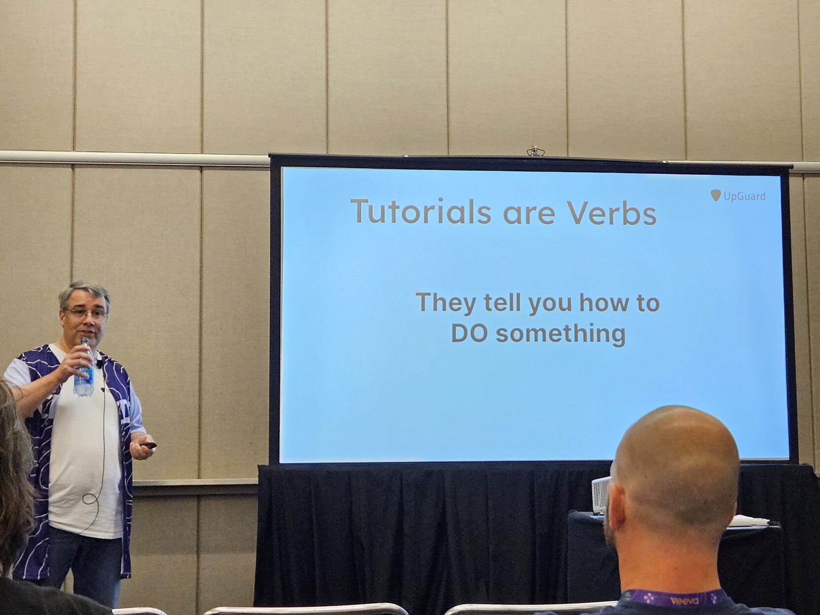
Don't call your readers stupid by calling something easy. Express your confidence in the user by telling them in plain terms what to do.
The example in the image is contrived because no one on earth has called YAML simple.
Also, avoid marketing copy. Stick to things that are provable.
Ian Littman · @ian
739 followers · 1825 posts · Server phpc.social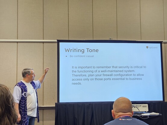
Use "confident casual" as your documentation tone. 1:1, as if you were talking to a smart junior colleague who's smart, motivated, and just needs to know how to do the thing. You don't need to pretend you're in a lecture hall and attempt to use words to burnish your authority. You already have the authority; you wrote the docs. And no "we"; you as the author aren't adding a user to the database or configuring the server. - @bmac #kcdc
Ian Littman · @ian
739 followers · 1824 posts · Server phpc.social
Ian Littman · @ian
740 followers · 1823 posts · Server phpc.social
Ian Littman · @ian
739 followers · 1821 posts · Server phpc.social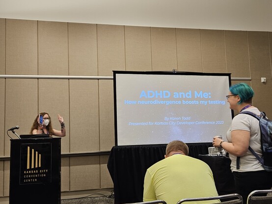
Time to talk about the intersection of testing and being wired differently, and more...from Karen Todd (KarenTestsStuff on various places). #kcdc
Ian Littman · @ian
738 followers · 1819 posts · Server phpc.social
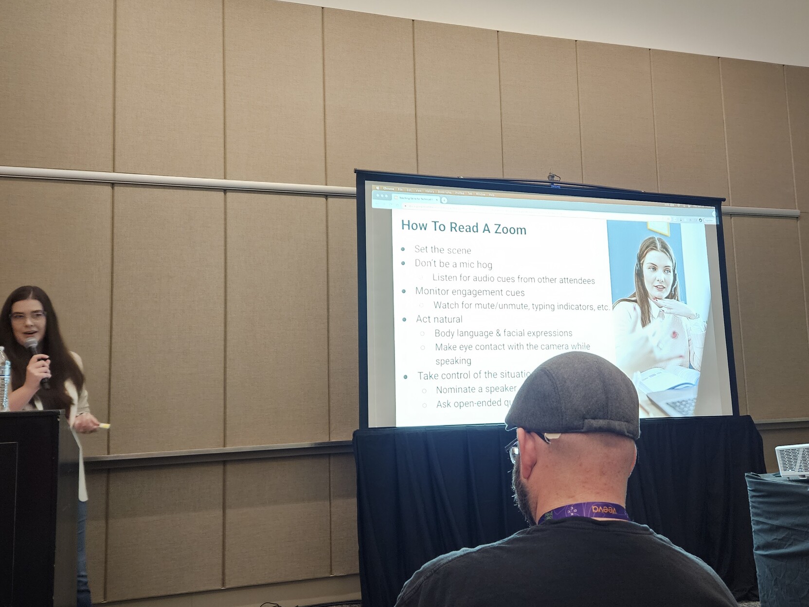
Watch for people unmuting in Zoom because if someone is wanting clarification badly enough to hop off mute that's significant. And watch for typing indicators/chat. And look at the camera rather than the screen when presenting. - Tori Brenneison
Ian Littman · @ian
738 followers · 1818 posts · Server phpc.social
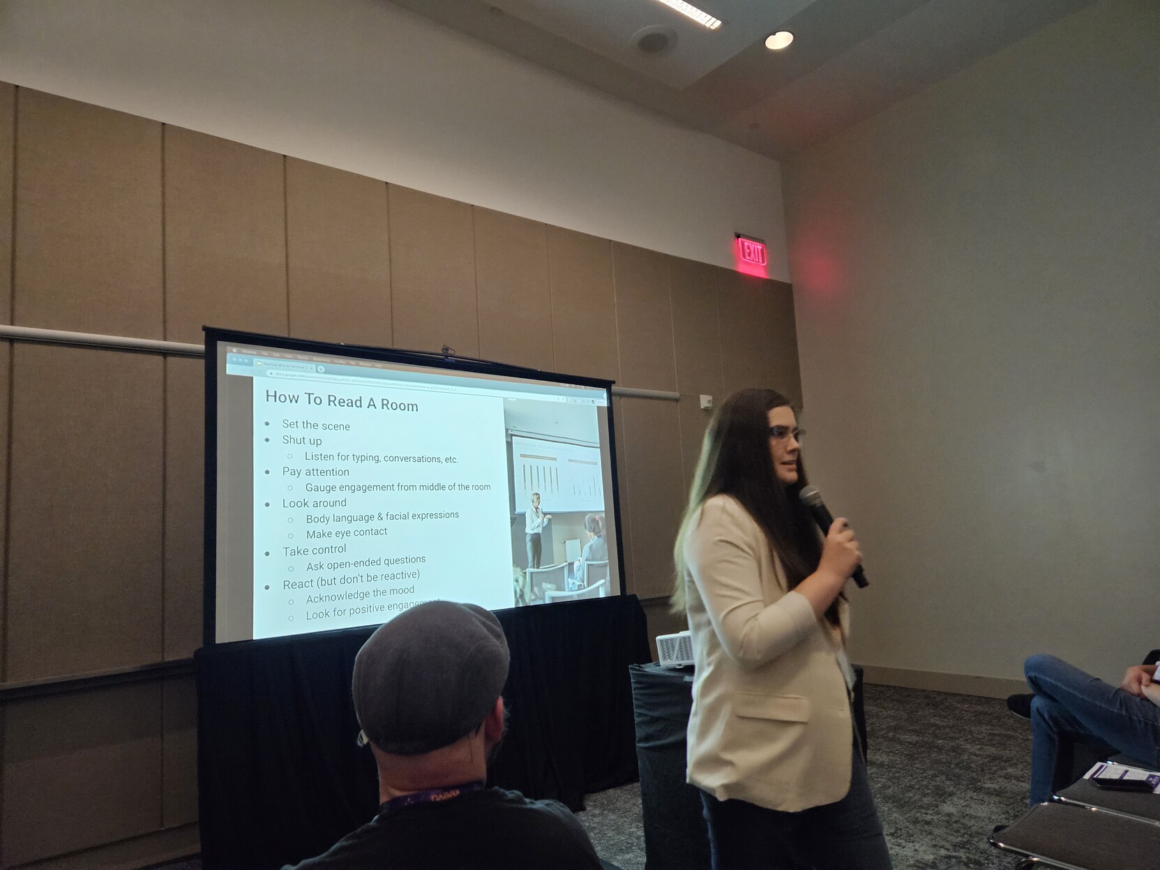
If you can keep the middle of the room engaged, you're keeping the room engaged. - Tori Brenneison #kcdc
Ian Littman · @ian
738 followers · 1817 posts · Server phpc.social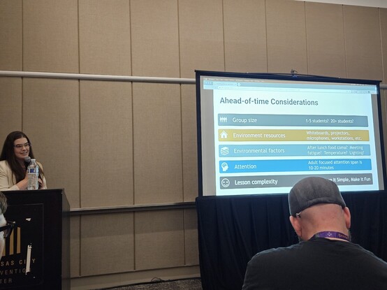
When preparing to teach, think about who you're teaching to and what condition they're in so you can tailor your presentation to the abilities and limitations of the audience. - Tori Brenneison #kcdc
Ian Littman · @ian
738 followers · 1815 posts · Server phpc.social
Ian Littman · @ian
738 followers · 1814 posts · Server phpc.social
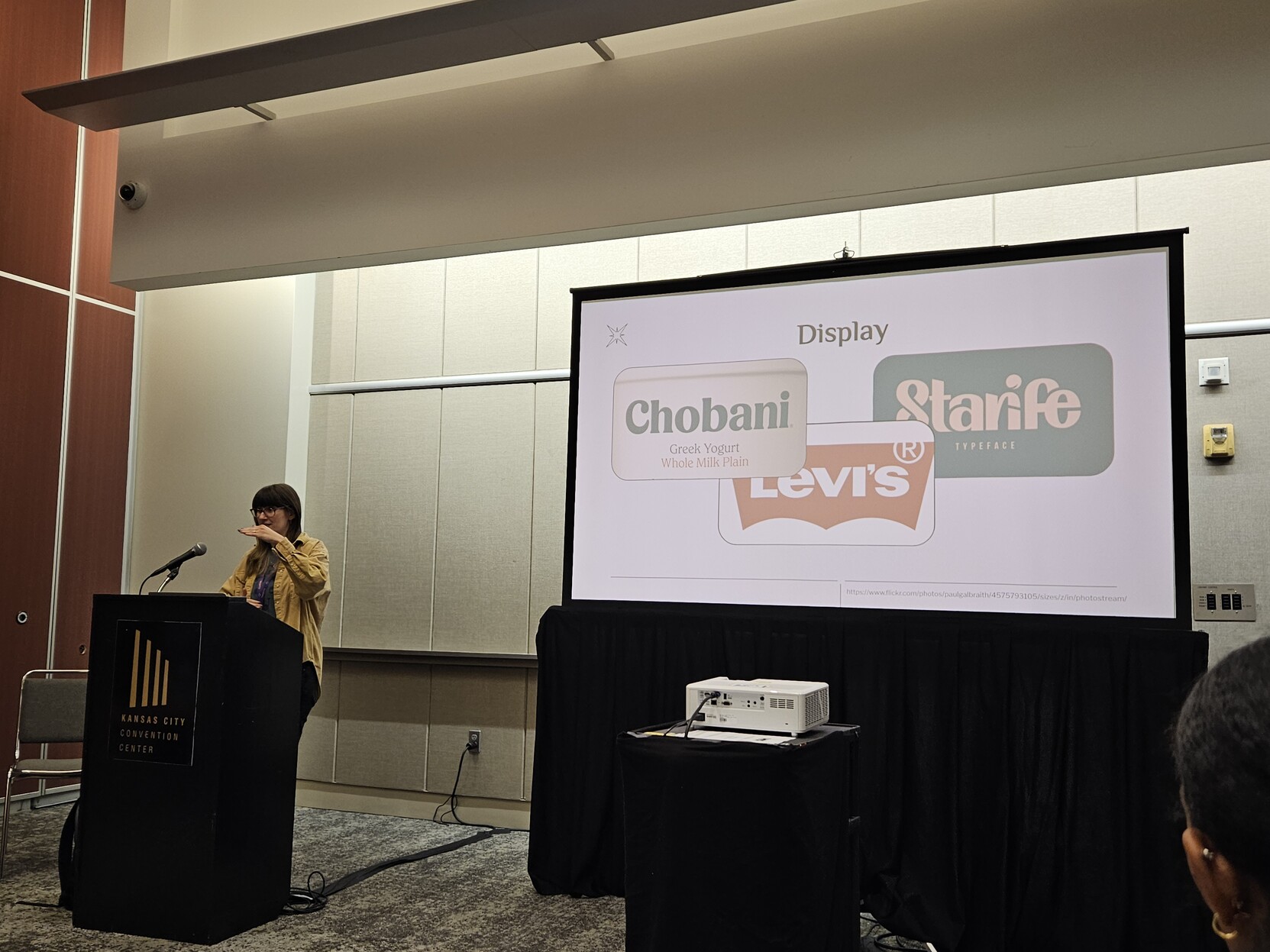
Use display fonts for headers, not body text, because they aren't particularly readable. - Kathryn Grayson Nanz #kcdc
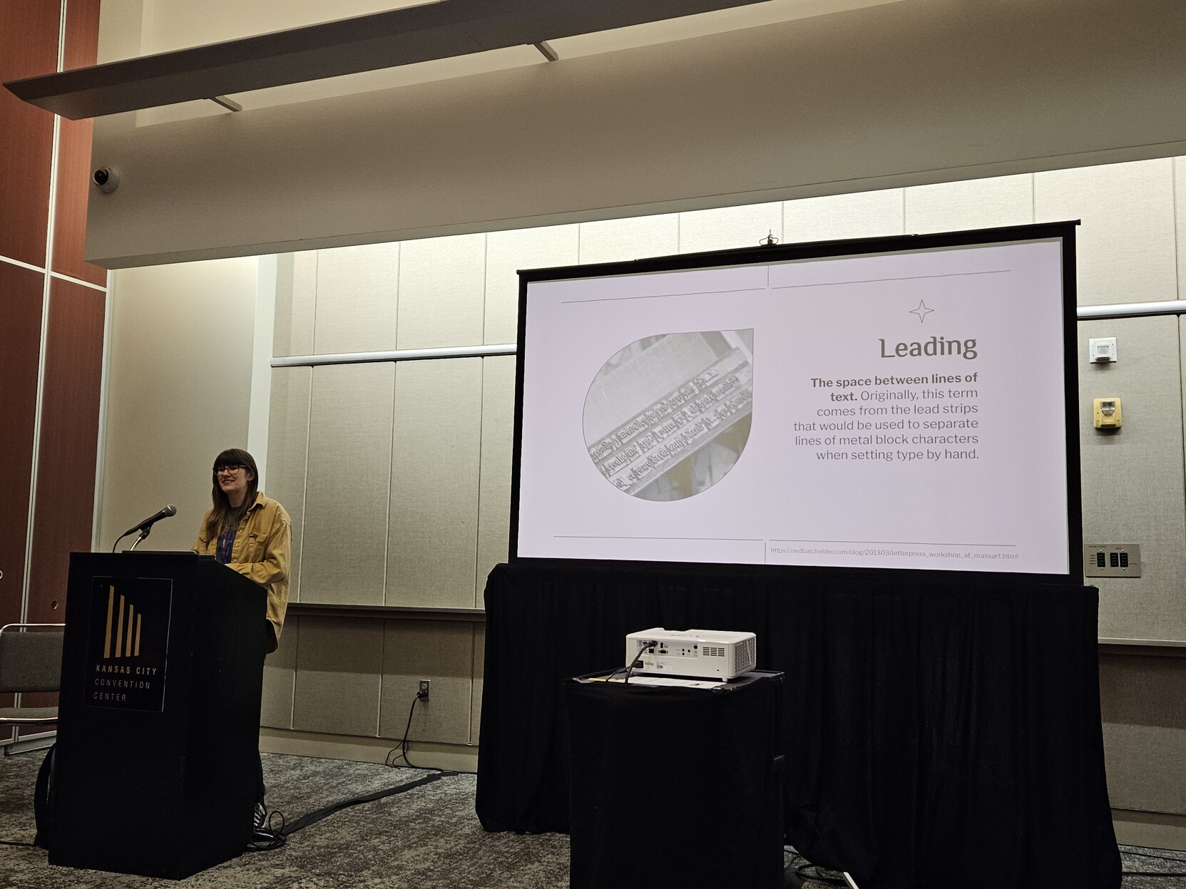
Ian Littman · @ian
738 followers · 1813 posts · Server phpc.social
Leading (as in the metal, not the contrast to following), or line height, is the vertical equivalent of kerning. - Kathryn Grayson Nanz #kcdc
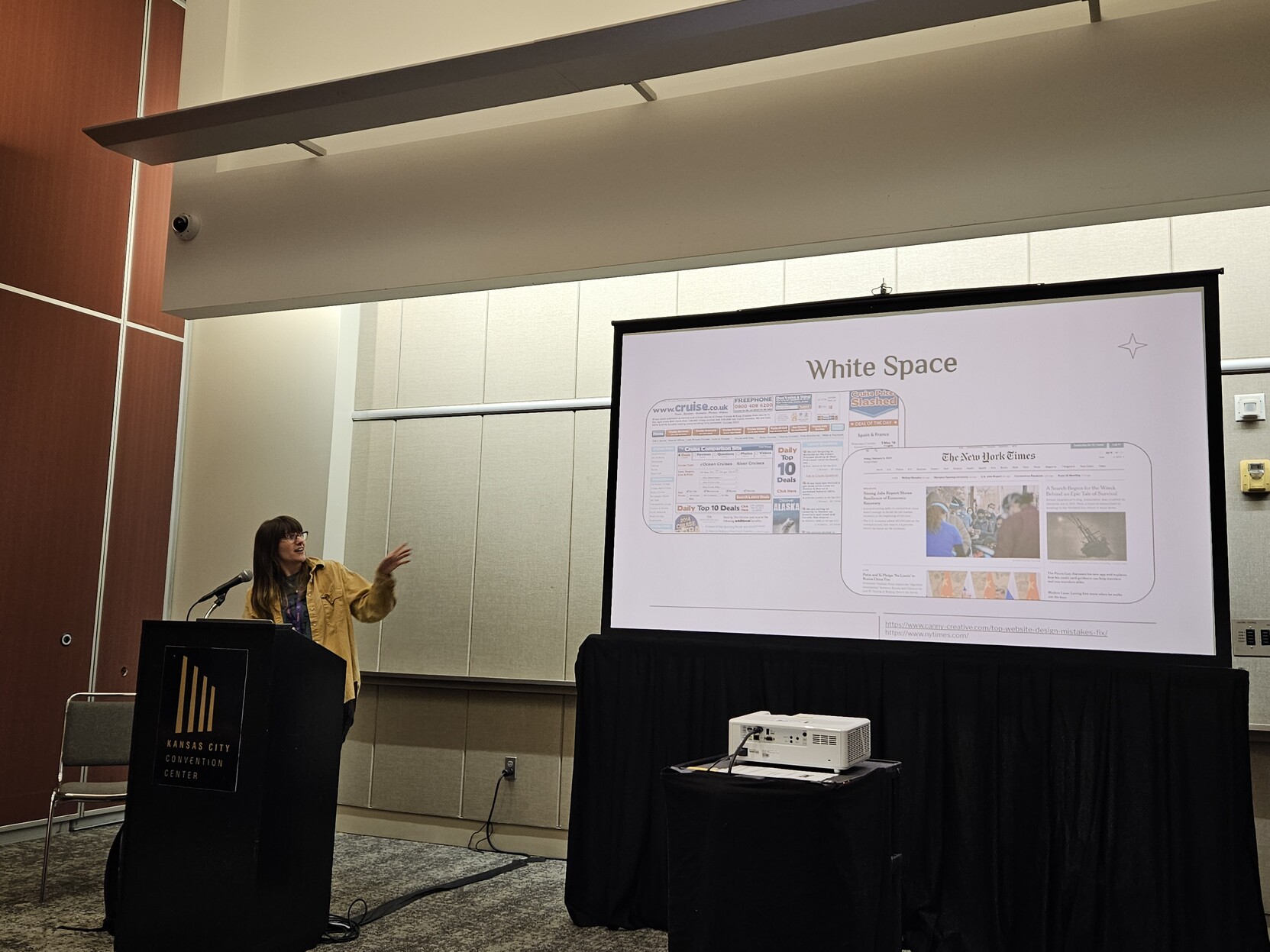
Ian Littman · @ian
738 followers · 1812 posts · Server phpc.social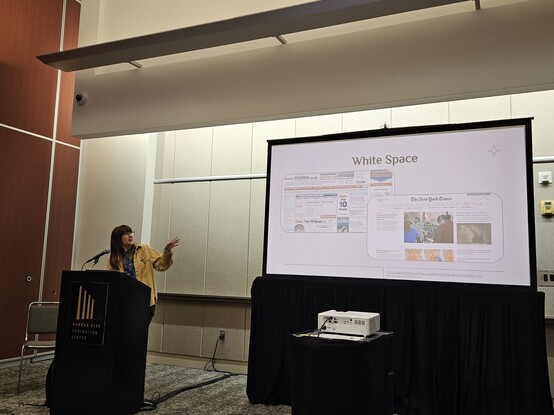
Use white space to give the eye somewhere to rest and tame the chaos of your layout - Kathryn Grayson Nanz #kcdc
Ian Littman · @ian
738 followers · 1811 posts · Server phpc.social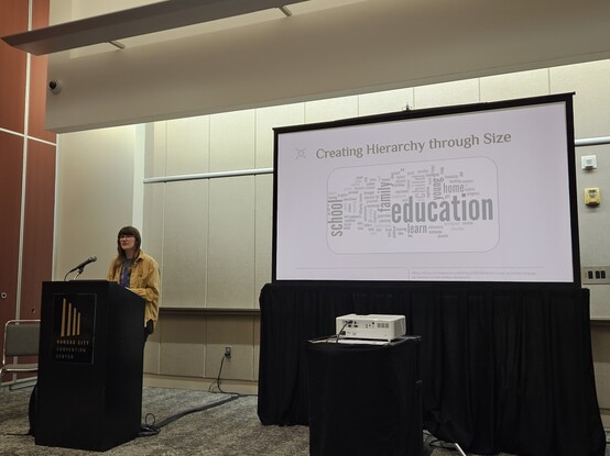
Word clouds are not a great visual design pattern, but they're a good example of pulling user attention based on size/color, vs. letting folks read in a standard "Z" layout - Kathryn Grayson Nanz #kcdc
Use element sizing as a visual funnel to direct users' attention.
Ian Littman · @ian
738 followers · 1810 posts · Server phpc.social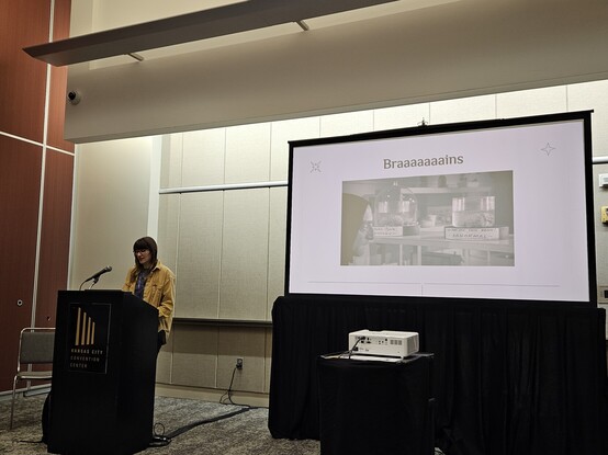
Braaaaaaaaains are cool, and work to make some logical order of elements e.g. on a web page - Kathryn Grayson Nanz #kcdc
Ian Littman · @ian
738 followers · 1809 posts · Server phpc.socialConsider adding a high contrast theme for users with visual disabilities - Kathryn Grayson Nanz #kcdc
As someone who uses high contrast themes relatively often, yes please.
Ian Littman · @ian
738 followers · 1808 posts · Server phpc.social
Images are an important part of your design, allowing for balancing out other parts of the page. So keep them in mind as you design rather than treating them as an "image goes here" box. - Kathryn Grayson Nanz #kcdc