
Web Axe · @WebAxe
881 followers · 662 posts · Server a11y.infoA Guide to Understanding What Makes a Typeface Accessible, and How to Make Informed Decisions
https://www.linkedin.com/pulse/guide-understanding-what-makes-typeface-accessible-ford-williams/
#a11y #fonts #typefaces #typography #legibility
#a11y #fonts #typefaces #typography #legibility

Jason Pester (GameDev) · @jay
311 followers · 420 posts · Server mastodon.gamedev.place
💡 Intel One Mono Font for Developers 💻
"Introducing Intel One Mono, an expressive monospaced font family that’s built with clarity, legibility, and the needs of developers in mind."
https://github.com/intel/intel-one-mono
#Intel #OneMono #IntelOneMono #Font #Fonts #Typeface #Legibile #Legibility #SWDev #AppleDev #MobileDev #WebDev #GameDev #Engineer #Developer #Coder #Coding #Developing #Engineering
#intel #onemono #intelonemono #font #fonts #typeface #legibile #legibility #swdev #appledev #mobiledev #webdev #gamedev #engineer #developer #coder #coding #developing #engineering

rob · @stokes
435 followers · 1652 posts · Server mstdn.social
For designers and anyone interested in making written materials easier to read across the entire visual-ability spectrum: Atkinson Hyperlegible.
https://brailleinstitute.org/freefont
(free download)
#fonts #typeface #typography #design #legibility #readability #accessibility
#Accessibility #readability #legibility #Design #typography #typeface #fonts

Terminal Impala · @terminalimpala
10 followers · 102 posts · Server me.dmSeen in a #datingprofile:
A tiny #unreadable #emoji in front of a #party #affiliation.
So... yeah... what do you mean. The emoji is tiny and unreadable. Do you support them? Hate them? Are indifferent towards them?
One thing for sure, #accessibility is not your primary concern.
(I've been functionally #blind during my #cancer. I can see well enough now that I don't need a screen reader. Still, I'd encourage everyone to aim for #legibility when writing.)
#datingprofile #unreadable #emoji #party #affiliation #accessibility #blind #cancer #legibility #dating

Lyle Solla-Yates · @Lyle
207 followers · 880 posts · Server cville.online
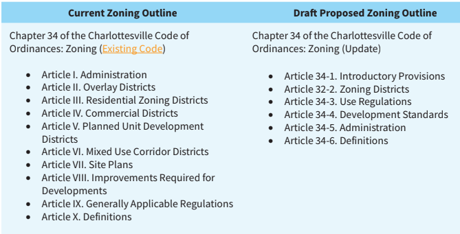
In my opinion the new chapter organization is much clearer and won't require me to explain what a "Planned Unit Development District" means in a city that has not been able to annex land since the desegregation movement, long before most residents were born. #legibility #transparency #opengovernment
#legibility #transparency #opengovernment

Amy Lee · @amyleesf
190 followers · 102 posts · Server social.design.systems
I still think about this a bit now: there is no legibility advantage of serif vs sans serif typefaces. However, I think there is a "contrast advantage". Design is all about making the user understand what things are grouped together. Like: using font size to indicate a new section. Or: using italics to highlight a foreign word. And even: serif vs. monospace to indicate a code block in an explanation. #legibility #accessibility https://link.springer.com/book/10.1007/978-3-030-90984-0 #typography
#typography #accessibility #legibility

robrich · @robrich
5 followers · 23 posts · Server hachyderm.io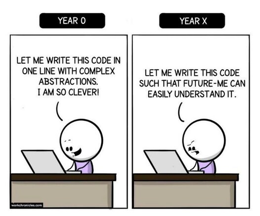
It's easy to be clever in #programming, but that usually makes it worse. Instead, focus on #legibility and the #code will be much more durable.
#programming #legibility #code

Karthik Srinivasan · @skarthik
137 followers · 70 posts · Server neuromatch.socialIndeed! It is a profound analogy.
I would like to add a couple of points that I believe are related to Ted Chiang's on knowledge generation, compression, complexity, and communication vis-à-vis LLMs (especially given the role these large and powerful corporations play in our day-to-day lives, and look increasingly indistinguishable from the role of states).
Both are from James C Scott, the great anthropologist who brilliantly captures these ideas in his work "Seeing Like a State: How Certain Schemes to Improve the Human Condition Have Failed"
1) The first of them is what he calls "legibility", and thus a simplification. Simplification (a form of compression) that turned out to be disastrous because of what he calls, "authoritarian high modernism".
This is how he explains legibility:
"The more I examined these efforts at sedentarization, the more I came to see them as a state’s attempt to make a society legible, to arrange the population in ways that simplified the classic state functions of taxation, conscription, and prevention of rebellion. Having begun to think in these terms, I began to see legibility as a central problem in statecraft. The pre-modern state was, in many crucial respects, particularly blind; it knew precious little about its subjects, their wealth, their landholdings and yields, their location, their very identity. It lacked anything like a detailed “map” of its terrain and its people."
2) The second idea is towards the end of the book, a type of knowledge he calls "metis" to contrast it to the knowledge a lot of us at the core of society generate and engage in, "techne".
Techne consists of our legible plans, rules, social codes, principles etc etc., including science and policy.
Metis on the other hand, is the thinking and knowledge process
that has to deal with the messy unpredictable complexity of both the human and natural world in the here and now. Thus practical skills and common sense improvisations to deal with such situations, which by their very nature are know-hows locally rooted, hardly transmittable, or legible, and thus harder or impossible to be either compressed or simplified.
I believe both "legibility" and "metis" along with lossy compression are equally applicable to LLMs.
Loosely speaking LLMs are like the "five year central plans" for organizing knowledge that Scott critiques in his book.
After all, Google does say their aim is to "organize the world's information and make it universally accessible and useful".
#legibility #metis #JamesCScott #chatgpt #LLMs #complexity #critique #mapterritoryrelation #AI #SeeingLikeAState
#legibility #metis #jamescscott #chatgpt #llms #complexity #critique #mapterritoryrelation #ai #seeinglikeastate

Phil Landmeier · @shuttersparks
273 followers · 2087 posts · Server qoto.orgThe Lato Font. I like it.
#typeface #typography #legibility #free #font

Jay Holler · @jay
1601 followers · 590 posts · Server macaw.social
This is pretty cool, a freely available font from the Braille Institute, named for their founder, J. Robert Atkinson. It is designed to be legible to people with different vision abilities. Thanks to @maique for sharing this! https://brailleinstitute.org/freefont #Fonts #BrailleInstitute #Legibility
#fonts #brailleinstitute #legibility

DennisL · @dennisl
379 followers · 257 posts · Server mastodon.socialHow type influences readability: https://fonts.google.com/knowledge/readability_and_accessibility/how_type_influences_readability #typography #legibility #readability #UIDesign
#typography #legibility #readability #uidesign

demï7en 🎗 · @demi7en
26 followers · 887 posts · Server infosec.exchange... for discovery since *no one* else seems to have bothered (beyond Hilda's initial effort).
#Atkinson #Hyperlegible #Fonts #legibility #BrailleInstitute #visionimpairment #dyslexia
#atkinson #hyperlegible #fonts #legibility #brailleinstitute #visionimpairment #dyslexia

Jonatan Hildén · @jhilden
288 followers · 775 posts · Server vis.socialThis article takes a slightly different angle but is very good about the significant complexities that arise when testing typefaces.
” So if you come across a scientific legibility study that compares typefaces set at the same point size, don’t even bother to read on!”
#legibility #typography #readability https://www.smashingmagazine.com/2022/06/measuring-performance-typefaces-users-part1/
#readability #typography #legibility

James Fairbairn · @james
180 followers · 280 posts · Server mastodon.exitmusic.world“…you should be able to understand technological systems without having to learn to code at all, just as one should not need to be a plumber to take a shit, nor to live without fear that your plumbing system might be trying to kill you.”
— James Bridle, New Dark Age: Technology and the End of the Future
#technology #legibility #systems

AesAthena · @AesAthena
586 followers · 4681 posts · Server mastodon.art
I discovered a new free typeface (font) today made for vision impairment! "Atkinson Hyperlegible"
https://www.youtube.com/watch?v=wjE5eHLICzc
As someone who occasionally makes large print books, I find this pretty cool!
#accessibility #legibility #fonts #font #typeface #typefaces #AtkinsonHyperlegible #free #gratis #legibility
#gratis #free #atkinsonhyperlegible #typefaces #typeface #font #fonts #legibility #accessibility

Mike · @Narshada
126 followers · 256 posts · Server masto.aiI’ve got to say, I love that Masto prefers Camel case for hashtags. I’ve always done it that way as it’s eminently more readable.
It’s also more inclusive and helps people who use screen readers. I’m all for it.
#hashtags #camelcase #legibility

Karl Voit :emacs: :orgmode: · @publicvoit
1527 followers · 11892 posts · Server graz.socialPhil Hagelberg: in which #legibility comes at a price
https://technomancy.us/199
Great read about #Mastodon (is it really so complicated? 🤔) and naming things. I've learned interesting things here.

Fran Burstall · @franburstall
7 followers · 19 posts · Server emacs.ch
Brian Marick · @marick
572 followers · 328 posts · Server mstdn.social
/Seeing Like a State/ (podcast episode tomorrow at https://podcast.oddly-influenced.dev/) is about #legibility of "productive units" to administrators or "the sovereign". Forests are legible when simplified to quantities of harvestable lumber. Villages are legible when simplified to producing taxes/conscripts. And so on.
I read people saying they've moved on from a focus on producing "story points" or "features" to producing #BusinessValue. Seems good!
But I have a question...

𝕤𝕙𝕚𝕓𝕒 𝕔𝕠𝕞𝕡𝕦𝕥𝕖𝕣 · @shibacomputer
412 followers · 256 posts · Server post.lurk.org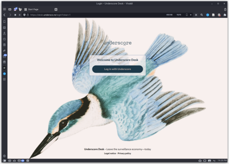
Here's a sneak peek of #Underscore's forthcoming v1.0 #Nextcloud re-skin. We've revised Nextcloud Hub 3's design for improved visual, layout and typographic #consistency and a focus on refining interface #legibility[1]. Once this is complete, we will redraw and replace all of Nextcloud's icons, authoring them against a grid and ensuring they follow a consistent stype.
We've also wrapped it in Underscore's identity and I'm pretty thrilled with how it's coming along. The first of many.
More about this project:
#Underscore is a #community based #creative platform, built from #opensource projects & refined with strong moderation tools. It features:
🐦 Creative collaboration, broadcasting, streaming and web publishing
🐦 No passwords - authentication through community participation
🐦 Analytics-free and hosted in Finland, Germany and Switzerland
Info & expressions of interest 👉 https://undersco.re
#opensource #creative #community #legibility #consistency #nextcloud #underscore