Rollleaf Drumlinhat · @rollleafd
342 followers · 2907 posts · Server warhammer.social@ErikBB think it’s been that way for a while. Just think it’s now a case of the place being busier. #MastodonUI giving you a “tick” respondents feature/etc would be a nice addition.
· @gholk
72 followers · 1748 posts · Server g0v.social看到幾則 mastodon ui 的嘟, 也來回顧一下以前自己寫的二欄式版面。
這版面是適合直式螢幕, 由來是我會把一般橫向螢幕切半, 左右各放一個視窗。
這種寬度下雙欄式剛剛好。
我 discord 也是把好友側邊欄收起來用直著用, 但某些操作介面會因為太窄爛掉, 也來用 #userstyle 調整好了。
(不知道要用什麼 tag, 不然就 #MastodonClient #MastodonUI)
#userstyle #mastodonclient #mastodonui
njsg · @njsg
4 followers · 41 posts · Server social.sdf.orgWhy does the down arrow key behave more like page down if a post is selected in the #mastodon web UI? Why doesn't it just scroll the same distance as it'd otherwise do? #mastodonui (suggestions of more appropriate hashtags for this are welcome)
:idle: OpenSoul :verified: · @opensoul
219 followers · 2367 posts · Server mastodon.uno#Mastoaiuto #mastofeaturerequest che riguarda: sull'interfaccia Web di #Mastodon, quando scrivo e metto gli #hashtag o anche un #emoticon, praticamente mi *costringe* a premere la barra (con #focus esclusivo) se l'#hashtag o l'emoticon viene trovata o riconosciuta. E' FASTIDIOSISSIMO e foriero di errori mentre si scrive. Sapevatelo :-)
(a magari se qualcuno che sviluppa la UI Web riuscisse a trovare una soluzione o un comportamente meno rigido, sarebbe bello)
#mastoaiuto #mastofeaturerequest #hashtag #mastodon #mastodonui #mastodonweb #emoticon #focus
$ writeblankspace :idle: · @writeblankspace
28 followers · 123 posts · Server fosstodon.orgHow do you make a poll in elk.zone?
#elk #elkzone #mastodon #mastodonui #mastodonclients
Stu · @og
25 followers · 416 posts · Server allthingstech.socialGoing to try and copy and paste some CSS into #Stylus and make my #MastodonUI look like #MastodonBirdUI 😎😊😍
#stylus #mastodonui #mastodonbirdui
Roni Laukkarinen · @rolle
2724 followers · 8597 posts · Server mementomori.social#MastodonBirdUI is in use on growing number on instances as default!
https://mementomori.social
https://techtodon.com
https://mastodonsweden.se
https://koyu.space
How cool is that! Happen to know more?
#mastodonbirdui #mastoadmin #css #ui #mastodonui #mastodon #opensource
Roni Laukkarinen · @rolle
2693 followers · 8435 posts · Server mementomori.socialJust released Mastodon Bird UI v1.2.0
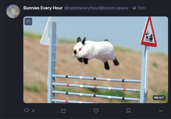
Most notable changes: The media that has no alt now uses the `:has` from CSS Selectors Level 4 Working Draft.
Wanted it to be more subtle instead of the whole image fading out. (It turns out too many forget the descriptive alt texts for their posts, but I still want to see if the post doesn't have one)
Practically here's the monster: `.wrapper:has(> img:not([alt]))::after`. Nice fun #CSS hack!
Get Mastodon Bird UI here: https://github.com/ronilaukkarinen/mastodon-bird-ui
Changelog:
* Consistency in follow/unfollow button hover and focus colors
* More distinct :focus-within to text inputs
* Hilight search icon when searching emojis
* Fix emoji-mart search icon color
* Add more consistent colors for emoji-mart
* Fix columns for RTL (thanks @ButterflyOfFire)
* Fix default relationship follow button color
* Improve relationship follow focus action on mobile
* Fix missing audio player alignment
* Fix audio player border-radius
* Use CSS Selectors Level 4 Working Draft :has for missing alt tag media instead of opacity #UI #MastodonUI #MastodonBirdUI #Design #UIDesign #AltText #OpenSource #Accessibility #A11y
#css #ui #mastodonui #mastodonbirdui #design #uidesign #alttext #opensource #accessibility #a11y
Roni Laukkarinen · @rolle
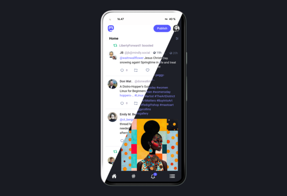
2693 followers · 8439 posts · Server mementomori.socialI'm finally quite happy with my CSS theme for #Mastodon. Mastodon is a joy to use now. I loove the fact I can make this my own.
Mastodon Bird UI has a combination of some hand picked and tweaked open source versions of Iconoir, Ionicons and Feather icons, threading styles, dark panels, lots of general fixes and more.
See it live on my instance: https://mementomori.social
Source code: https://github.com/ronilaukkarinen/mastodon-bird-ui #CSS #MastoAdmin #MastodonUI #UI #WebDev
#mastodon #css #mastoadmin #mastodonui #ui #webdev
Roni Laukkarinen · @rolle
2693 followers · 8442 posts · Server mementomori.socialThe bottom bar on mobile turned out pretty nicely. :bunhdheart: #CSS #MastodonUI #UI #Mobile
LisPi · @lispi314
324 followers · 4756 posts · Server mastodon.top@cstross @ArmyGirl @ChrisMayLA6 @fencoul I'd partly blame #Mastodon's terrible UI for this problem.
On the #ActivityPub level, Content Warnings occupy the title/name slot of a post (you know, that old subject field for #email or #Usenet articles? It was there for a reason).
That should be exposed directly and shouldn't count against character count in posts.
#mastodon #activitypub #email #usenet #mastodonui #mastoui #MastoUX #mastodonux
PJ Coffey · @Homebrewandhacking
887 followers · 6629 posts · Server mastodon.ieHuh, I do not appear to be following a person with such unusual good sense.
How remiss of me.
#MastodonFuture #mastodondesign #mastodonui #mastodonux
PJ Coffey · @Homebrewandhacking
864 followers · 6380 posts · Server mastodon.ieparv · @parvXm
66 followers · 2214 posts · Server mastodon.social#AltText to read is available in #Mastodon_iOS application now!🎉 Sweet!
Let’s see if I can add too (cat picture by @randynose; longer image description by @SnoopJ); yes, works. I think that might have been working earlier already.
(ah yes, "retoot-with-lock" -- did not mean to; forget that that seems to be the default in 💩#Mastodon_iOS; "Delete & re-draft"ed in #webUI 😒)
#mastodonUI #mastodonUX
#alttext #mastodon_ios #webui #mastodonui #mastodonux
parv · @parvXm
66 followers · 2214 posts · Server mastodon.social... #Stylus #CSS affects some icon/glyphs which were already covered by other font ("Noto (Color) Emoji" I suspect) but none of interest ...
.fa
{
/* Last is the one that comes with the web page */
font-family: "Font Awesome 6 Free", "Font Awesome 6 Brands", FontAwesome;
}
#stylus #css #hack_webui #mastodonui #hackcss #csshelp
dropbear42 🌈♀:arch: :plasma: · @dropbear42
27 followers · 575 posts · Server fosstodon.orgWhat does this UI symbol denote, please?
I Block some nasty people, & Mute a larger number of peeps who are merely irritating rather than nasty. Does it mean that some of the Mutees have attempted to interact with me? If so, can i do anything to make this symbol not appear [maybe by converting all Mutees to Blockees]?
Hovering my pointer over the symbol gives no info, whilst clicking it just makes it vanish, with me still clueless.
Kee Hinckley · @nazgul
1153 followers · 2082 posts · Server infosec.exchangeI've been trying a *lot* of iOS Mastodon clients. And while they all have pluses and minuses, some paterns for good UI are emerging.
One thing I particularly appreciate is apps which put who boosted something *over* the boosted post, rather than below it.
I'm far more likely to see it there. And I see it *before* I read it. So I never read the post wondering "Which of the people I follow shared *this*?" or "Wow, this is great, so glad I follow this person." I know right away why I'm seeing it, and am prepared to act accordingly.
And obviously, *huge* bonus points for apps that consolidate boosts and show it once, with a list of (at least some of) the people I follow who boosted it.
Kee Hinckley · @nazgul
1031 followers · 1903 posts · Server infosec.exchangeI've generally been using mobile UIs, and only now am working on setting up my web one.
Is there a way to collapse this UI down to three (or better, two) columns? There's an amazing amount of wasted space here. The compose column is completely unnecessary, could be a popup. But even if it's there, the whole getting started section could go under it. And I can't find a way to get rid of Getting Started (but of course, if I did, then there would need to be a menu somewhere to get those options.
I get the feeling I'm getting burned by the common model of using a limited number of wide windows. I prefer many tiled smaller windows, and if I'm writing or reading, I want tall, not wide.
· @royal
43 followers · 427 posts · Server theres.lifeHm. I had a user's post show up on my #thereslife home feed whom I knew I hadn't followed. (This is not a problem for me, but a mystery.) How do I find out if the post is there because I've followed a hashtag? I don't see a place in the #MastodonUI to discover my followed #hashtags. I don't find any hashtags in Preferences > Follows and Followers.
#hashtags #mastodonui #thereslife
Joss The Transient · @JoscelynTransient
50 followers · 128 posts · Server chaosfem.twWeird #MastodonUI question: How do I approve follow requests on the phone app? Is there even that option?


