
Xan Gregg · @xangregg
190 followers · 82 posts · Server vis.social
Catching up on #30DayChartChallenge, I guess this one combines the last 3 days themes: #OWID, hazards, humans.
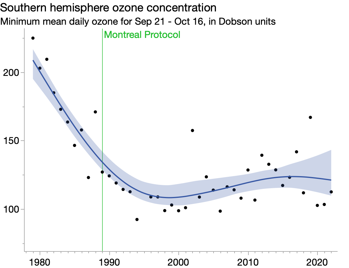
I like how the smoother helps see the overall trend of ozone recovery since the Montreal Protocol was adopted and how the bootstrap confidence interval reflects recent variation. Puzzled/concerned by the low 2020/2021 values, though.

Asjad Naqvi :stata: · @asjadnaqvi
427 followers · 267 posts · Server econtwitter.net
Since I was already making these figures, might as well submit them for the #30DayChartChallenge Day6: #OWID.
CO2 emissions by regions and countries. Made in #Stata using the #treemap package (https://github.com/asjadnaqvi/stata-treemap). One of the hardest ones to code but it's pretty solid now.
#30DayChartChallenge #owid #Stata #treemap
Benjamin Nowak · @bjnnowak
28 followers · 39 posts · Server fosstodon.org
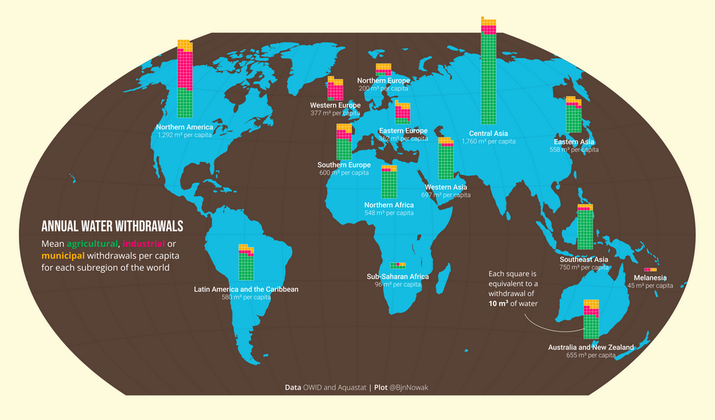
For #Day6 of #30DayChartChallenge a #map to compare annual wather withdrawals between subregions of the world.
Based on #OWID data : https://ourworldindata.org/water-use-stress
#RStats code for waffleplots : https://github.com/BjnNowak/TidyTuesday/blob/main/SC_irrigation.R
#day6 #30DayChartChallenge #map #owid #rstats

jaxroam · @jaxroam
38 followers · 156 posts · Server social.vivaldi.net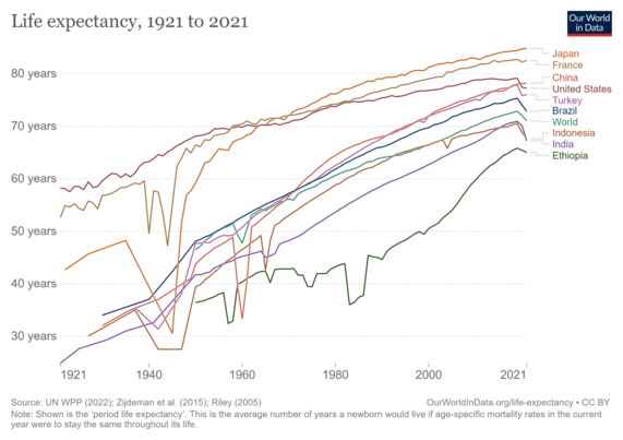
@paulisci While not quite 100 years global increases in life expectancy has been fairly stable (and linear), as long as disasters such as war and famine are avoided. #lifeExpectancy #OWID

CryptoNewsBot · @cryptonewsbot
33 followers · 2390 posts · Server schleuss.onlineTremors from FTX's collapse reverberate through the scientific community - With Sam Bankman-Fried involved in so many philanthropic ventures... - https://cointelegraph.com/news/tremors-from-ftx-s-collapse-reverberate-through-the-scientific-community #biosciences #propublica #securebio #esvelt #kovite #owid
#owid #kovite #esvelt #securebio #propublica #biosciences