Typographica · @typographica
2570 followers · 837 posts · Server typo.socialIt was a joy to work on this piece with Anne Galperin. As soon as I saw her essay on Betti Haft in @BriarLevit’s book I knew we had to expand on the search for @letterformarchive’s blog. (Sadly, nearly all these women were gone before Anne could interview them. Another reminder to talk to elder designers *now*!) https://letterformarchive.org/news/from-the-collection-the-women-of-photo-lettering/
#TypeDesign #WomenDesigners #Phototype #PhotoLettering #Typography
#typedesign #womendesigners #phototype #photolettering #typography
Typographica · @typographica
2542 followers · 803 posts · Server typo.socialNarrow-format font catalogs. From condensed, to compressed, to ridiculous. 🤳@laureola
https://www.flickr.com/photos/stewf/52943712051/
#TypeSpecimen #Fonts #Typefaces #FontShop #Lettergraphics #Headliners #PhotoLettering #Linotype
#TypeSpecimen #fonts #typefaces #fontshop #lettergraphics #headliners #photolettering #linotype
Typographica · @typographica
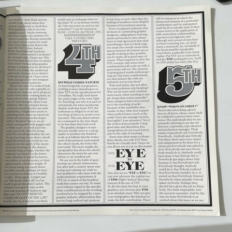
2510 followers · 776 posts · Server typo.socialEd Benguiat, decrying the use of TNT (tight-not-touching) spacing commonly requested by Photo-Lettering customers. As I suspected, this is not a technique professionals like Ed really appreciated because it generally looks like crud.
#PhotoLettering #Phototype #Typography #1970s #1980s #GraphicDesign
#photolettering #phototype #typography #1970s #1980s #graphicdesign
Fonts In Use · @FontsInUse
545 followers · 22 posts · Server typo.socialWhen House Industries released a digital version of Photo-Lettering’s Benguiat Montage, they asked its original designer to do a voiceover for a delightful promotional video: https://vimeo.com/358911510
The early uses of Montage that Ed mentions, and many more, are up on Fonts In Use today. https://fontsinuse.com/typefaces/111777/benguiat-montage
#Phototype #PhotoLettering #Fonts #Typography #EdBenguiat #FontsInUse
#phototype #photolettering #fonts #typography #edbenguiat #fontsinuse

