
DeadlyEssence - IndieDev · @DeadlyEssence01
106 followers · 482 posts · Server mastodon.gamedev.place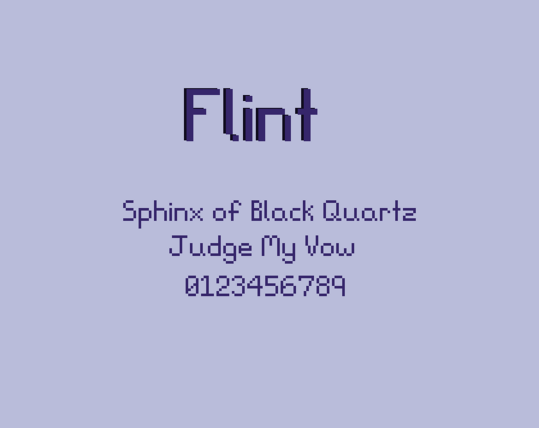
Taking a little sidebar to tell you: I've released a new pixel font~
Feel free to check it out on itch.io :itchio:
(PS. It's creator day sale! So everything is 50% off!~)
#gamedev #indiedev #designer #font #pixelfont
DeadlyEssence - IndieDev · @DeadlyEssence01
90 followers · 420 posts · Server mastodon.gamedev.place🎉 You may have seen the sneak peek 👀 earlier, but I've just released Mercite! The Pixel Font.
To celebrate, pick up either of my fonts on sale!~
DeadlyEssence - IndieDev · @DeadlyEssence01
90 followers · 416 posts · Server mastodon.gamedev.place
👀 Please gaze your peepers on this lovely in progress font: Mercite.
I enjoyed making the last one (Viscous Bold, available on :itchio: itch.io still!), so much, I had to try again!~

Patrick H. Lauke · @patrick_h_lauke
791 followers · 2007 posts · Server mastodon.socialtoday's #pixelfont recreation: HAL laboratory's "new ghostbusters II" (1990) on the NES https://www.splintered.co.uk/experiments/1224 #pixelart
Patrick H. Lauke · @patrick_h_lauke
785 followers · 1913 posts · Server mastodon.socialtoday's #pixelfont recreation: taito's "the lost castle in darkmist" (1986) https://www.splintered.co.uk/experiments/1221 #pixelart
Patrick H. Lauke · @patrick_h_lauke
783 followers · 1894 posts · Server mastodon.socialtoday's #pixelfont recreation: jaleco's "field combat" (1985) https://www.splintered.co.uk/experiments/1220 #pixelart

zlago · @zlago
25 followers · 65 posts · Server mastodon.gamedev.place
#pixelfont #small #tiny #1bit so.. now i can fit 3 lines of text in a mere 16 scanlines.. since apparently bitmap fonts cannot be copyrighted feel free to use this thing i guess?
Patrick H. Lauke · @patrick_h_lauke
782 followers · 1879 posts · Server mastodon.socialtoday's #pixelfont recreation: nintendo/tose's "tetris 2" (aka "tetris flash", 1993) on the NES https://www.splintered.co.uk/experiments/1219 #pixelart
Patrick H. Lauke · @patrick_h_lauke
779 followers · 1812 posts · Server mastodon.socialtoday's #pixelfont recreation: sega's "gigas mark II" (1986) https://www.splintered.co.uk/experiments/1218 #pixelart
Patrick H. Lauke · @patrick_h_lauke
779 followers · 1805 posts · Server mastodon.socialtonight's #pixelfont recreation: sega's "gigas" (1986) https://www.splintered.co.uk/experiments/1217 #pixelart
Patrick H. Lauke · @patrick_h_lauke
775 followers · 1708 posts · Server mastodon.socialtoday's #pixelfont recreation: the colour version of the small font from NMK/jaleco's "saint dragon" (1989) https://www.splintered.co.uk/experiments/1216
Patrick H. Lauke · @patrick_h_lauke
776 followers · 1672 posts · Server mastodon.socialtoday's #pixelfont recreation: the coloured version of sega's "columns II: the voyage through time" (1990) #pixelart https://www.splintered.co.uk/experiments/1213/
Patrick H. Lauke · @patrick_h_lauke
772 followers · 1650 posts · Server mastodon.socialtonight's #pixelfont recreation: sega's "columns II: the voyage through time" (1990) https://www.splintered.co.uk/experiments/1212 #pixelart
Samf · @samf
91 followers · 372 posts · Server mastodon.gamedev.place
Coming soon! Needs polish and Polish (and a few other characters for language completeness.) #pixelfont

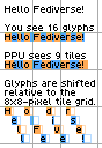
Damian Yerrick · @PinoBatch
109 followers · 23 posts · Server peoplemaking.games
Say I'm drawing the 16-character text "Hello Fediverse!" using a proportional #PixelFont on #NES, #GameBoy, #ZXSpectrum, #MSX, or #MasterSystem. Because these #RetroGaming platforms' graphics chips can't display 16 #sprites (moving objects) horizontally across the screen, I need to pack the glyphs (pictures of characters) into the 8×8-pixel background tiles that they can display.
Each glyph consists of pixels and an advance width. The pixels define its shape, and the width tells how far to move the "pen" forward after drawing the glyph to a line buffer. To draw a glyph that doesn't line up with the tile grid, a text plotter first shifts each row of pixels in the glyph to the right by a few bits, resulting in two 8×8-pixel tiles, and then combines the bits with the bits already in the buffer using bitwise OR. After all 16 glyphs are drawn, the text covers 9 tiles.
#pixelfont #nes #gameboy #zxspectrum #msx #mastersystem #RetroGaming #sprites
Damian Yerrick · @PinoBatch
107 followers · 20 posts · Server peoplemaking.games
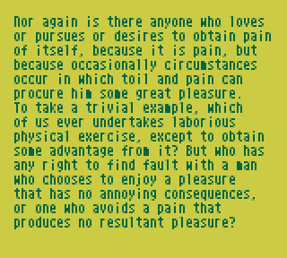
When designing a typeface, test it with real text.
#LoremIpsum is a nonsense snippet used to test #fonts and typographic layouts. It's based on a passage about pleasure and pain from M. T. Cicero's "De finibus bonorum et malorum" ("On the ends of good and evil") written in 45 BCE.
Nonsense harms design mockups by drawing attention away from the meaning that a design aims to convey.[1][2] So instead, I test a #PixelFont with meaningful text, preferably a draft of the copy to be displayed. If I must use Lorem Ipsum, I use H. Rackham's English translation of the passage, which calls to mind the pain of design leading to the pleasure of the result.
[1]: Jason Fried https://signalvnoise.com/archives/001083.php
[2]: Kyle Fiedler https://www.smashingmagazine.com/2010/01/lorem-ipsum-killing-designs/
Damian Yerrick · @PinoBatch
93 followers · 16 posts · Server peoplemaking.games
Many older games use a monospace #PixelFont, in which all glyphs are placed on a grid, because it was simpler to display on inexpensive hardware. It's often more readable to use a proportional #font (also called a variable-width font or #VWF) that makes, for example, 'm' wider than 'i'. I use a VWF in two #GameBoy projects: Libbet and the Magic Floor and 144p Test Suite.
#pixelfont #font #vwf #gameboy #pixelart #gamedev
Patrick H. Lauke · @patrick_h_lauke
729 followers · 1170 posts · Server mastodon.socialtonight's #pixelfont recreation: NMK/jaleco's "saint dragon" (1989) https://www.splintered.co.uk/experiments/1210 #pixelart
Patrick H. Lauke · @patrick_h_lauke
724 followers · 1111 posts · Server mastodon.socialtonight's #pixelfont recreation: the colour version of capcom's "goof troop: pirate island adventure" (1993) on the SNES https://www.splintered.co.uk/experiments/1209 #pixelart
Patrick H. Lauke · @patrick_h_lauke
721 followers · 1087 posts · Server mastodon.socialtonight's #pixelfont recreation: capcom's "goof troop: pirate island adventure" (2003) on the SNES (including an almost complete set of hiragana and katakana characters) https://www.splintered.co.uk/experiments/1208 #pixelart