
Maarten Lambrechts · @maarten
1760 followers · 545 posts · Server vis.socialThe last example by the New York Times used satellite imagery to 'chronolocate' the murder of civilians in the streets of Bucha. Based on the dates satellite images were taken, they could prove that the bodies appeared in the streets while the city was still under Russian control. https://www.nytimes.com/2022/04/04/world/europe/bucha-ukraine-bodies.html #SatelliteJournalism
Maarten Lambrechts · @maarten
1755 followers · 529 posts · Server vis.social
Ok, slides are done, here is the first batch of #SatelliteJournalism examples I'll use.
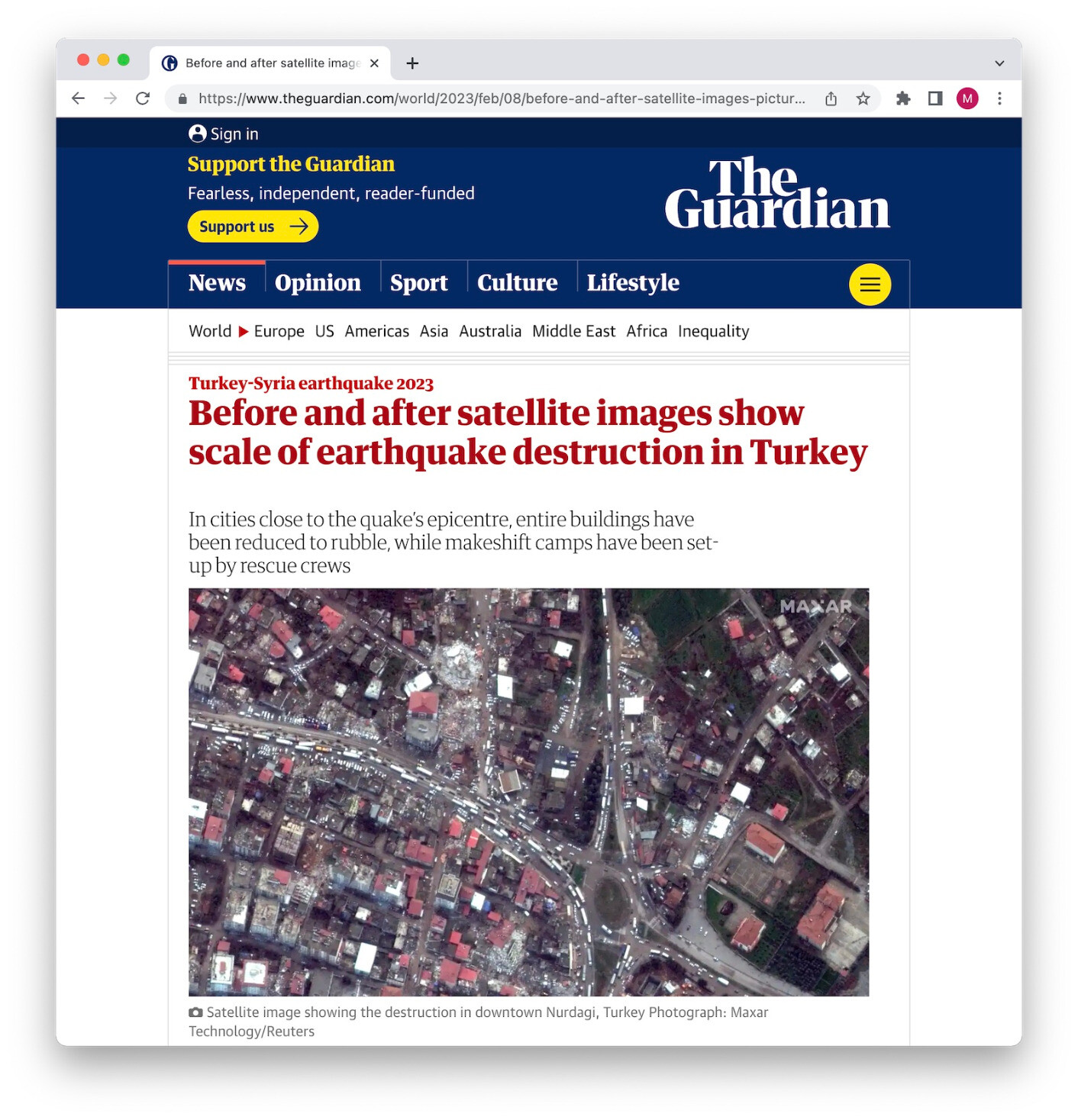
The "before-after" format is probably the most used format in journalism. Many media use sliders for this, like The Guardian on the Turkey earthquake https://www.theguardian.com/world/2023/feb/08/before-and-after-satellite-images-pictures-turkey-syria-earthquake-destruction
But you can also put the images next to each other, like USA Today does here https://eu.usatoday.com/in-depth/graphics/2023/02/09/turkey-before-after-drastic-images-show-damage-earthquakes/11211526002/
And I especially like the way the after image "fades over" the before image in this NYT piece on flooding https://www.nytimes.com/2023/01/23/opinion/california-drought-flooding.html
Maarten Lambrechts · @maarten
1742 followers · 503 posts · Server vis.socialWas asked by a media company to give a webinar on #DataViz, but in light of my upcoming career switch, I proposed another topic: #SatelliteJournalism. They agreed, so hit me with your best examples of the use of satellite imagery and other satellite data in journalism!
(I will add the examples I'll use here too)

annabehrend · @annabehrend
257 followers · 41 posts · Server norden.social
Nur rund 5% der ausgewerteten Geschichten verwendeten Satellitenbilder. Das wird eher mehr, vermutet @edytapbogucka@twitter.com bei der #NIAM23 im Zuge von #satellitejournalism #storiesfromabove
RT @annabehrend@twitter.com
Weiter geht es mit @edytapbogucka@twitter.com bei der #NIAM23. Sie hat 215 kartenbasierte Geschichten ausgewertet und auf Story-Muster hin untersucht. Hier geht's zum Livestream-Link: https://news-infographics-analytics-maps.media/2023_agenda.html
🐦🔗: https://twitter.com/annabehrend/status/1616022021699211264
#NIAM23 #satellitejournalism #storiesfromabove