Setsune Wave · @Setsune
103 followers · 165 posts · Server furries.clubForget confusing flat design and minimalism; a return to skeuomorphic ui, with big elements that can be laid out in ways that are comfortable to them. We're talking the revenge of Microsoft Bob. #ui #ux #skeuomorphism #microsoftbob
#ui #UX #skeuomorphism #microsoftbob

Sinclair-Terminal · @SinclairSpeccy
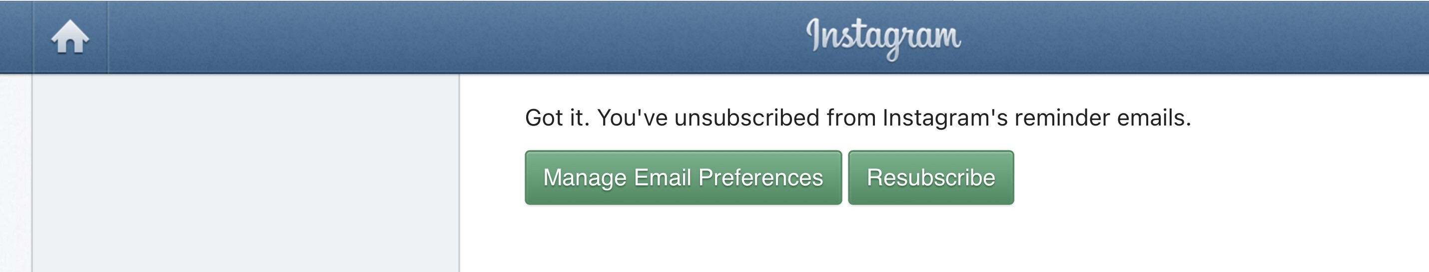
526 followers · 13171 posts · Server bitbang.socialI miss the days of skeuomorphism in UI design.
Everything feels so bland and flat these days. I want my buttons to look like buttons, and my sliders to look like sliders. Please give me some texture and depth!
#ui #gui #flatdesign #skeuomorphism

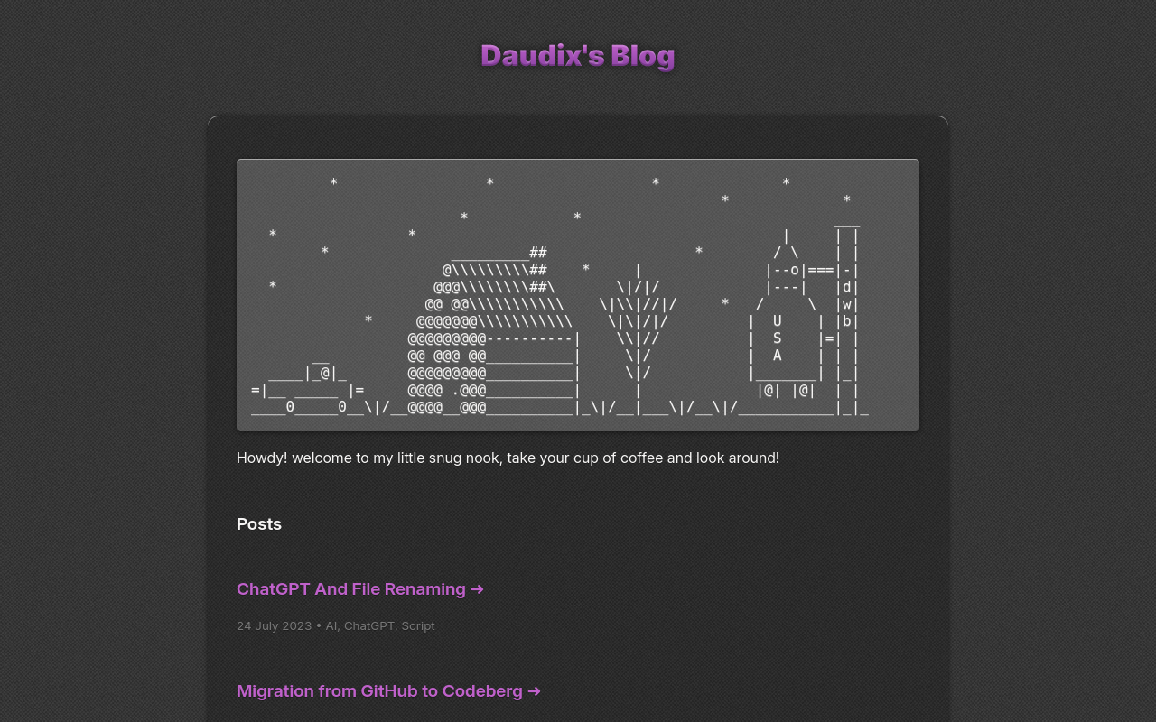
Daudix UFO 🦆 · @Daudix
80 followers · 558 posts · Server mstdn.social

iūlia · @ivlia
110 followers · 131 posts · Server no-outlet.com
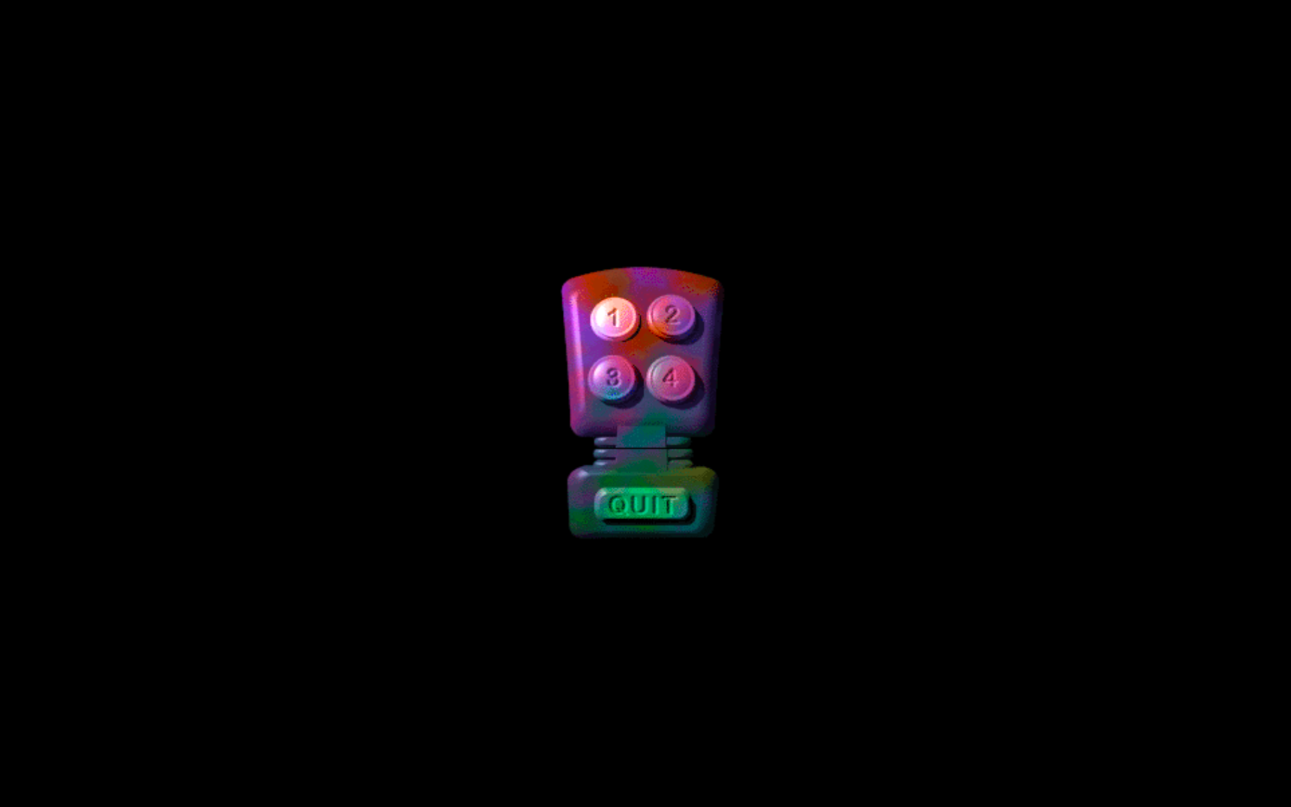
man they fuckin don’t make menus like this anymore do they

Jack William Bell · @jackwilliambell
266 followers · 10878 posts · Server rustedneuron.com
Every web designer and ABSOLUTELY EVERYONE WORKING FOR APPLE needs to read the entire archives of KnobFeel.
#skeuomorphism #haptics #design

Conor · @conorporter
26 followers · 683 posts · Server techhub.social@thatkruegergirl @woollyapp @mttvll wow, that icon is out of this world. #skeuomorphism

jamsilmonkey 🇦🇺 · @Stafford
17 followers · 123 posts · Server noagendasocial.comAn icon is a sign that resembles something but may not be a true representation. #skeuomorphism usually uses icons e.g.☎️ (still means "phone" even though phones don't look like this anymore).
An index replicates the thing e.g., a photograph.
A symbol has no relation to what it represents but we all agree what it means e.g., ♀️♂️ for female and male.
@adam @Johncdvorak

Gianmarco :archlinux: :kde: · @gianmarcogg03
116 followers · 1196 posts · Server mastodon.uno
Check out my cool ass 3D #Firefox. This comes from Everaldo's Crystal Project icons.
#firefox #frutigeraero #mozilla #nostalgia #2000s #skeuomorphism

Humbird0 Fandom · @humbird0
104 followers · 2313 posts · Server mstdn.party...
There is an argument that #Skeuomorphism was merely a stepping-stone and is no longer needed. I disagree. I do not believe every human being on the planet is a computer expert. Novices are born every second.
A do agree that standard menus and interfaces help that knowledge transfer to new software. But there is always a first time.
While an abstract menu can be more flexible, that completely goes to waste if nobody can figure out how to use it. That moment of confusion is friction.
Humbird0 Fandom · @humbird0
104 followers · 2311 posts · Server mstdn.party
I have always loved #Skeuomorphism , the idea that when you make something look like a real-world object, people will intuitively understand what it is.
It has gone out of fashion over the past decade. Watering everything down to an excessively dull state of simplicity in my opinion. While I agree that it makes sense to prioritize function over form, that does NOT mean you should disregard form completely!
...

CodePen.IO :verify: · @CodePen
216 followers · 2099 posts · Server hello.2heng.xin
RT LukyVj - A$AP Luky
✨ Recap of my #css week 👇
1️⃣ "Sliding button" https://codepen.io/LukyVj/pen/bGxpORa
2️⃣"Skeuomorphic like button" https://codepen.io/LukyVj/pen/XWPKvjP
3️⃣ "Glowing button" https://codepen.io/LukyVj/pen/vYzXNev
4️⃣ "Cute skeuomorphic checkboxes" https://codepen.io/LukyVj/pen/bGxwWVv
#webdesign #frontend #codepen #skeuomorphism https://t.co/45pbDa3HVn
:sys_twitter: https://twitter.com/LukyVJ/status/1629551578389651456
#css #webdesign #frontend #codepen #skeuomorphism

Mark Gardner :sdf: · @mjgardner
538 followers · 2761 posts · Server social.sdf.org
Chris DeMarco (Topher) 🌱🐧 · @chrisdemarco
166 followers · 1581 posts · Server mastodon.social
Oh look, icons that actually make sense!
Chris DeMarco (Topher) 🌱🐧 · @chrisdemarco
166 followers · 1580 posts · Server mastodon.socialOh look, icons that actually make sense!

Rubén · @rubenx
54 followers · 934 posts · Server mastodon.social

Ade Thompson :apple: · @apt
233 followers · 662 posts · Server mas.to@dancounsell I remember it well. History will repeat itself and we will (hopefully) be seeing #skeuomorphism again.

ovan · @ovan
133 followers · 286 posts · Server social.olstrom.be

Sinclair-Speccy · @SinclairSpeccy
172 followers · 2066 posts · Server bitbang.social

Gabriela Queiroz 🏳️⚧️ 🇧🇷 · @gabri
96 followers · 703 posts · Server tech.lgbt@theconfusedyeti #Skeuomorphism can look nice but it's also somewhat limiting as some digital things have no good real world analogue. Plus, having so many textures increases the chances of something clashing in the design and it increases app sizes (which are already ridiculous).
But one of the biggest problems for me is that all those textures sometimes made text hard to read, specially on buttons.

ivlia girardi · @ivlia
52 followers · 150 posts · Server universeodon.comThe certain way by which that certainly reads, however, is probably the point. At this point, anyway.
The actual content of Elements would be much better served by later translations straight from the Greek into Latin—or English.
Additionally, subsequent printings of this same book dropped the manuscript-style #skeuomorphism--for obvious reasons.
Here’s one from 1558, apparently,
https://www.google.com/books/edition/Euclidis_Elementorum_geometricorum_libri/1HkiZoBiFvsC?hl=en&gbpv=0
much of the #scribalAbbreviation still in tact--which is honestly very cool!
#skeuomorphism #scribalabbreviation