
Steven Ponce · @sponce1
0 followers · 29 posts · Server graphics.social
Here is my #viz for the #SWDchallenge – SEP 2023 | makeover magic
.
The data comes from the book Storytelling with Data: Let's Practice! This #viz is about the actual vs. projected target of reaching 450 accounts.
.
🔗: https://community.storytellingwithdata.com/challenges/sep-2023-makeover-magic/line-chart-actual-vs-projected
.
📂: https://github.com/poncest/SWDchallange/tree/main/2023/09_September
.
#SWDchallange | #dataviz | #rstats | #ggplot2
#viz #swdchallenge #swdchallange #dataviz #rstats #ggplot2
Steven Ponce · @sponce1
0 followers · 24 posts · Server graphics.social
Here is my #viz for the #SWDchallenge – AUG 2023 | what does your audience know?
.
The data comes from the J Pharm Sci . 2022 Jun;111(6):1761-1769. This #viz is about swelling profiles in various media of IMC-HPMC-AS SDDs with different drug loading percentages.
.
🔗: https://community.storytellingwithdata.com/challenges/aug-2023-what-does-your-audience-know/polymerdrug-swelling-profiles
.
📂: https://github.com/poncest/SWDchallange/tree/main/2023/08_August
.
#SWDchallange | #dataviz | #rstats | #ggplot2
#viz #swdchallenge #swdchallange #dataviz #rstats #ggplot2

Datylon · @datylon
24 followers · 32 posts · Server vis.social
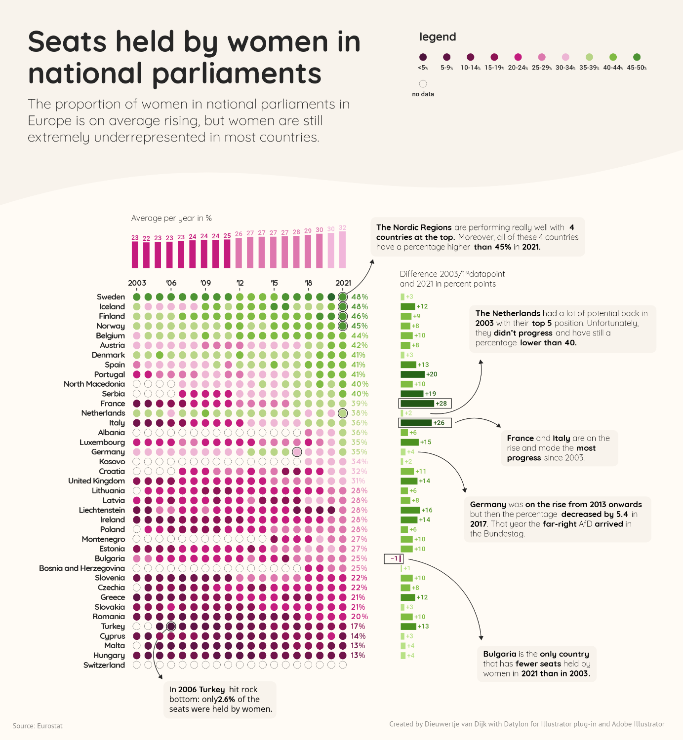
'Seats held by women in national parliaments’ 👩🏻💼👩🏾💼👩🏼💼
Our data visualization designer submitted this beautiful chart design for #SWDchallenge in July 2022. The topic of the challenge was ‘Think globally’. 🌍
“I used the dataset about seats held by women in national parliaments in Europe from Eurostat.
In theme with the subject, I tried to break gender stereotypes by using a color palette in which purple/pink represent the low numbers/absence of women."
🔎 High-definition: https://insights.datylon.com/stories/riP0nX1xZ0DHe4QV1wRH3w

Cédric Scherer · @CedScherer
1185 followers · 30 posts · Server vis.social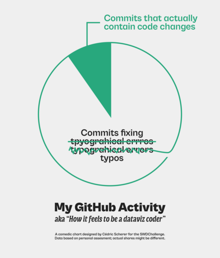
#SWDChallenge Nov 2022
Topic "Comedic Charts"
A remake of a silly visualization I've created in 2021 for the 30DayChartChallenge and that I use since then as a fun banner on my GitHub profile.
Couldn't resist pulling that one out again and giving it a refresh :)
No coding involved here though; the original #dataviz was created in PowerPoint, the remake in #Figma.