
Museum of Portable Sound · @museumofportablesound
864 followers · 273 posts · Server toot.community
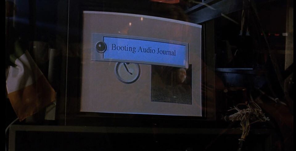
Audio Journal interface from The Lawnmower Man (dir. Brett Leonard, 1992)
#90s #interfacedesign #ux #ui #timesnewroman

t o d d w a r n e r · @tw
80 followers · 222 posts · Server writing.exchange
Dear #Monotype,
The #publishing world demands (mostly) that #manuscripts be formatted in #TimesNewRoman. I can't change the publishing industry, but you could help #authors by freeing up your #proprietary #typefaces. You've made your money 1-billion-fold. Set it free!
Dear #Microsoft #Google #Apple,
Pick a handful of high-quality, open-source typefaces & include them by default in your OSs. Work w/ the Fedora & Ubuntu communities to settle on the set.
#writingcommunity #opensource #fonst #apple #google #microsoft #typefaces #proprietary #authors #timesnewroman #manuscripts #publishing #monotype

Kristoffer Lawson · @Setok
361 followers · 1938 posts · Server attractive.space@w7voa utter disgrace! #Calibri just lacks the weight and authority of #TimesNewRoman.

Itamar Medeiros · @designative
319 followers · 1285 posts · Server mastodon.socialThe #USA State Department has used #TimesNewRoman for its official communications since 2004. Now it’s switching to the #SansSerif #Calibri in an effort to improve #accessibility. https://www.fastcompany.com/90836830/the-state-department-ditching-times-new-roman-for-calibri?partner=rss&utm_source=feedly&utm_medium=feed&utm_campaign=rss+fastcompany&utm_content=rss #Typography #GraphicDesign #Fonts #Typefaces
#usa #timesnewroman #sansserif #calibri #accessibility #typography #graphicdesign #fonts #typefaces

OsteoarthriticAutistic she/her · @OsteoarthriticAutistic
84 followers · 837 posts · Server disabled.socialHome Office civil servants ‘told to stop using Times New Roman’ | The Independent
#Fonts
#HomeOffice
#TimesNewRoman
#SansSerifFonts
#AccessibleFonts
#Accessibility
Department now opts for more ‘accessible’ sans serif fonts
https://www.independent.co.uk/news/uk/politics/home-office-times-new-roman-b2266970.html
#fonts #homeoffice #timesnewroman #sansseriffonts #accessiblefonts #accessibility

pablolarah · @pablolarah
122 followers · 920 posts · Server mastodon.social
⏳ Time(s) for a change: State Department picks a new official typeface
From February, US diplomats and their staff will no longer use Times New Roman.
by Jonathan M. Gitlin @drgitlin at @arstechnica
#TimesNewRoman #Calibri #typography
#timesnewroman #calibri #typography

chikorita157 :verifiednew: · @chikorita157
132 followers · 1103 posts · Server sakurajima.moeAbout time, but I prefer using Myriad Pro just because, and it was the font Apple used to use.
Helvetica would have been a better choice, but oh well.

John L. Grantham · @jlgrantham
162 followers · 291 posts · Server mastodon.socialThis is the typographic equivalent to “Olympus has fallen”.
Effing _Calibri?_ That’s the improvement?
We’re doomed. These are truly the End Times.
#timesnewroman #fonts #typography #calibri #afontalypse #endtimes
#timesnewroman #fonts #typography #calibri #afontalypse #endtimes

David VINCENT · @dgvincent
97 followers · 234 posts · Server social.sciences.reComment la police d'écriture caroline, conçue en Picardie, a donné naissance à la ponctuation et à la Times New Roman
#ecriture #timesnewroman #police #histoire

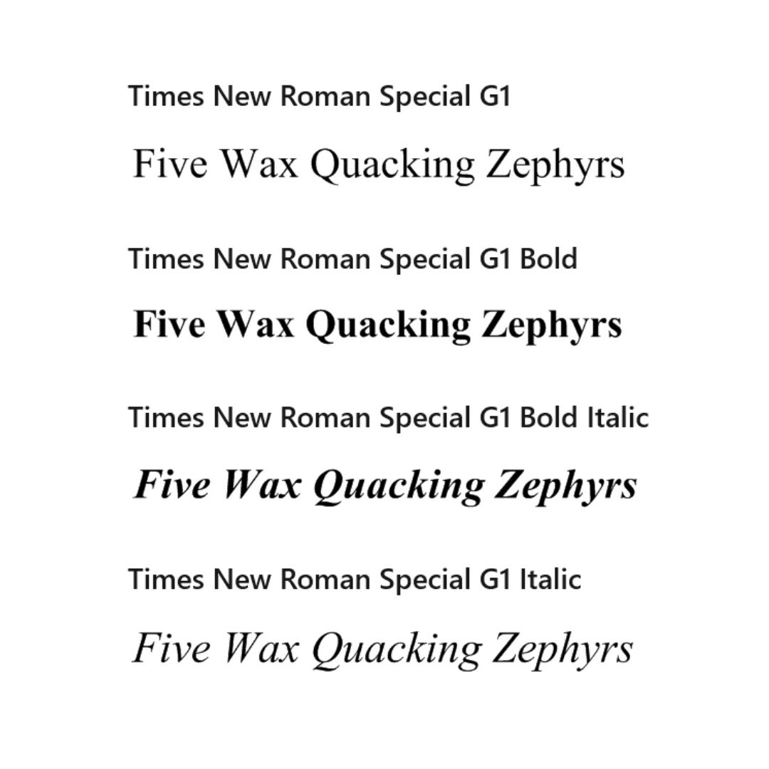
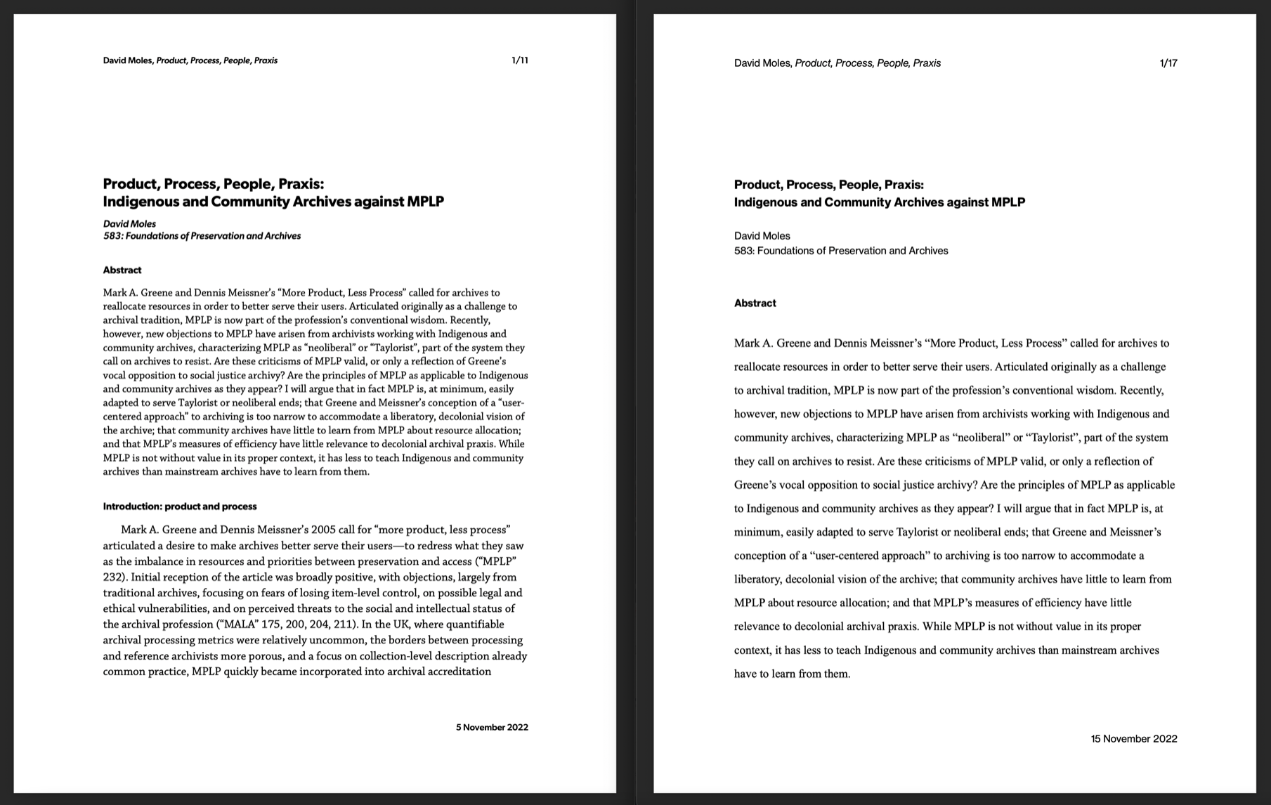
David 🌍🌏🌎 Moles · @chronodm
44 followers · 52 posts · Server mastodon.social
They tell you that as a writer you’ll need to murder your darlings, but they don’t tell you that as an #iSchool student you’ll need to murder your inner graphic designer. #doubleSpaced #TimesNewRoman #justRequireComicSansWhyDontYou
#ischool #doublespaced #timesnewroman #justrequirecomicsanswhydontyou

Z Pamiętnika Admina :verified: · @pamietnikadmina
14 followers · 9 posts · Server 101010.plTen moment, kiedy piszesz obszerne #FAQ na 10 stron A4, czcionką #TimesNewRoman 12 pkt. z opcją szybkiego wyszukiwania, a i tak dostajesz w kółko te same pytania (na które odpowiedzi są w tym FAQ) na pv…
#historia #opowiadanie #pov #admin #timesnewroman #faq
Z Pamiętnika Admina :verified: · @pamietnikadmina
7 followers · 6 posts · Server 101010.plTen moment, kiedy piszesz obszerne #FAQ na 10 stron A4, czcionką #TimesNewRoman 12 pkt. z opcją szybkiego wyszukiwania, a i tak dostajesz pytania (na które odpowiedzi są w tym FAQ) na pv…
#historia #opowiadanie #pov #admin #timesnewroman #faq

· @n8zug
281 followers · 4337 posts · Server social.tchncs.de
Ihr wisst welcher Tag gestern gefeiert wurde?
Richtig! Gestern vor 90 Jahren wurde die Schriftart #TimesNewRoman in der Zeitung The Times erstmals eingesetzt. 📰😉
#podcast
https://pca.st/episode/5f173388-56f6-4e64-bf84-308117f22151