Ana Tudor 🐯 · @anatudor
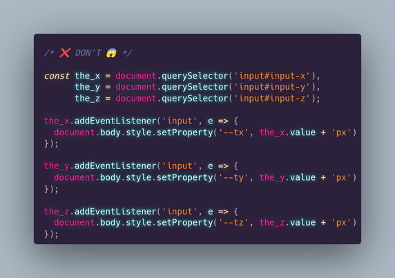
701 followers · 440 posts · Server mastodon.socialIf you have 3 inputs for values of translation/ rotation/ scale along/ around the 3 axes and you want to update a CSS variable for each, here's how (not) to do it.*
*we assume we're using a translation:
transform:
translate3d(var(--x), var(--y), var(--z))
Ana Tudor 🐯 · @anatudor
628 followers · 363 posts · Server mastodon.socialI got slapped with one of these and I thought I could make better button hover transitions than the one they use (which involve changing the button `color` and horizontally shrinking to nothing a span underneath the text).
So here it is, normal version and slow motion with only 1 button element: https://codepen.io/thebabydino/pen/ExRqOGP?editors=0100
For the how behind the technique (and more similar cool techniques), see my Taming Blend Modes: `difference` & `exclusion` https://css-tricks.com/taming-blend-modes-difference-and-exclusion/
Ana Tudor 🐯 · @anatudor
595 followers · 335 posts · Server mastodon.socialBecause I saw a piece of #CSS used to illustrate the 1st principle of animation & almost screamed in horror...
❌ DON'T
.b { -webkit-animation: a 1s ease infinite alternate }
@-webkit-keyframes a {
0% { -webkit-transform: scaley(1.0) }
50% { -webkit-transform: translatey(-300%) scaley(1.2) }
100% { -webkit-transform: scale(1.0) }
}
✅ DO
.b { animation: a .5s ease-out infinite alternate }
@keyframes a {
to { transform: translatey(-300%) scale(.83, 1.2) }
}
Why? 👇
#tinyCodingTips #cssAnimation
#css #tinycodingtips #cssanimation
Ana Tudor 🐯 · @anatudor
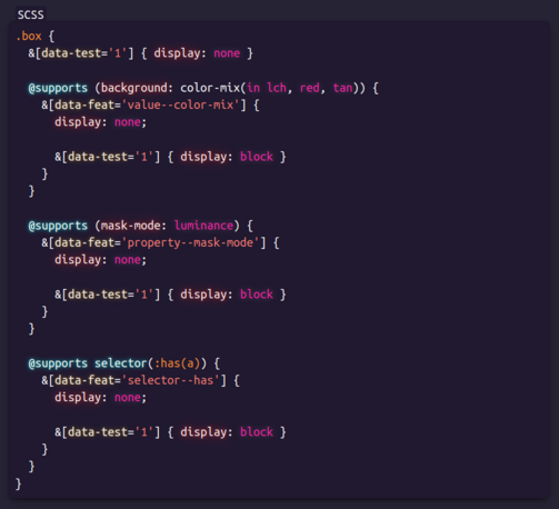
579 followers · 302 posts · Server mastodon.socialThis is the little bit of #CSS code that does the magic of showing the "yay, supported!" box or the "sorry, not supported" one depending on whether the browser supports a particular feature (values, properties, selectors) or not.
Conditional display of info boxes depending on browser support and all in pure CSS, no JS needed.
Ana Tudor 🐯 · @anatudor
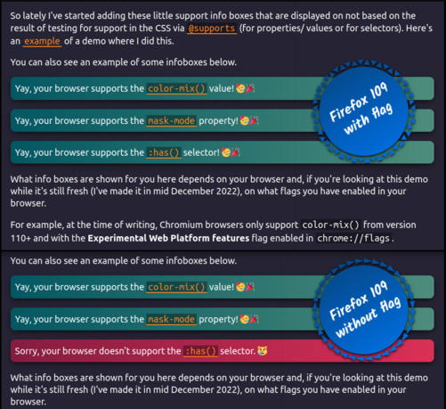
574 followers · 296 posts · Server mastodon.socialSomething I've been including in my demos containing bleeding edge features lately: have two info boxes, one saying "yay, your browser supports [feature]!" and the other "sorry, your browser doesn't support [feature]." and toggle their display depending on support.
Live demo on #CodePen https://codepen.io/thebabydino/full/qBKvjKM
This is a pure #css support test, using `@supports` - no JS is required.
Another example of such info boxes in my partial `grayscale(1)` demo: https://mastodon.social/@anatudor/109445767480226285
Ana Tudor 🐯 · @anatudor
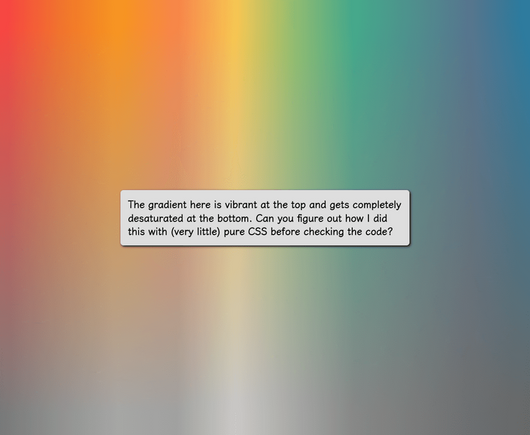
537 followers · 250 posts · Server mastodon.socialBonus, this is also what helps solve a recent challenge (this one https://mastodon.social/@anatudor/109404963501056367): instead of a sharp gradient transition between transparent and grey, have a smooth one in order to progressively desaturate the top layer going from top (vibrant) to bottom (completely desaturated).
Live demos:
💫 https://codepen.io/thebabydino/pen/yLEjjWE
#css #tinycodingtips #codepen #blending #csschallenge2022
Ana Tudor 🐯 · @anatudor
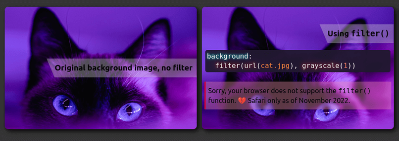
534 followers · 239 posts · Server mastodon.socialWhat if you wanted the filter: grayscale(1) effect to apply only to (a part of) the background?
There's filter() (https://www.w3.org/TR/filter-effects/#FilterCSSImageValue), but, while Safari has supported it since 2015, it's not in any other browser 😿
Better solution: blend with a grey (*any* grey works because all that matters is saturation being 0%) background-color or gradient layer underneath using luminosity! 🌟
Test https://codepen.io/thebabydino/full/qBKobME
Cool use case https://codepen.io/thebabydino/pen/KKgEqGZ
#css #codepen #blending #tinycodingtips
Ana Tudor 🐯 · @anatudor
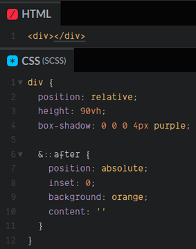
439 followers · 174 posts · Server mastodon.socialWant your absolutely positioned pseudo/ child to cover its entire parent?
❌DON'T
```
top: 0;
left: 0;
width: 100%;
height: 100%
```
or
```
top: 0;
right: 0;
bottom: 0;
left: 0
```
✅ DO
```
inset: 0
```
Live demo https://codepen.io/thebabydino/pen/xxXjBpO
`inset` is well supported and can take 1, 2, 3 or 4 values, just like `margin` or `padding`.
On MDN https://developer.mozilla.org/en-US/docs/Web/CSS/Inset
Ana Tudor 🐯 · @anatudor
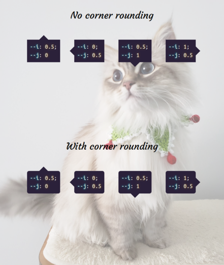
377 followers · 132 posts · Server mastodon.socialSaw https://getcssscan.com/css-shapes - the code for some of them (polygons, tooltips) is terribly outdated.
Here's how you make tooltips with *no pseudos* https://codepen.io/thebabydino/pen/dyKZRzy
`--i` & `--j` are all that differ between the four tooltip directions and indicate where the tooltip is along the horizontal & vertical axes respectively.
+more interesting ones
💫 gradient background https://codepen.io/thebabydino/pen/GRoxvOr
💫 border + text gradient & transparency https://codepen.io/thebabydino/pen/pogLXQP
Ana Tudor 🐯 · @anatudor
368 followers · 128 posts · Server mastodon.socialBonus tip to the one @chenry shared https://mastodon.social/@chenry/109325956277772390 - you can have a `background` for an `<img>`.
This helps with getting a gradient `border` for the image when the image also has rounded corners or for a multi-gradient layer border pattern: https://codepen.io/thebabydino/pen/JjZNXoQ
Because `border-image` only accepts one gradient image (can't have more to get ⭐ or ❤️ patterns) & doesn't play nice with `border-radius` (https://codepen.io/thebabydino/pen/jxZyed).
#css #CSSTips #tinycodingtips #codepen
Ana Tudor 🐯 · @anatudor
354 followers · 116 posts · Server mastodon.socialThe `aspect-ratio` property relates to `box-sizing`.
Let's say we have `aspect-ratio: 4/ 3`
By default, this is the aspect ratio of the `content-box`.
But if we set `box-sizing: border-box`, 4/ 3 becomes the aspect ratio of the `border-box`.
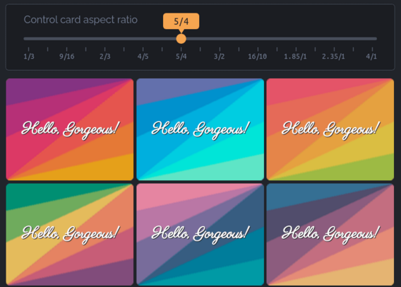
Bonus, here's a cool little thing I've used `aspect-ratio` for: cards with 2 conic gradients at opposite corners, meeting along the diagonal in between the 2 corners https://css-tricks.com/variable-aspect-ratio-card-with-conic-gradients-meeting-along-the-diagonal/ (this should get easier with atan in CSS)
Ana Tudor 🐯 · @anatudor
352 followers · 115 posts · Server mastodon.socialSomething I've shared before (years ago on twitter):
DON'T ❌
@keyframes b {
0% { color: tan }
49.99999% { color: tan }
50.00001% { color: red }
100% { color: red }
}
p { animation: b 2s infinite }
Instead, DO ✅
@keyframes b { 50% { color: red } }
p {
color: tan;
animation: b 2s steps(1) infinite
}
Some examples of demos where I've used this:
✨ https://codepen.io/thebabydino/pen/BadYORM
✨ https://codepen.io/thebabydino/pen/vNxboo
✨ https://codepen.io/thebabydino/pen/yQewOm
✨ https://codepen.io/thebabydino/pen/MQeEed
